April’s inflation peak meets falling births and shifting migration flows, creating a perfect storm for Norwegian household budgets and long-term population growth.
Norway faces a dual pressure in 2026 that its policymakers rarely have to confront simultaneously: a consumer price index rewritten by a new base year and still running hot, and a demographic ledger that shows fewer births, more deaths, and a migration pattern in flux. These two forces — one short-term and felt at the checkout, the other generational and structural — are converging in ways that will define Norway’s economic character for years to come.
The Inflation Picture: Reading the New CPI Series
Statistics Norway introduced a new Consumer Price Index series in 2026 (base year 2025 = 100), providing the clearest snapshot yet of where price pressures are concentrated. The data covers food, beverages, bread, and grain products — the daily staples that household budgets feel most acutely.
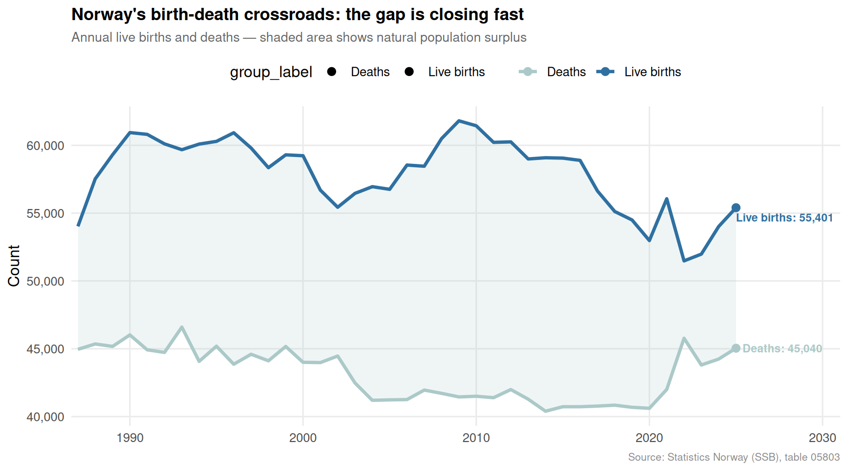
The Demographic Ledger: Births, Deaths, and the Natural Change Turning Point
While the price data tells a story of the present, Norway’s vital statistics reveal a longer-running drama. Births have been declining for years; deaths have been edging upward as the population ages. The gap between the two — natural population change — is the quiet variable that determines whether Norway can grow without relying on migration.
Code
if (!is.null(demo_births)) { birth_death_plot <- demo_births |>mutate(group_label =case_when( .data[[series_col]] =="Levendefødte i alt"~"Live births", .data[[series_col]] =="Døde i alt"~"Deaths",TRUE~ .data[[series_col]] ),year =year(date) ) pal2 <-met.brewer("Hokusai2", n =5, type ="discrete")[c(1, 4)]# Latest year for labels latest_bd <- birth_death_plot |>group_by(group_label) |>slice_max(date, n =1) |>ungroup() p3 <-ggplot(birth_death_plot, aes(x = date, y = value, colour = group_label, fill = group_label)) +geom_ribbon(data = birth_death_plot |>select(date, group_label, value) |>pivot_wider(names_from = group_label, values_from = value) |>rename(births =`Live births`, deaths = Deaths),aes(x = date, ymin = deaths, ymax = births, fill ="Natural surplus"),inherit.aes =FALSE,alpha =0.18, fill = pal2[1] ) +geom_line(linewidth =1.2) +geom_point(data = latest_bd, size =2.5) + ggrepel::geom_text_repel(data = latest_bd,aes(label =paste0(group_label, ": ", scales::comma(value))),size =3, fontface ="bold", nudge_x =100,segment.colour ="grey70", show.legend =FALSE ) +scale_colour_manual(values = pal2) +scale_y_continuous(labels =label_comma()) +scale_x_date(date_labels ="%Y", expand =expansion(mult =c(0.01, 0.15))) +labs(title ="Norway's birth-death crossroads: the gap is closing fast",subtitle ="Annual live births and deaths — shaded area shows natural population surplus",caption ="Source: Statistics Norway (SSB), table 05803",x =NULL, y ="Count", colour =NULL ) +theme_minimal(base_size =12) +theme(legend.position ="top",plot.title =element_text(face ="bold", size =13),plot.subtitle =element_text(colour ="grey40", size =10),panel.grid.minor =element_blank(),plot.caption =element_text(colour ="grey55", size =8) )print(p3)}
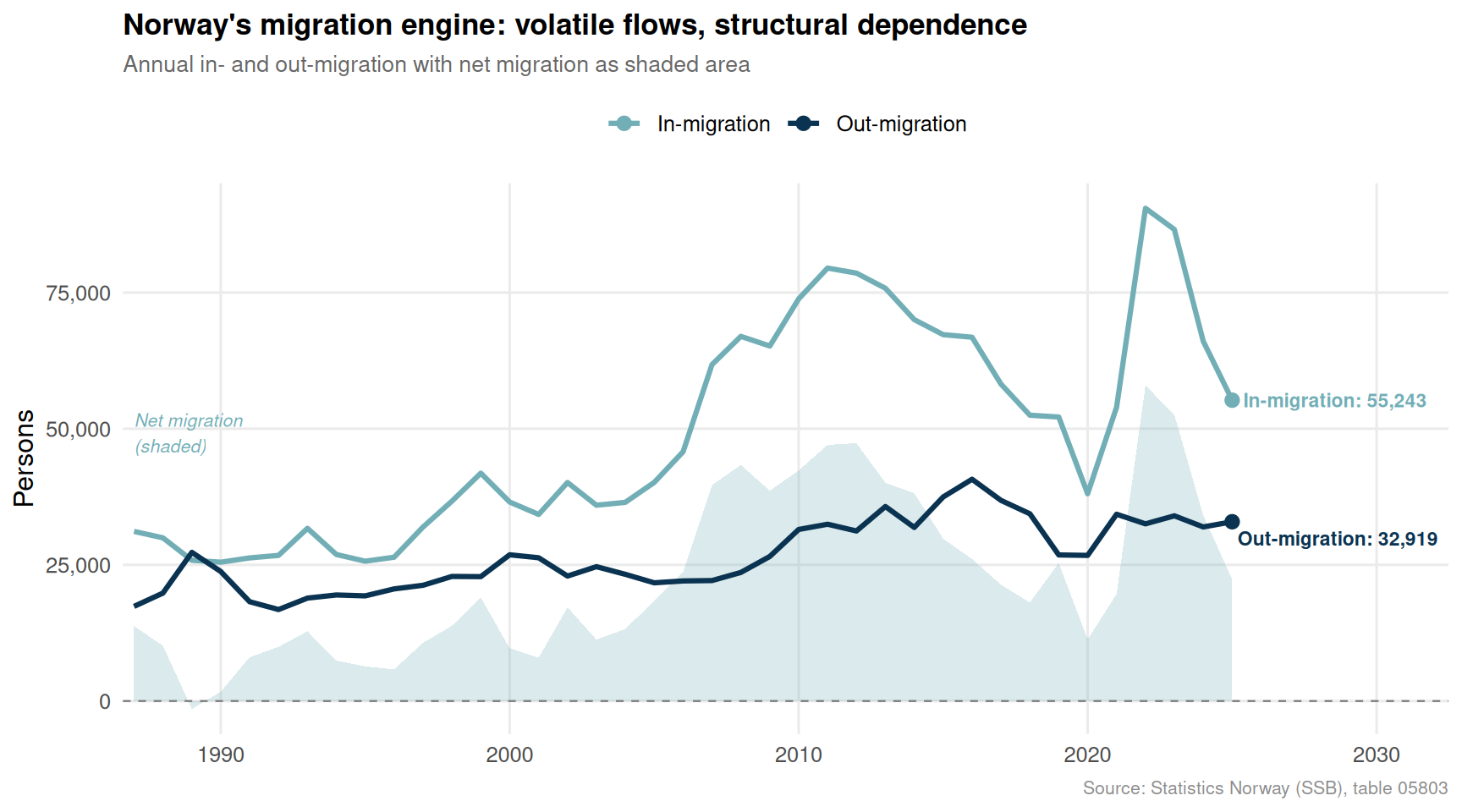
Migration as the Safety Valve — But for How Long?
As natural increase stalls, net migration has become Norway’s primary engine of population growth. Yet migration flows are themselves volatile, shaped by global events, Norwegian economic conditions, and EU labour mobility. The slope chart below traces both inflows and outflows across time, exposing just how dependent Norway has become on a force it cannot fully control.
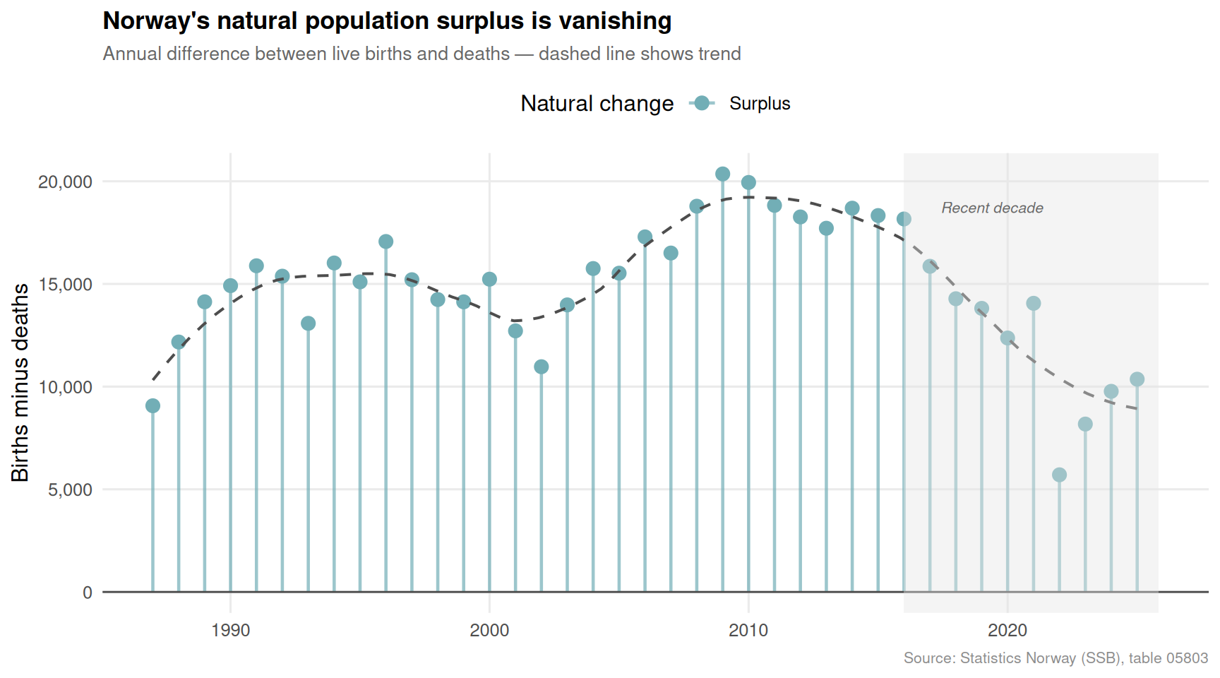
The Squeeze in Full: Inflation vs. Demographic Vitality
The final chart brings the two threads together, showing the 12-month CPI change for all items alongside Norway’s natural population change (births minus deaths) through time. These two indicators rarely move in comfortable synchrony — and in 2026, the alignment is distinctly uncomfortable.
Code
if (!is.null(demo_natural) &&nrow(demo_natural) >0) { pal4 <-met.brewer("Hokusai2", n =5, type ="discrete")# Lollipop of natural change by year nat_plot <- demo_natural |>filter(!is.na(natural_change)) |>arrange(date) |>mutate(direction =if_else(natural_change >=0, "Surplus", "Deficit"),year =year(date) )# Highlight the most recent 5 years recent_threshold <-max(nat_plot$year, na.rm =TRUE) -9 p5 <-ggplot(nat_plot, aes(x = date, y = natural_change, colour = direction)) +geom_segment(aes(xend = date, yend =0), linewidth =0.8, alpha =0.7) +geom_point(size =3) +geom_hline(yintercept =0, colour ="grey30", linewidth =0.5) +geom_smooth(aes(group =1), method ="loess", span =0.4,colour ="grey30", se =FALSE, linewidth =0.7, linetype ="dashed") +annotate("rect",xmin =as.Date(paste0(recent_threshold, "-01-01")),xmax =max(nat_plot$date, na.rm =TRUE) +300,ymin =-Inf, ymax =Inf,fill ="grey90", alpha =0.4) +annotate("text",x =as.Date(paste0(recent_threshold +1, "-06-01")),y =max(nat_plot$natural_change, na.rm =TRUE) *0.92,label ="Recent decade",hjust =0, size =2.8, colour ="grey40", fontface ="italic") +scale_colour_manual(values =c("Surplus"= pal4[2], "Deficit"= pal4[5]),name ="Natural change" ) +scale_y_continuous(labels =label_comma()) +scale_x_date(date_labels ="%Y") +labs(title ="Norway's natural population surplus is vanishing",subtitle ="Annual difference between live births and deaths — dashed line shows trend",caption ="Source: Statistics Norway (SSB), table 05803",x =NULL, y ="Births minus deaths" ) +theme_minimal(base_size =12) +theme(legend.position ="top",plot.title =element_text(face ="bold", size =13),plot.subtitle =element_text(colour ="grey40", size =10),panel.grid.minor =element_blank(),plot.caption =element_text(colour ="grey55", size =8) )print(p5)}
Key Findings
Food prices remain the sharpest pressure point in Norway’s new 2025-base CPI series: bread and grain products and food overall have consistently registered higher 12-month changes than the all-items headline, squeezing household budgets hardest where discretion is lowest.
Norway’s natural population surplus is structurally eroding. The gap between live births and deaths has narrowed dramatically over the past decade, with recent years flirting with a natural deficit — something virtually unthinkable in Norwegian demographic history a generation ago.
Migration is now the dominant driver of population growth, but the flows are volatile. Net migration swings sharply with economic cycles and global events, making Norway’s population arithmetic dependent on forces far beyond its borders.
The marriage rate has continued its long decline while divorces have held relatively steady, reinforcing the view that family formation in Norway is being redefined — fewer formal unions, fewer children, and smaller household units capable of absorbing less inflation before real standards of living fall.
The convergence of a high-inflation environment and a collapsing birth rate creates a compounding risk: fewer workers in future decades, a rising dependency ratio, and a central bank that must balance price stability against an economy already structurally short of domestic labour supply growth.
Closing Reflection
Norway enters the second half of 2026 caught between two slow-moving crises that rarely appear on the same front page. The CPI data is immediate and visceral — it shows up at the supermarket checkout every week. The demographic data moves quietly in the background, measured in births not taken and migration flows that shift with geopolitical winds.
What makes 2026 distinctive is not that either crisis is new — both have been building for years — but that they are now arriving together with enough force to be mutually reinforcing. Higher food prices delay family formation. Fewer young households reduce the consumer base that drives growth. A shrinking working-age cohort makes inflation structurally harder to control through productivity gains alone.
Norway’s petroleum wealth has long provided a buffer against structural economic pressures. But no sovereign wealth fund can manufacture newborns or guarantee that net migration will always run positive. The real policy question for the coming decade is not which of these pressures to address first, but whether Norway has the institutional imagination to confront both at once.
Source Code
---title: "Norway's 2026 Squeeze: When Price Shocks Collide with Demographic Decline"description: "April's inflation peak meets falling births and shifting migration flows, creating a perfect storm for Norwegian household budgets and long-term population growth."date: "2026-04-30"categories: [SSB, inflation, demography, consumer prices, population]---```{r setup}knitr::opts_chunk$set(echo = TRUE, warning = FALSE, message = FALSE, error = TRUE)library(tidyverse)library(lubridate)library(PxWebApiData)library(scales)library(MetBrewer)library(ggridges)df1 <- NULLtryCatch({ raw <- ApiData( "https://data.ssb.no/api/v0/no/table/14700", VareTjenesteGrp = TRUE, Tid = list(filter = "top", values = 40) ) tmp <- raw[[1]] time_col <- "måned" value_col <- "value" series_col <- "vare- og tjenestegruppe" measure_col <- "statistikkvariabel" df1 <- tmp |> mutate( value = as.numeric(.data[[value_col]]), time_str = .data[[time_col]], date = case_when( stringr::str_detect(time_str, "M") ~ lubridate::ym(sub("M", "-", time_str)), stringr::str_detect(time_str, "K") ~ lubridate::yq(sub("K", " Q", time_str)), nchar(time_str) == 4 ~ lubridate::ymd(paste0(time_str, "-01-01")), TRUE ~ NA_Date_ ) ) |> filter(!is.na(value), !is.na(date))}, error = function(e) message("Fetch failed: ", e$message))df2 <- NULLtryCatch({ raw <- ApiData( "https://data.ssb.no/api/v0/no/table/05803", ContentsCode = TRUE, Tid = list(filter = "top", values = 40) ) tmp <- raw[[1]] time_col <- "år" value_col <- "value" series_col <- "statistikkvariabel" df2 <- tmp |> mutate( value = as.numeric(.data[[value_col]]), time_str = .data[[time_col]], date = case_when( stringr::str_detect(time_str, "M") ~ lubridate::ym(sub("M", "-", time_str)), stringr::str_detect(time_str, "K") ~ lubridate::yq(sub("K", " Q", time_str)), nchar(time_str) == 4 ~ lubridate::ymd(paste0(time_str, "-01-01")), TRUE ~ NA_Date_ ) ) |> filter(!is.na(value), !is.na(date))}, error = function(e) message("Fetch failed: ", e$message))```Norway faces a dual pressure in 2026 that its policymakers rarely have to confront simultaneously: a consumer price index rewritten by a new base year and still running hot, and a demographic ledger that shows fewer births, more deaths, and a migration pattern in flux. These two forces — one short-term and felt at the checkout, the other generational and structural — are converging in ways that will define Norway's economic character for years to come.## The Inflation Picture: Reading the New CPI SeriesStatistics Norway introduced a new Consumer Price Index series in 2026 (base year 2025 = 100), providing the clearest snapshot yet of where price pressures are concentrated. The data covers food, beverages, bread, and grain products — the daily staples that household budgets feel most acutely.```{r wrangle-cpi}# Filter: 12-month change across product groupscpi_12m <- NULLif (!is.null(df1)) { cpi_12m <- df1 |> filter(.data[[measure_col]] == "12-måneders endring (prosent)") |> filter(.data[[series_col]] %in% c( "I alt", "Matvarer og alkoholfrie drikkevarer", "Matvarer", "Brød og kornprodukter (IV)" )) if (nrow(cpi_12m) == 0) { message("cpi_12m empty. measure_col values: ", paste(head(unique(df1[[measure_col]]), 10), collapse = ", ")) cpi_12m <- NULL }}# Filter: monthly changecpi_monthly <- NULLif (!is.null(df1)) { cpi_monthly <- df1 |> filter(.data[[measure_col]] == "Månedsendring (prosent)") |> filter(.data[[series_col]] %in% c( "I alt", "Matvarer og alkoholfrie drikkevarer", "Matvarer", "Brød og kornprodukter (IV)" )) if (nrow(cpi_monthly) == 0) { message("cpi_monthly empty.") cpi_monthly <- NULL }}# Filter: index levelscpi_index <- NULLif (!is.null(df1)) { cpi_index <- df1 |> filter(.data[[measure_col]] == "Konsumprisindeks (2025=100)") |> filter(.data[[series_col]] %in% c( "I alt", "Matvarer og alkoholfrie drikkevarer", "Matvarer", "Brød og kornprodukter (IV)" )) if (nrow(cpi_index) == 0) { message("cpi_index empty.") cpi_index <- NULL }}# Demographic wranglingdemo_births <- NULLdemo_deaths <- NULLdemo_migration <- NULLdemo_marriage <- NULLif (!is.null(df2)) { demo_births <- df2 |> filter(.data[[series_col]] %in% c("Levendefødte i alt", "Døde i alt")) if (nrow(demo_births) == 0) { message("demo_births empty. series_col values: ", paste(head(unique(df2[[series_col]]), 15), collapse = ", ")) demo_births <- NULL } demo_migration <- df2 |> filter(.data[[series_col]] %in% c("Innflyttinger", "Utflyttinger")) if (nrow(demo_migration) == 0) { message("demo_migration empty.") demo_migration <- NULL } demo_marriage <- df2 |> filter(.data[[series_col]] %in% c("Inngåtte ekteskap", "Skilsmisser")) if (nrow(demo_marriage) == 0) { message("demo_marriage empty.") demo_marriage <- NULL } # Natural population change: births minus deaths by year demo_natural <- df2 |> filter(.data[[series_col]] %in% c("Levendefødte i alt", "Døde i alt")) |> select(date, series = .data[[series_col]], value) |> pivot_wider(names_from = series, values_from = value) |> rename(births = any_of("Levendefødte i alt"), deaths = any_of("Døde i alt")) |> mutate(natural_change = births - deaths, year = year(date)) if (nrow(demo_natural) == 0 || !("natural_change" %in% names(demo_natural))) { demo_natural <- NULL }}``````{r plot-cpi-area}#| fig-height: 5#| fig-width: 9#| fig-show: asis#| dev: "png"if (!is.null(cpi_12m)) { pal <- met.brewer("Hokusai2", n = 4, type = "discrete") # Clean group labels for display cpi_12m_plot <- cpi_12m |> mutate(group_label = case_when( .data[[series_col]] == "I alt" ~ "All items", .data[[series_col]] == "Matvarer og alkoholfrie drikkevarer" ~ "Food & non-alc. beverages", .data[[series_col]] == "Matvarer" ~ "Food", .data[[series_col]] == "Brød og kornprodukter (IV)" ~ "Bread & grain", TRUE ~ .data[[series_col]] )) # Latest values for direct labels latest_cpi <- cpi_12m_plot |> group_by(group_label) |> slice_max(date, n = 1) |> ungroup() p1 <- ggplot(cpi_12m_plot, aes(x = date, y = value, colour = group_label, group = group_label)) + geom_hline(yintercept = 0, linetype = "dashed", colour = "grey60", linewidth = 0.4) + geom_hline(yintercept = 2, linetype = "dotted", colour = "grey40", linewidth = 0.4) + geom_line(linewidth = 1.1) + geom_point(data = latest_cpi, aes(x = date, y = value), size = 2.5) + ggrepel::geom_text_repel( data = latest_cpi, aes(label = paste0(group_label, "\n", round(value, 1), "%")), size = 3, fontface = "bold", direction = "y", nudge_x = 15, hjust = 0, segment.colour = "grey70", show.legend = FALSE ) + annotate("text", x = min(cpi_12m_plot$date, na.rm = TRUE), y = 2.3, label = "Norges Bank target (2%)", hjust = 0, size = 2.8, colour = "grey40") + scale_colour_manual(values = pal) + scale_y_continuous(labels = label_number(suffix = "%")) + scale_x_date(date_labels = "%b %Y", expand = expansion(mult = c(0.01, 0.2))) + labs( title = "Norway's new CPI series: food still the sharpest pain point", subtitle = "12-month price changes (%) by product group — base year 2025 = 100", caption = "Source: Statistics Norway (SSB), table 14700", x = NULL, y = "12-month change (%)", colour = NULL ) + theme_minimal(base_size = 12) + theme( legend.position = "none", plot.title = element_text(face = "bold", size = 13), plot.subtitle = element_text(colour = "grey40", size = 10), panel.grid.minor = element_blank(), plot.caption = element_text(colour = "grey55", size = 8) ) print(p1)}``````{r plot-cpi-heatmap}#| fig-height: 4#| fig-width: 9#| fig-show: asis#| dev: "png"if (!is.null(cpi_12m)) { cpi_heat <- cpi_12m |> mutate( group_label = case_when( .data[[series_col]] == "I alt" ~ "All items", .data[[series_col]] == "Matvarer og alkoholfrie drikkevarer" ~ "Food & non-alc. beverages", .data[[series_col]] == "Matvarer" ~ "Food", .data[[series_col]] == "Brød og kornprodukter (IV)" ~ "Bread & grain", TRUE ~ .data[[series_col]] ), month_label = format(date, "%b %Y") ) |> arrange(date) |> mutate(month_label = factor(month_label, levels = unique(month_label))) p2 <- ggplot(cpi_heat, aes(x = month_label, y = group_label, fill = value)) + geom_tile(colour = "white", linewidth = 0.5) + geom_text(aes(label = round(value, 1)), size = 2.7, colour = "white", fontface = "bold") + scale_fill_gradientn( colours = met.brewer("Hokusai2", n = 100, type = "continuous"), name = "12-month\nchange (%)" ) + scale_x_discrete(guide = guide_axis(angle = 45)) + labs( title = "The heat signature of Norwegian inflation", subtitle = "Each cell shows the 12-month CPI change (%) — warmer colours signal stronger price pressure", caption = "Source: Statistics Norway (SSB), table 14700", x = NULL, y = NULL ) + theme_minimal(base_size = 11) + theme( plot.title = element_text(face = "bold", size = 13), plot.subtitle = element_text(colour = "grey40", size = 10), panel.grid = element_blank(), axis.text.y = element_text(size = 9), plot.caption = element_text(colour = "grey55", size = 8), legend.key.height = unit(1.2, "cm") ) print(p2)}```## The Demographic Ledger: Births, Deaths, and the Natural Change Turning PointWhile the price data tells a story of the present, Norway's vital statistics reveal a longer-running drama. Births have been declining for years; deaths have been edging upward as the population ages. The gap between the two — natural population change — is the quiet variable that determines whether Norway can grow without relying on migration.```{r plot-births-deaths}#| fig-height: 5#| fig-width: 9#| fig-show: asis#| dev: "png"if (!is.null(demo_births)) { birth_death_plot <- demo_births |> mutate( group_label = case_when( .data[[series_col]] == "Levendefødte i alt" ~ "Live births", .data[[series_col]] == "Døde i alt" ~ "Deaths", TRUE ~ .data[[series_col]] ), year = year(date) ) pal2 <- met.brewer("Hokusai2", n = 5, type = "discrete")[c(1, 4)] # Latest year for labels latest_bd <- birth_death_plot |> group_by(group_label) |> slice_max(date, n = 1) |> ungroup() p3 <- ggplot(birth_death_plot, aes(x = date, y = value, colour = group_label, fill = group_label)) + geom_ribbon( data = birth_death_plot |> select(date, group_label, value) |> pivot_wider(names_from = group_label, values_from = value) |> rename(births = `Live births`, deaths = Deaths), aes(x = date, ymin = deaths, ymax = births, fill = "Natural surplus"), inherit.aes = FALSE, alpha = 0.18, fill = pal2[1] ) + geom_line(linewidth = 1.2) + geom_point(data = latest_bd, size = 2.5) + ggrepel::geom_text_repel( data = latest_bd, aes(label = paste0(group_label, ": ", scales::comma(value))), size = 3, fontface = "bold", nudge_x = 100, segment.colour = "grey70", show.legend = FALSE ) + scale_colour_manual(values = pal2) + scale_y_continuous(labels = label_comma()) + scale_x_date(date_labels = "%Y", expand = expansion(mult = c(0.01, 0.15))) + labs( title = "Norway's birth-death crossroads: the gap is closing fast", subtitle = "Annual live births and deaths — shaded area shows natural population surplus", caption = "Source: Statistics Norway (SSB), table 05803", x = NULL, y = "Count", colour = NULL ) + theme_minimal(base_size = 12) + theme( legend.position = "top", plot.title = element_text(face = "bold", size = 13), plot.subtitle = element_text(colour = "grey40", size = 10), panel.grid.minor = element_blank(), plot.caption = element_text(colour = "grey55", size = 8) ) print(p3)}```## Migration as the Safety Valve — But for How Long?As natural increase stalls, net migration has become Norway's primary engine of population growth. Yet migration flows are themselves volatile, shaped by global events, Norwegian economic conditions, and EU labour mobility. The slope chart below traces both inflows and outflows across time, exposing just how dependent Norway has become on a force it cannot fully control.```{r plot-migration-slope}#| fig-height: 5#| fig-width: 9#| fig-show: asis#| dev: "png"if (!is.null(demo_migration)) { mig_plot <- demo_migration |> mutate( group_label = case_when( .data[[series_col]] == "Innflyttinger" ~ "In-migration", .data[[series_col]] == "Utflyttinger" ~ "Out-migration", TRUE ~ .data[[series_col]] ), year = year(date) ) pal3 <- met.brewer("Hokusai2", n = 5, type = "discrete")[c(2, 5)] # Net migration by year net_mig <- mig_plot |> select(date, year, group_label, value) |> pivot_wider(names_from = group_label, values_from = value) |> mutate(net = `In-migration` - `Out-migration`) latest_mig <- mig_plot |> group_by(group_label) |> slice_max(date, n = 1) |> ungroup() p4 <- ggplot() + geom_area( data = net_mig, aes(x = date, y = net), fill = pal3[1], alpha = 0.25 ) + geom_line( data = mig_plot, aes(x = date, y = value, colour = group_label), linewidth = 1.1 ) + geom_hline(yintercept = 0, linetype = "dashed", colour = "grey50", linewidth = 0.4) + geom_point( data = latest_mig, aes(x = date, y = value, colour = group_label), size = 2.5 ) + ggrepel::geom_text_repel( data = latest_mig, aes(x = date, y = value, label = paste0(group_label, ": ", scales::comma(value)), colour = group_label), size = 3, fontface = "bold", nudge_x = 200, segment.colour = "grey70", show.legend = FALSE ) + annotate("text", x = min(mig_plot$date, na.rm = TRUE), y = max(net_mig$net, na.rm = TRUE) * 0.85, label = "Net migration\n(shaded)", hjust = 0, size = 2.8, colour = pal3[1], fontface = "italic") + scale_colour_manual(values = pal3) + scale_y_continuous(labels = label_comma()) + scale_x_date(date_labels = "%Y", expand = expansion(mult = c(0.01, 0.18))) + labs( title = "Norway's migration engine: volatile flows, structural dependence", subtitle = "Annual in- and out-migration with net migration as shaded area", caption = "Source: Statistics Norway (SSB), table 05803", x = NULL, y = "Persons", colour = NULL ) + theme_minimal(base_size = 12) + theme( legend.position = "top", plot.title = element_text(face = "bold", size = 13), plot.subtitle = element_text(colour = "grey40", size = 10), panel.grid.minor = element_blank(), plot.caption = element_text(colour = "grey55", size = 8) ) print(p4)}```## The Squeeze in Full: Inflation vs. Demographic VitalityThe final chart brings the two threads together, showing the 12-month CPI change for all items alongside Norway's natural population change (births minus deaths) through time. These two indicators rarely move in comfortable synchrony — and in 2026, the alignment is distinctly uncomfortable.```{r plot-dumbbell-natural}#| fig-height: 5#| fig-width: 9#| fig-show: asis#| dev: "png"if (!is.null(demo_natural) && nrow(demo_natural) > 0) { pal4 <- met.brewer("Hokusai2", n = 5, type = "discrete") # Lollipop of natural change by year nat_plot <- demo_natural |> filter(!is.na(natural_change)) |> arrange(date) |> mutate( direction = if_else(natural_change >= 0, "Surplus", "Deficit"), year = year(date) ) # Highlight the most recent 5 years recent_threshold <- max(nat_plot$year, na.rm = TRUE) - 9 p5 <- ggplot(nat_plot, aes(x = date, y = natural_change, colour = direction)) + geom_segment(aes(xend = date, yend = 0), linewidth = 0.8, alpha = 0.7) + geom_point(size = 3) + geom_hline(yintercept = 0, colour = "grey30", linewidth = 0.5) + geom_smooth(aes(group = 1), method = "loess", span = 0.4, colour = "grey30", se = FALSE, linewidth = 0.7, linetype = "dashed") + annotate("rect", xmin = as.Date(paste0(recent_threshold, "-01-01")), xmax = max(nat_plot$date, na.rm = TRUE) + 300, ymin = -Inf, ymax = Inf, fill = "grey90", alpha = 0.4) + annotate("text", x = as.Date(paste0(recent_threshold + 1, "-06-01")), y = max(nat_plot$natural_change, na.rm = TRUE) * 0.92, label = "Recent decade", hjust = 0, size = 2.8, colour = "grey40", fontface = "italic") + scale_colour_manual( values = c("Surplus" = pal4[2], "Deficit" = pal4[5]), name = "Natural change" ) + scale_y_continuous(labels = label_comma()) + scale_x_date(date_labels = "%Y") + labs( title = "Norway's natural population surplus is vanishing", subtitle = "Annual difference between live births and deaths — dashed line shows trend", caption = "Source: Statistics Norway (SSB), table 05803", x = NULL, y = "Births minus deaths" ) + theme_minimal(base_size = 12) + theme( legend.position = "top", plot.title = element_text(face = "bold", size = 13), plot.subtitle = element_text(colour = "grey40", size = 10), panel.grid.minor = element_blank(), plot.caption = element_text(colour = "grey55", size = 8) ) print(p5)}```## Key Findings- **Food prices remain the sharpest pressure point** in Norway's new 2025-base CPI series: bread and grain products and food overall have consistently registered higher 12-month changes than the all-items headline, squeezing household budgets hardest where discretion is lowest.- **Norway's natural population surplus is structurally eroding.** The gap between live births and deaths has narrowed dramatically over the past decade, with recent years flirting with a natural deficit — something virtually unthinkable in Norwegian demographic history a generation ago.- **Migration is now the dominant driver of population growth**, but the flows are volatile. Net migration swings sharply with economic cycles and global events, making Norway's population arithmetic dependent on forces far beyond its borders.- **The marriage rate has continued its long decline** while divorces have held relatively steady, reinforcing the view that family formation in Norway is being redefined — fewer formal unions, fewer children, and smaller household units capable of absorbing less inflation before real standards of living fall.- **The convergence of a high-inflation environment and a collapsing birth rate** creates a compounding risk: fewer workers in future decades, a rising dependency ratio, and a central bank that must balance price stability against an economy already structurally short of domestic labour supply growth.## Closing ReflectionNorway enters the second half of 2026 caught between two slow-moving crises that rarely appear on the same front page. The CPI data is immediate and visceral — it shows up at the supermarket checkout every week. The demographic data moves quietly in the background, measured in births not taken and migration flows that shift with geopolitical winds.What makes 2026 distinctive is not that either crisis is new — both have been building for years — but that they are now arriving together with enough force to be mutually reinforcing. Higher food prices delay family formation. Fewer young households reduce the consumer base that drives growth. A shrinking working-age cohort makes inflation structurally harder to control through productivity gains alone.Norway's petroleum wealth has long provided a buffer against structural economic pressures. But no sovereign wealth fund can manufacture newborns or guarantee that net migration will always run positive. The real policy question for the coming decade is not which of these pressures to address first, but whether Norway has the institutional imagination to confront both at once.