Serve patterns, rally length, break point pressure, distance run, and long-point fatigue across all four Grand Slams (2011–2020)
Published
March 12, 2026
Data
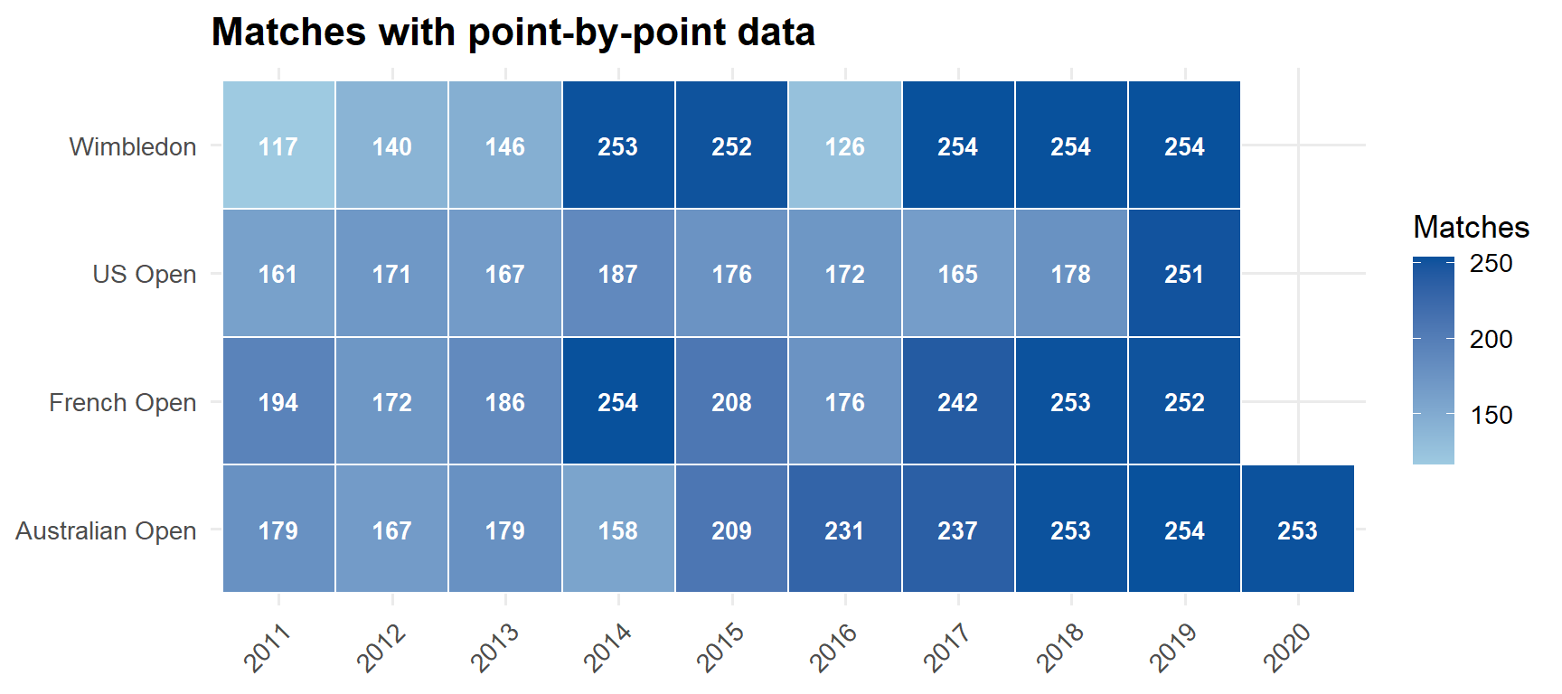
Point-by-point data from Jeff Sackmann’s Grand Slam repository. Covers matches on courts with the Hawkeye tracking system — typically from the second week onward plus select early-round showcourts. Australian Open runs 2011–2020; the other three slams run 2011–2019.
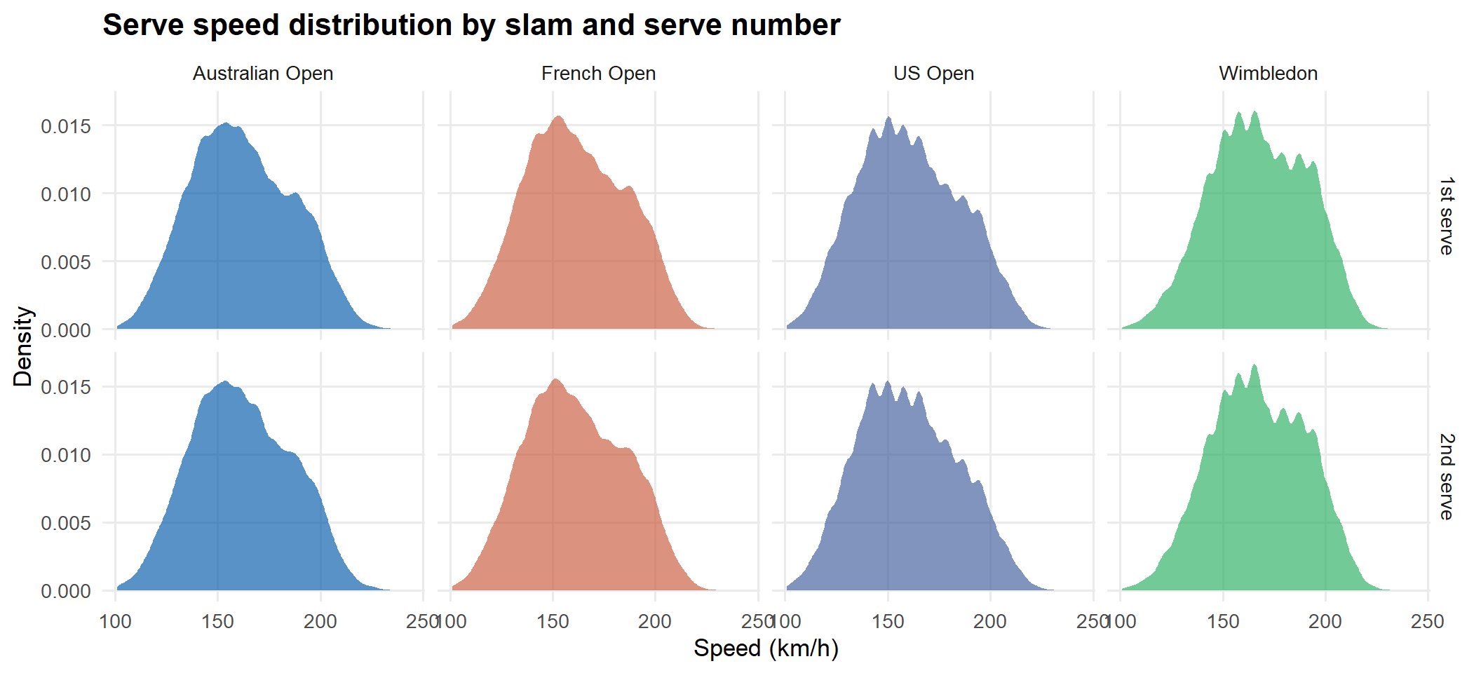
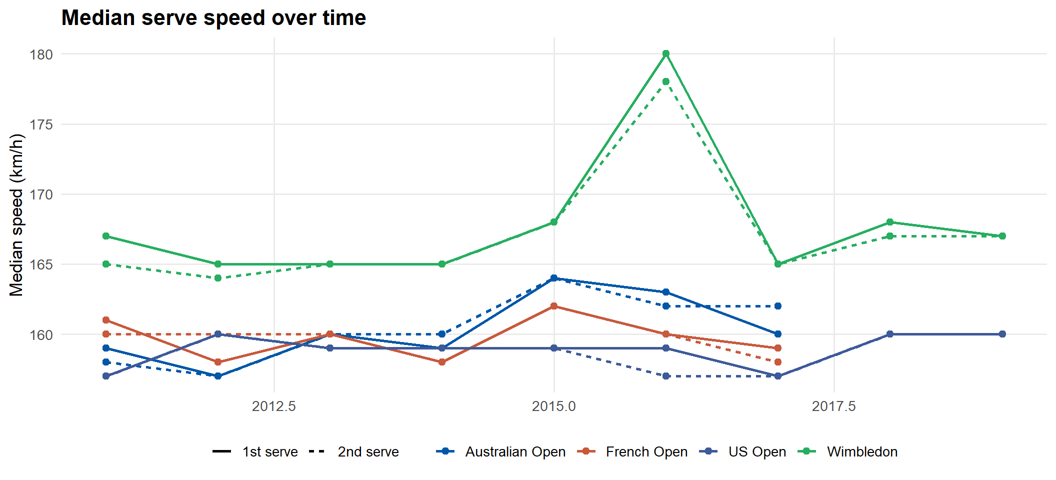
First serves are substantially faster than second serves at every slam. Hard-court slams (AO, USO) tend to produce slightly higher serve speeds than clay or grass.
Code
speed_df <- pts |>filter(!is.na(Speed_KMH), Speed_KMH >100, Speed_KMH <260, ServeIndicator %in%c("1", "2")) |>mutate(serve =if_else(ServeIndicator =="1", "1st serve", "2nd serve"),slam_label = slam_labels[slam] )if (nrow(speed_df) >0) { speed_df |>ggplot(aes(Speed_KMH, fill = slam)) +geom_density(alpha =0.65, colour =NA) +scale_fill_manual(values = slam_cols, labels = slam_labels) +facet_grid(serve ~ slam_label) +labs(title ="Serve speed distribution by slam and serve number",x ="Speed (km/h)", y ="Density", fill =NULL ) +theme(legend.position ="none")}
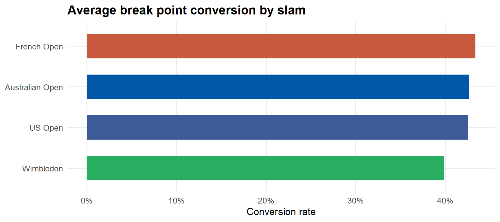
if (nrow(bp_data) >0) { bp_data |>group_by(slam, slam_label) |>summarise(avg_conversion =mean(conversion), .groups ="drop") |>mutate(slam_label =fct_reorder(slam_label, avg_conversion)) |>ggplot(aes(avg_conversion, slam_label, fill = slam)) +geom_col(width =0.6) +scale_fill_manual(values = slam_cols) +scale_x_continuous(labels = percent) +labs(title ="Average break point conversion by slam", x ="Conversion rate", y =NULL) +theme(legend.position ="none")}
Distance run: winners vs losers
Do match winners consistently run more or less than their opponents? Distance run data reflects how much each player was pushed around the court.
Code
# winner column in matches may be a player name or "1"/"2" — try bothmatches_winner <- matches_raw |>mutate(winner_int =suppressWarnings(as.integer(winner))) |>filter(!is.na(winner_int)) |>select(match_id, winner_int)dist_data <- pts |>filter(!is.na(P1DistanceRun), !is.na(P2DistanceRun), P1DistanceRun >0, P2DistanceRun >0) |>inner_join(matches_winner, by ="match_id") |>mutate(winner_dist =if_else(winner_int ==1L, P1DistanceRun, P2DistanceRun),loser_dist =if_else(winner_int ==1L, P2DistanceRun, P1DistanceRun) ) |>group_by(match_id, slam, year) |>summarise(winner_total =sum(winner_dist, na.rm =TRUE),loser_total =sum(loser_dist, na.rm =TRUE),.groups ="drop" ) |>filter(winner_total >0, loser_total >0) |>mutate(diff = winner_total - loser_total,slam_label = slam_labels[slam] )if (nrow(dist_data) >0) { dist_data |>pivot_longer(c(winner_total, loser_total), names_to ="result", values_to ="dist") |>mutate(result =if_else(result =="winner_total", "Match winner", "Match loser")) |>ggplot(aes(dist /1000, fill = result)) +geom_density(alpha =0.6, colour =NA) +scale_fill_manual(values =c("Match winner"="#27AE60", "Match loser"="#CB4335")) +scale_x_continuous(labels = \(x) paste0(x, "k")) +facet_wrap(~slam_label) +labs(title ="Total distance run per match: winners vs losers",subtitle ="Metres run by winner and loser across tracked matches",x ="Distance run (metres, thousands)", y ="Density", fill =NULL ) |>print()} else {message("Distance run data not available in this dataset.")}
Code
if (nrow(dist_data) >0) { dist_data |>ggplot(aes(diff, fill = slam)) +geom_vline(xintercept =0, linetype ="dashed", colour ="grey50") +geom_density(alpha =0.65, colour =NA) +scale_fill_manual(values = slam_cols, labels = slam_labels) +labs(title ="Winner's distance advantage per match",subtitle ="Positive = winner ran more; negative = winner ran less",x ="Winner metres − Loser metres", y ="Density", fill =NULL )}
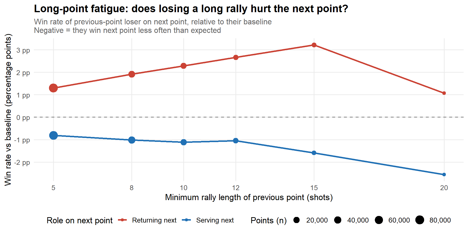
After a long point: does the loser fade?
When a rally goes long, one player wins and one loses. Does the losing player carry any fatigue into the next point — or do elite players reset completely?
The test: for every point following a rally of length ≥ threshold, compute the win rate of the player who lost the previous long point, split by whether they are serving or returning. Compare against their overall win rate in that role.
Code
if (nrow(fatigue_df) ==0) stop("No fatigue data available.")fatigue_df |>ggplot(aes(threshold, edge, colour = prev_loser_role)) +geom_hline(yintercept =0, linetype ="dashed", colour ="grey50") +geom_line(linewidth =1.1) +geom_point(aes(size = n)) +scale_colour_manual(values =c("Serving next"="#2171B5", "Returning next"="#CB4335")) +scale_size_continuous(range =c(2, 6), labels = comma) +scale_x_continuous(breaks = thresholds) +scale_y_continuous(labels = \(x) paste0(round(x *100, 1), " pp")) +labs(title ="Long-point fatigue: does losing a long rally hurt the next point?",subtitle ="Win rate of previous-point loser on next point, relative to their baseline\nNegative = they win next point less often than expected",x ="Minimum rally length of previous point (shots)",y ="Win rate vs baseline (percentage points)",colour ="Role on next point",size ="Points (n)" )
Code
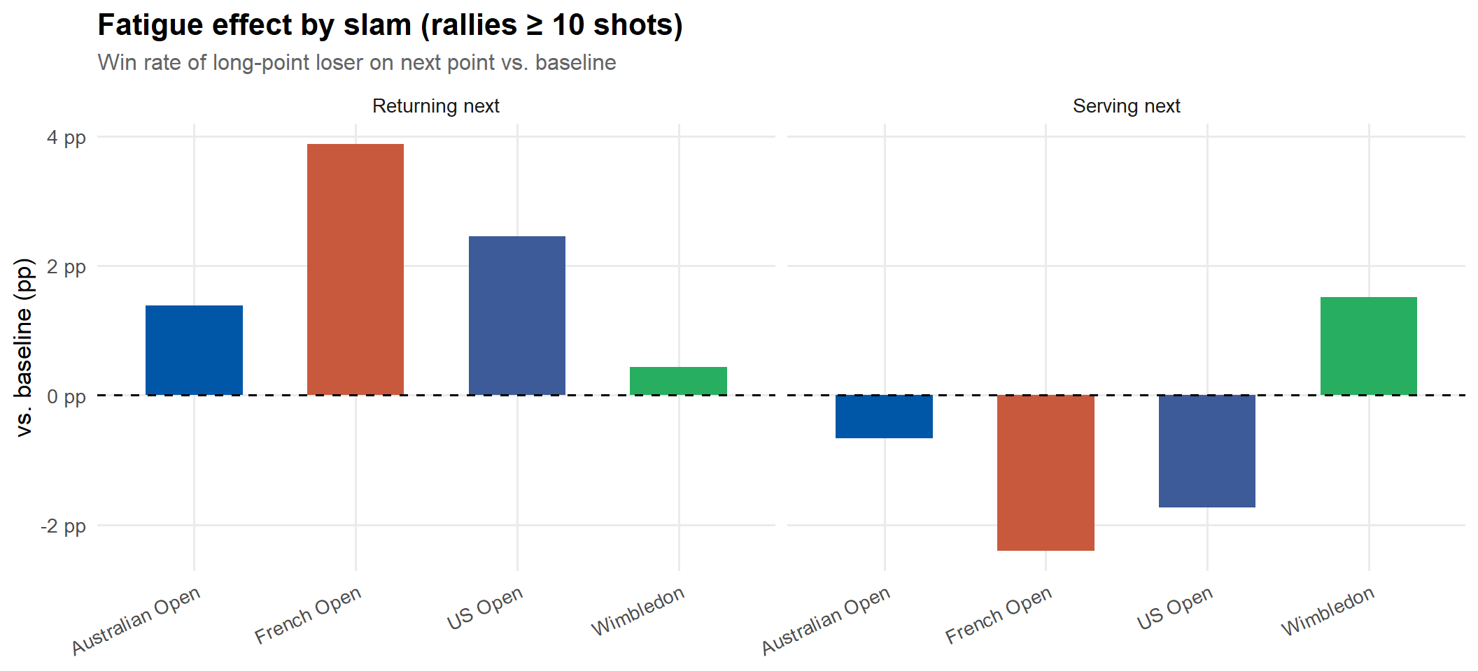
thr_main <-10# focus on rallies of 10+ shotspts_lagged |>filter(prev_rally >= thr_main) |>group_by(slam, prev_loser_role) |>summarise(win_rate =mean(loser_won_next, na.rm =TRUE),n =n(),.groups ="drop" ) |>left_join(baseline, by ="prev_loser_role") |>mutate(edge = win_rate - baseline_win,slam_label = slam_labels[slam] ) |>ggplot(aes(slam_label, edge, fill = slam)) +geom_col(width =0.6) +geom_hline(yintercept =0, linetype ="dashed") +scale_fill_manual(values = slam_cols) +scale_y_continuous(labels = \(x) paste0(round(x *100, 1), " pp")) +facet_wrap(~prev_loser_role) +labs(title ="Fatigue effect by slam (rallies ≥ 10 shots)",subtitle ="Win rate of long-point loser on next point vs. baseline",x =NULL, y ="vs. baseline (pp)", fill =NULL ) +theme(legend.position ="none", axis.text.x =element_text(angle =25, hjust =1))
Win rate of previous-point loser on the immediately following point
Min rally
Role
Win rate (next point)
Baseline win rate
Difference
N
5
Returning next
38.8%
37.5%
1.3 pp
82,993
5
Serving next
59.7%
60.5%
-0.81 pp
71,015
10
Returning next
39.8%
37.5%
2.28 pp
17,020
10
Serving next
59.4%
60.5%
-1.12 pp
21,661
15
Returning next
40.7%
37.5%
3.22 pp
5,490
15
Serving next
58.9%
60.5%
-1.59 pp
4,401
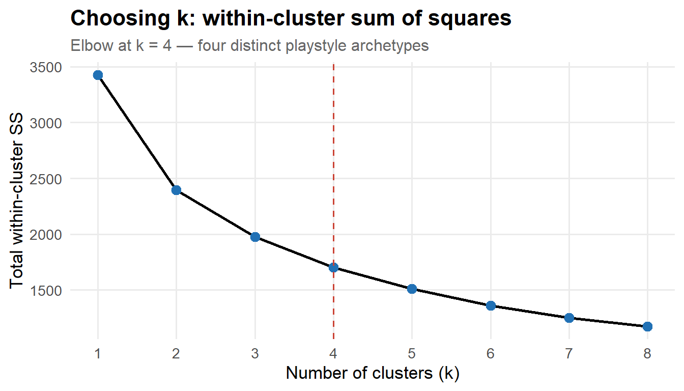
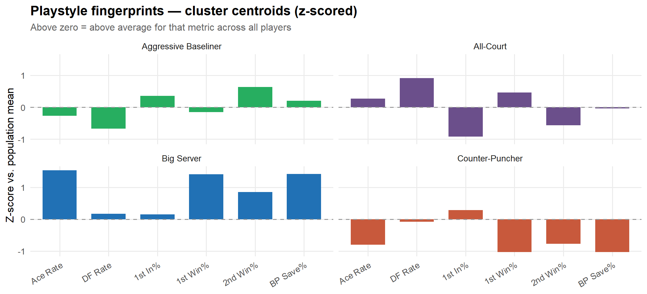
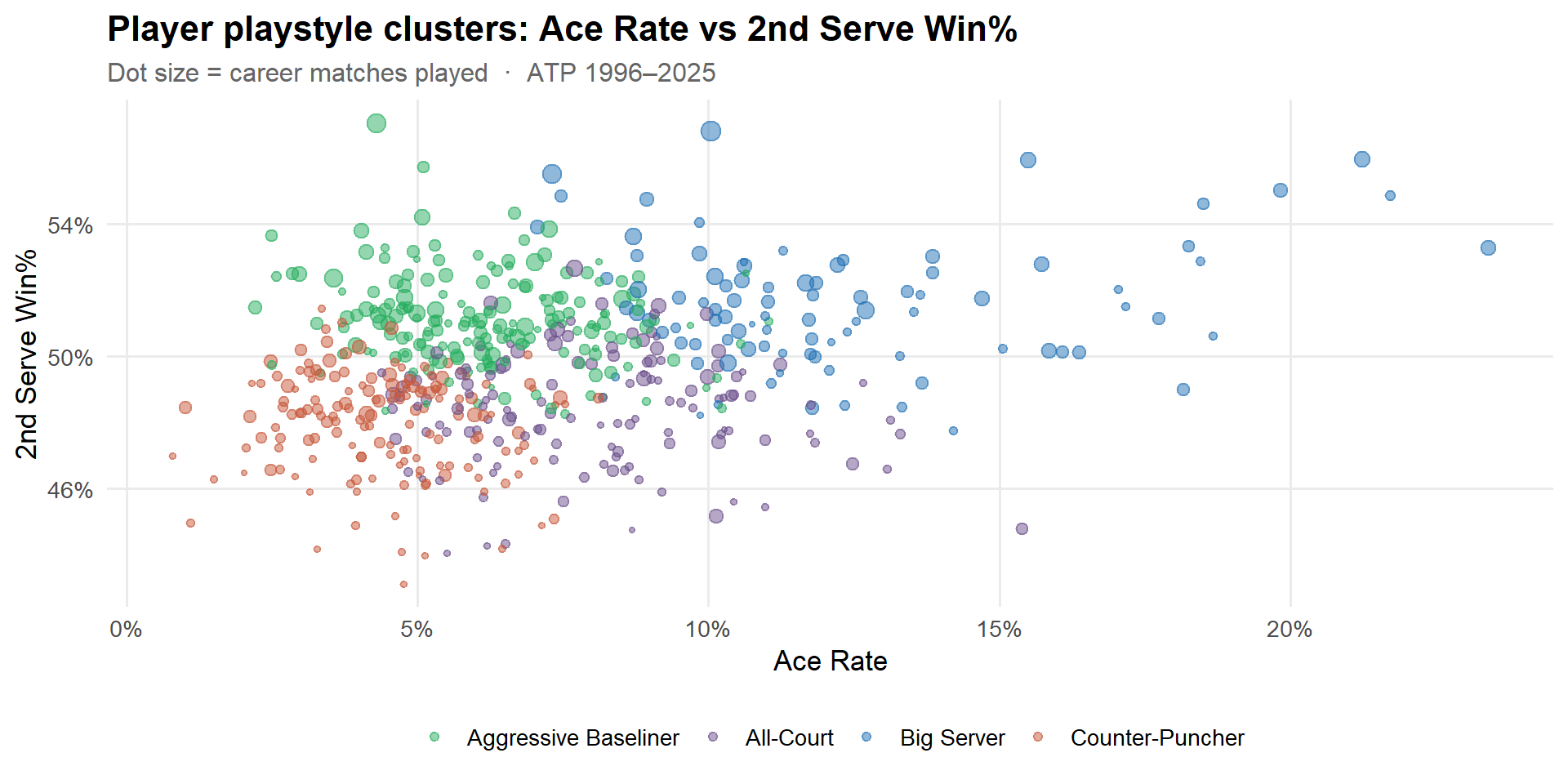
Playstyle Clusters — Last 30 Years
Every player has a statistical “recipe” — the blend of serving aggression, consistency, and defensive resilience that defines how they win matches. K-means clustering on six serve-and-match metrics groups ATP players (1996–2025, ≥ 50 matches) into four distinct archetypes.
Features:
Metric
What it captures
Ace rate
Serving firepower
Double-fault rate
Serve risk tolerance
1st serve in %
Serve consistency
1st serve win %
Dominance when 1st serve lands
2nd serve win %
Baseline / net quality under pressure
BP save rate
Clutch performance defending break points
Code
wss_df |>ggplot(aes(k, wss)) +geom_line(linewidth =1) +geom_point(size =3, colour ="#2171B5") +geom_vline(xintercept =4, linetype ="dashed", colour ="#CB4335", linewidth =0.7) +scale_x_continuous(breaks =1:8) +labs(title ="Choosing k: within-cluster sum of squares",subtitle ="Elbow at k = 4 — four distinct playstyle archetypes",x ="Number of clusters (k)", y ="Total within-cluster SS" )
Code
centroids |>left_join(style_map, by ="cluster") |>pivot_longer(all_of(feat_cols), names_to ="feature", values_to ="z") |>mutate(feature =factor(feat_labels[feature], levels = feat_labels)) |>ggplot(aes(feature, z, fill = style)) +geom_col(width =0.7) +geom_hline(yintercept =0, linetype ="dashed", colour ="grey60") +scale_fill_manual(values = cluster_cols) +facet_wrap(~style, nrow =2) +labs(title ="Playstyle fingerprints — cluster centroids (z-scored)",subtitle ="Above zero = above average for that metric across all players",x =NULL, y ="Z-score vs. population mean", fill =NULL ) +theme(legend.position ="none",axis.text.x =element_text(angle =30, hjust =1))