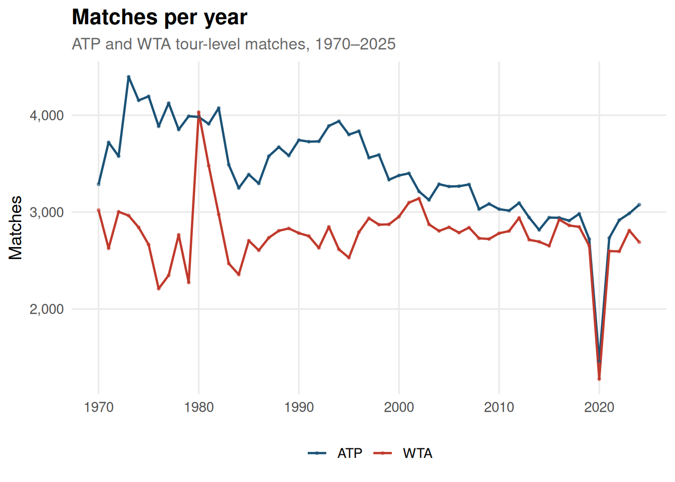
The ATP has consistently staged more tour-level matches than the WTA, though both tours expanded rapidly through the 1970s and early 1980s before stabilising.
Code
matches |>filter(!is.na(year), year >=1970, year <=2025) |>count(year, tour) |>ggplot(aes(year, n, colour = tour)) +geom_line(linewidth =0.8) +geom_point(size =0.6, alpha =0.5) +scale_colour_manual(values = tour_cols) +scale_y_continuous(labels = comma) +labs(title ="Matches per year",subtitle ="ATP and WTA tour-level matches, 1970\u20132025",x =NULL, y ="Matches", colour =NULL )
Total matches played per year by tour
Surface distribution over time
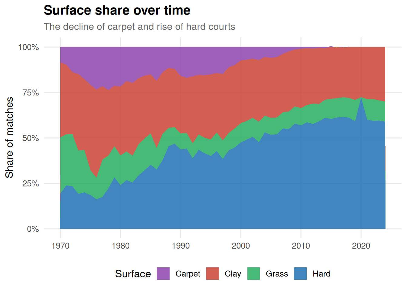
The decline of carpet courts and the ascent of hard courts is one of the most visible structural changes in professional tennis. Clay has held remarkably steady as a share of total matches.
Code
matches |>filter(!is.na(surface), !is.na(year), year >=1970, year <=2025) |>count(year, surface) |>group_by(year) |>mutate(pct = n /sum(n)) |>ungroup() |>ggplot(aes(year, pct, fill = surface)) +geom_area(alpha =0.85) +scale_fill_manual(values = surface_cols) +scale_y_continuous(labels = percent) +labs(title ="Surface share over time",subtitle ="The decline of carpet and rise of hard courts",x =NULL, y ="Share of matches", fill ="Surface" )
Share of matches by surface type over time
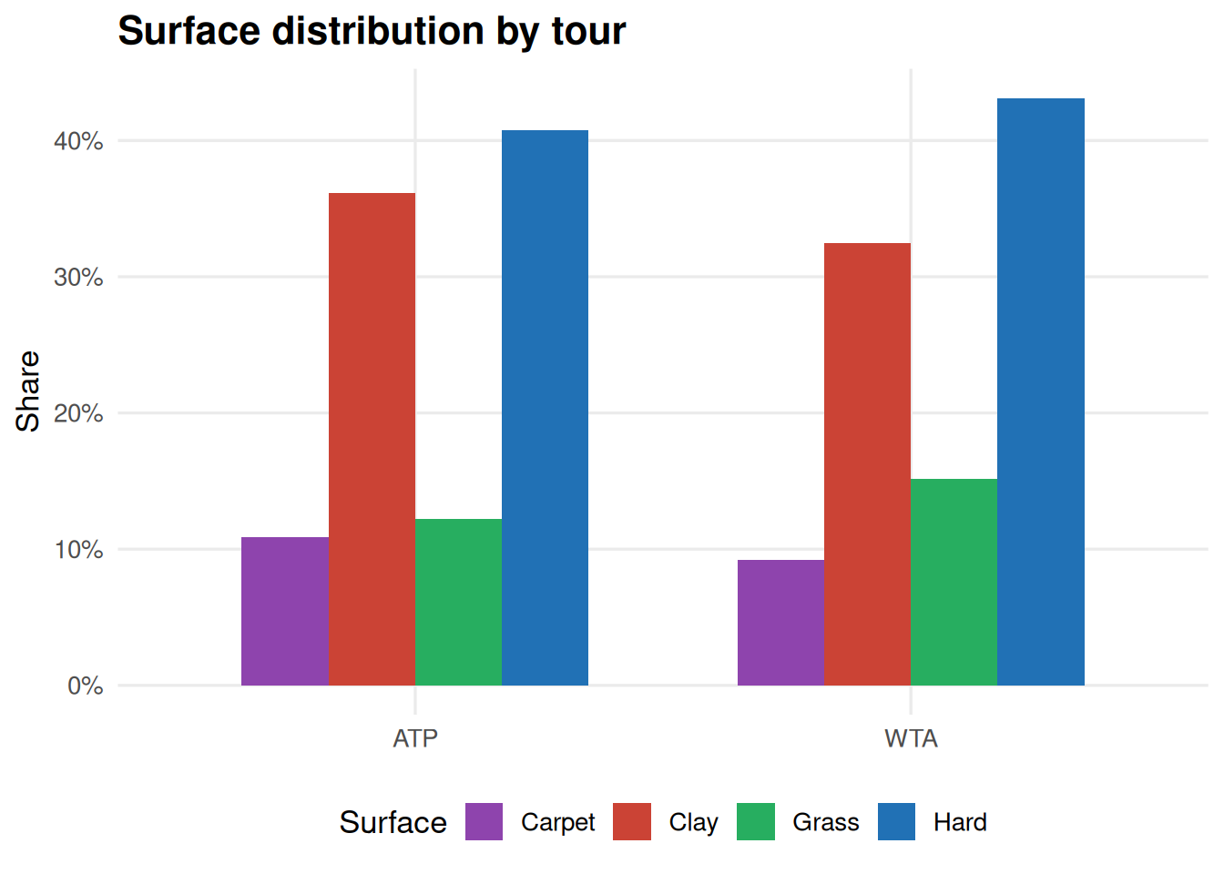
Surface breakdown by tour
Code
matches |>filter(!is.na(surface)) |>count(tour, surface) |>group_by(tour) |>mutate(pct = n /sum(n)) |>ungroup() |>ggplot(aes(tour, pct, fill = surface)) +geom_col(position ="dodge", width =0.7) +scale_fill_manual(values = surface_cols) +scale_y_continuous(labels = percent) +labs(title ="Surface distribution by tour", x =NULL, y ="Share", fill ="Surface")
Surface distribution split by tour
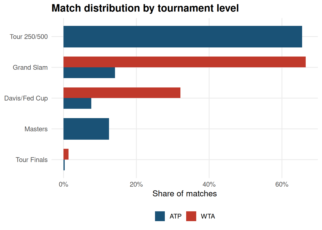
Tournament levels
Code
matches |>filter(!is.na(tourney_level), tourney_level %in%c("Grand Slam", "Masters", "Tour 250/500","Tour Finals", "Davis/Fed Cup")) |>count(tour, tourney_level) |>group_by(tour) |>mutate(pct = n /sum(n)) |>ungroup() |>ggplot(aes(reorder(tourney_level, pct), pct, fill = tour)) +geom_col(position ="dodge", width =0.7) +scale_fill_manual(values = tour_cols) +scale_y_continuous(labels = percent) +coord_flip() +labs(title ="Match distribution by tournament level",x =NULL, y ="Share of matches", fill =NULL )
Match distribution by tournament level
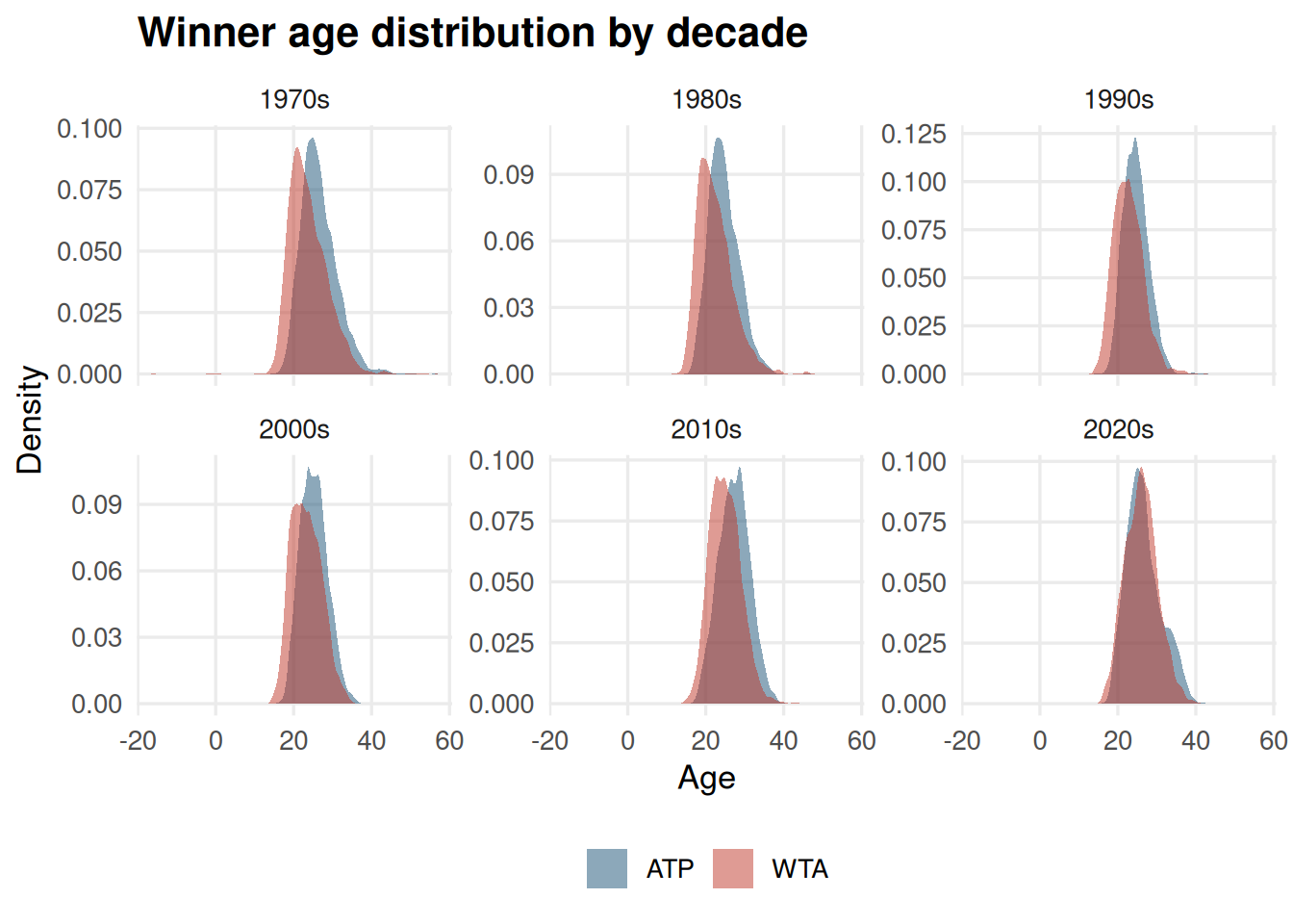
Age distribution of winners
The peak winning age has shifted upward over the decades, particularly on the men’s side, reflecting improved fitness, sports science, and longer career spans at the top.
Code
matches |>filter(!is.na(winner_age), !is.na(year), year >=1970) |>mutate(decade =paste0(10* (year %/%10), "s")) |>ggplot(aes(winner_age, fill = tour)) +geom_density(alpha =0.5, colour =NA) +scale_fill_manual(values = tour_cols) +facet_wrap(~decade, scales ="free_y") +labs(title ="Winner age distribution by decade",x ="Age", y ="Density", fill =NULL )
Winner age density across decades
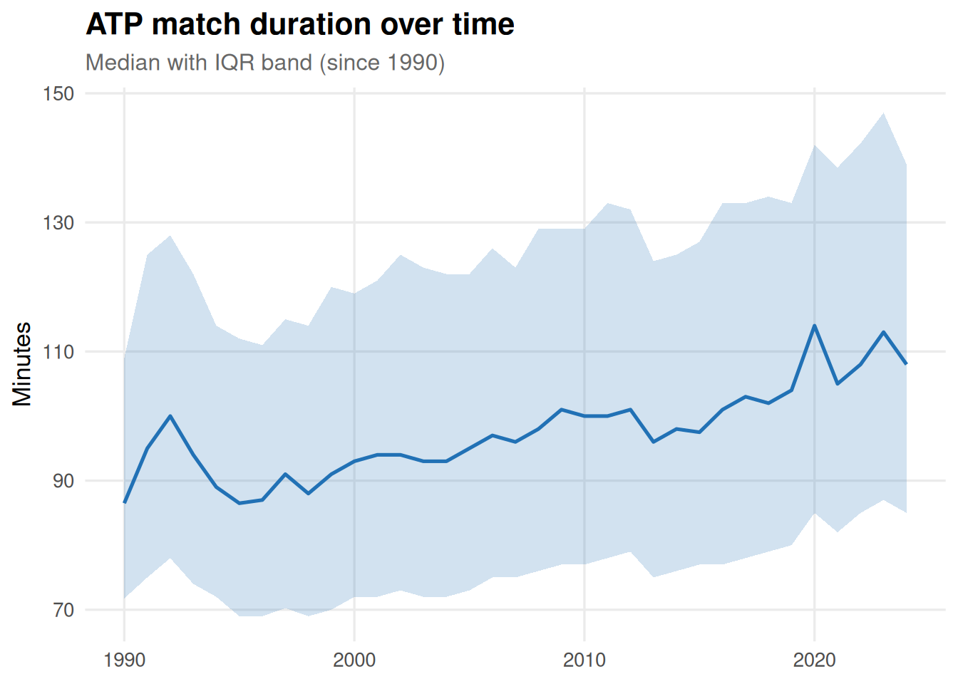
Match duration
Duration data becomes reliable from around 1990. The IQR band shows match lengths have been remarkably stable on the ATP tour, with a slight upward drift in median duration through the 2010s.
Code
atp |>filter(!is.na(minutes), !is.na(year), minutes >0, minutes <600, year >=1990) |>group_by(year) |>summarise(median_min =median(minutes),q25 =quantile(minutes, 0.25),q75 =quantile(minutes, 0.75),.groups ="drop" ) |>ggplot(aes(year, median_min)) +geom_ribbon(aes(ymin = q25, ymax = q75), fill ="#2171B5", alpha =0.2) +geom_line(colour ="#2171B5", linewidth =0.9) +labs(title ="ATP match duration over time",subtitle ="Median with IQR band (since 1990)",x =NULL, y ="Minutes" )
ATP match duration: median with IQR band
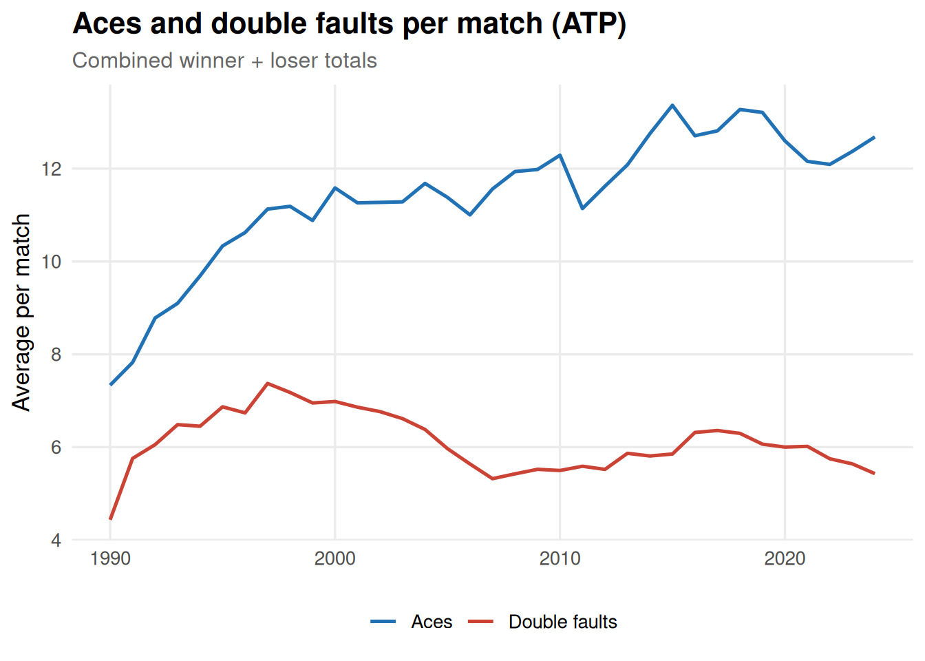
Aces and double faults
Ace counts have trended upward over time, consistent with the increasing emphasis on serve speed and the shift toward hard courts.
Code
atp |>filter(!is.na(w_ace), !is.na(w_df), !is.na(year), year >=1990) |>mutate(total_aces = w_ace + l_ace, total_df = w_df + l_df) |>group_by(year) |>summarise(avg_aces =mean(total_aces, na.rm =TRUE),avg_df =mean(total_df, na.rm =TRUE),.groups ="drop" ) |>pivot_longer(c(avg_aces, avg_df), names_to ="stat", values_to ="value") |>mutate(stat =if_else(stat =="avg_aces", "Aces", "Double faults")) |>ggplot(aes(year, value, colour = stat)) +geom_line(linewidth =0.9) +scale_colour_manual(values =c("Aces"="#2171B5", "Double faults"="#CB4335")) +labs(title ="Aces and double faults per match (ATP)",subtitle ="Combined winner + loser totals",x =NULL, y ="Average per match", colour =NULL )
Average aces and double faults per match (ATP)
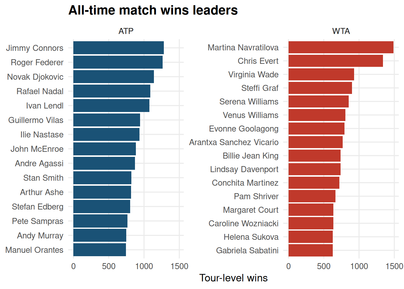
All-time match wins leaders
Code
top_n_wins <-function(df, tour_name, n =15) { df |>count(winner_name, name ="wins") |>slice_max(wins, n = n) |>mutate(tour = tour_name)}bind_rows(top_n_wins(atp, "ATP"),top_n_wins(wta, "WTA")) |>mutate(winner_name =fct_reorder(winner_name, wins)) |>ggplot(aes(wins, winner_name, fill = tour)) +geom_col() +scale_fill_manual(values = tour_cols) +facet_wrap(~tour, scales ="free_y") +labs(title ="All-time match wins leaders", x ="Tour-level wins", y =NULL) +theme(legend.position ="none")
Top 15 match wins leaders (ATP and WTA)
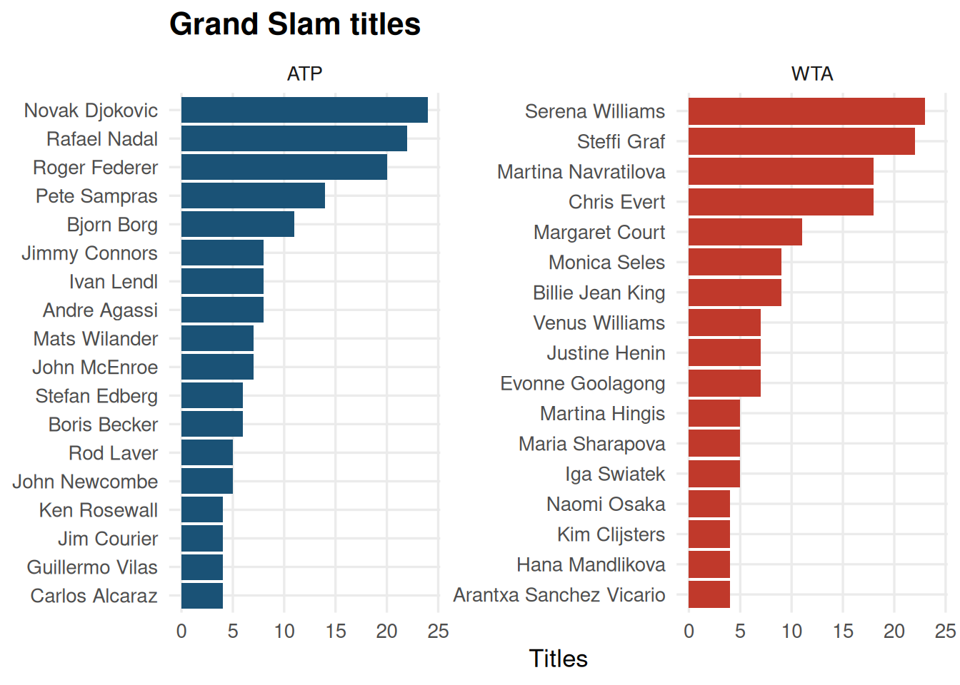
Grand Slam titles
Code
slam_titles <-function(df, tour_name, n =15) { df |>filter(tourney_level =="Grand Slam", round =="F") |>count(winner_name, name ="titles") |>slice_max(titles, n = n) |>mutate(tour = tour_name)}bind_rows(slam_titles(atp, "ATP"),slam_titles(wta, "WTA")) |>mutate(winner_name =fct_reorder(winner_name, titles)) |>ggplot(aes(titles, winner_name, fill = tour)) +geom_col() +scale_fill_manual(values = tour_cols) +facet_wrap(~tour, scales ="free_y") +labs(title ="Grand Slam titles", x ="Titles", y =NULL) +theme(legend.position ="none")
Grand Slam titles (top 15 per tour)
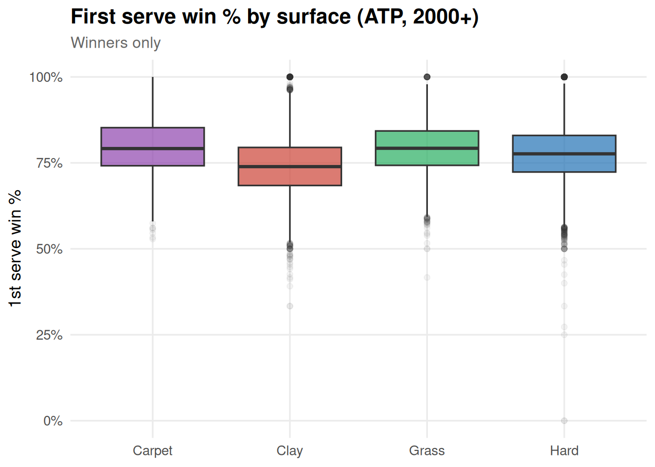
First serve win % by surface
Grass courts show the highest first serve win percentage, reflecting the low bounce and faster pace. Clay is the lowest, where rallies are longer and returns more effective.
Code
atp |>filter(!is.na(w_1stWon), !is.na(w_1stIn), !is.na(surface), w_1stIn >0, year >=2000) |>mutate(first_serve_pct = w_1stWon / w_1stIn) |>ggplot(aes(surface, first_serve_pct, fill = surface)) +geom_boxplot(alpha =0.7, outlier.alpha =0.05) +scale_fill_manual(values = surface_cols) +scale_y_continuous(labels = percent) +labs(title ="First serve win % by surface (ATP, 2000+)",subtitle ="Winners only",x =NULL, y ="1st serve win %" ) +theme(legend.position ="none")
First serve win % by surface (ATP, 2000+)
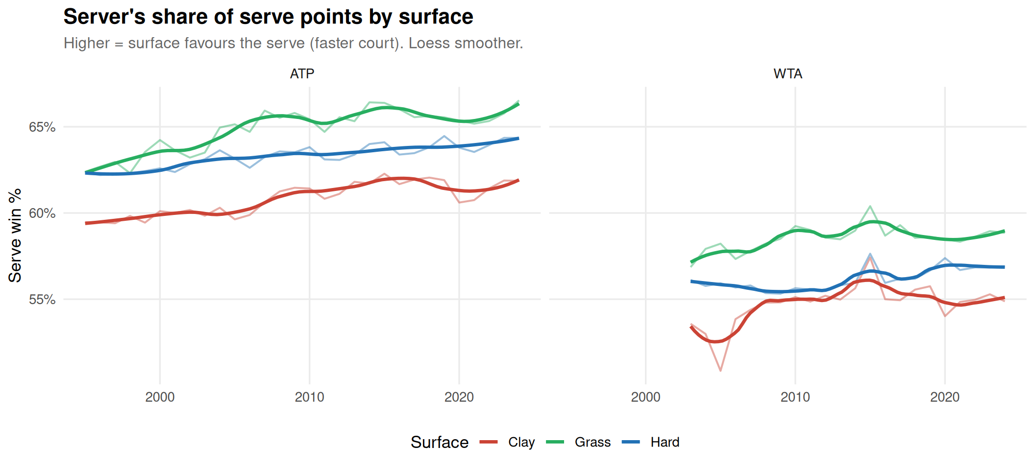
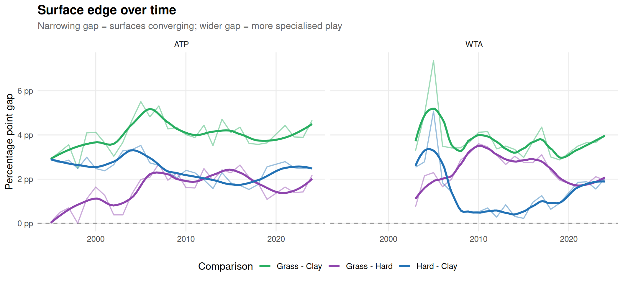
Surface edge over time
Has professional tennis become more or less surface-neutral over the past 30 years? The “surface edge” is measured as the server’s share of all serve points played — a high value means big serves dominate (fast surface); a low value means returns and rallies rule (slow surface). The gap between Grass and Clay is the best single indicator of how differentiated the three main surfaces are.
Server’s share of serve points by surface (1995–2025)
Code
gap_cols <-c("Grass - Clay"="#27AE60","Hard - Clay"="#2171B5","Grass - Hard"="#8E44AD")gap_df |>ggplot(aes(year, pct_pts, colour = gap)) +geom_hline(yintercept =0, linetype ="dashed", colour ="grey60") +geom_line(linewidth =0.7, alpha =0.45) +geom_smooth(method ="loess", span =0.4, se =FALSE, linewidth =1.2) +scale_colour_manual(values = gap_cols) +scale_y_continuous(labels = \(x) paste0(round(x *100, 1), " pp")) +facet_wrap(~tour) +labs(title ="Surface edge over time",subtitle ="Narrowing gap = surfaces converging; wider gap = more specialised play",x =NULL, y ="Percentage point gap", colour ="Comparison" )
Surface edge: gap in serve dominance between surfaces (1995–2025)
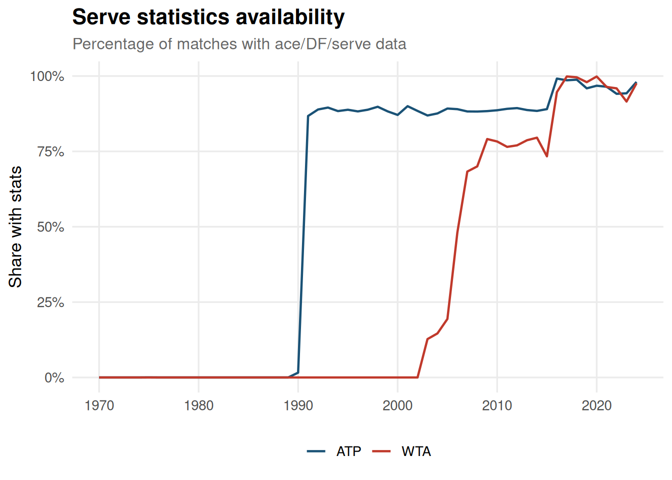
Data completeness
Serve statistics are only consistently recorded from the early 1990s onward. This is worth keeping in mind when doing any time-series analysis involving ace counts, break points, or serve percentages.
Code
matches |>filter(!is.na(year), year >=1970, year <=2025) |>mutate(has_serve_stats =!is.na(w_ace)) |>group_by(year, tour) |>summarise(pct_complete =mean(has_serve_stats), .groups ="drop") |>ggplot(aes(year, pct_complete, colour = tour)) +geom_line(linewidth =0.8) +scale_colour_manual(values = tour_cols) +scale_y_continuous(labels = percent) +labs(title ="Serve statistics availability",subtitle ="Percentage of matches with ace/DF/serve data",x =NULL, y ="Share with stats", colour =NULL )
Share of matches with serve statistics recorded
Source Code
---title: "ATP & WTA Match Data: Descriptive Overview"description: "Surface trends, serve statistics, age distributions, and all-time leaders across 55+ years of professional tennis"date: "2026-03-10"categories: [Tennis, R, Data Analysis]execute: warning: false message: false freeze: auto---```{r setup}library(tidyverse)library(scales)library(gt)theme_set( theme_minimal(base_size = 13) + theme( plot.title = element_text(face = "bold", size = 16), plot.subtitle = element_text(colour = "grey40", size = 12), panel.grid.minor = element_blank(), legend.position = "bottom" ))surface_cols <- c( "Hard" = "#2171B5", "Clay" = "#CB4335", "Grass" = "#27AE60", "Carpet" = "#8E44AD")tour_cols <- c("ATP" = "#1A5276", "WTA" = "#C0392B")```## DataThe data comes from [Jeff Sackmann's GitHub repositories](https://github.com/JeffSackmann), which contain match-by-match results for every ATP and WTA tour-level match since 1968.```{r download-and-load}data_dir <- here::here("data-projects", "data")dir.create(data_dir, showWarnings = FALSE, recursive = TRUE)download_tour <- function(tour_prefix, base_url, years = 1968:2025) { cache_file <- file.path(data_dir, paste0(tour_prefix, "_matches.csv")) if (file.exists(cache_file)) { return(read_csv(cache_file, show_col_types = FALSE)) } df <- map_dfr(paste0(tour_prefix, "_matches_", years, ".csv"), \(f) { tryCatch( read_csv(paste0(base_url, f), show_col_types = FALSE, col_types = cols(.default = "c")), error = \(e) tibble() ) }) write_csv(df, cache_file) df}atp_raw <- download_tour( "atp", "https://raw.githubusercontent.com/JeffSackmann/tennis_atp/master/")wta_raw <- download_tour( "wta", "https://raw.githubusercontent.com/JeffSackmann/tennis_wta/master/")``````{r clean-data}clean_matches <- function(df, tour) { df |> mutate( tour = tour, tourney_date = as.Date(as.character(tourney_date), format = "%Y%m%d"), year = year(tourney_date), surface = str_to_title(surface), surface = if_else(surface %in% c("Hard", "Clay", "Grass", "Carpet"), surface, NA_character_), winner_age = as.numeric(winner_age), loser_age = as.numeric(loser_age), w_ace = as.numeric(w_ace), l_ace = as.numeric(l_ace), w_df = as.numeric(w_df), l_df = as.numeric(l_df), w_svpt = as.numeric(w_svpt), l_svpt = as.numeric(l_svpt), w_1stIn = as.numeric(w_1stIn), l_1stIn = as.numeric(l_1stIn), w_1stWon = as.numeric(w_1stWon), l_1stWon = as.numeric(l_1stWon), w_2ndWon = as.numeric(w_2ndWon), l_2ndWon = as.numeric(l_2ndWon), w_bpSaved = as.numeric(w_bpSaved), l_bpSaved = as.numeric(l_bpSaved), w_bpFaced = as.numeric(w_bpFaced), l_bpFaced = as.numeric(l_bpFaced), minutes = as.numeric(minutes), tourney_level = case_when( tourney_level == "G" ~ "Grand Slam", tourney_level == "M" ~ "Masters", tourney_level == "A" ~ "Tour 250/500", tourney_level == "F" ~ "Tour Finals", tourney_level == "D" ~ "Davis/Fed Cup", TRUE ~ tourney_level ) )}atp <- clean_matches(atp_raw, "ATP")wta <- clean_matches(wta_raw, "WTA")matches <- bind_rows(atp, wta)```## Overview```{r overview-table}matches |> group_by(tour) |> summarise( `Total matches` = comma(n()), `Year range` = paste(min(year, na.rm = TRUE), "\u2013", max(year, na.rm = TRUE)), `Unique winners` = comma(n_distinct(winner_name)), `Unique tournaments` = comma(n_distinct(tourney_name)), `Median duration (min)` = round(median(minutes, na.rm = TRUE), 0), .groups = "drop" ) |> gt() |> tab_header(title = "Dataset overview") |> cols_label(tour = "Tour")```## Matches per yearThe ATP has consistently staged more tour-level matches than the WTA, though both tours expanded rapidly through the 1970s and early 1980s before stabilising.```{r matches-per-year}#| fig-cap: "Total matches played per year by tour"matches |> filter(!is.na(year), year >= 1970, year <= 2025) |> count(year, tour) |> ggplot(aes(year, n, colour = tour)) + geom_line(linewidth = 0.8) + geom_point(size = 0.6, alpha = 0.5) + scale_colour_manual(values = tour_cols) + scale_y_continuous(labels = comma) + labs( title = "Matches per year", subtitle = "ATP and WTA tour-level matches, 1970\u20132025", x = NULL, y = "Matches", colour = NULL )```## Surface distribution over timeThe decline of carpet courts and the ascent of hard courts is one of the most visible structural changes in professional tennis. Clay has held remarkably steady as a share of total matches.```{r surface-dist}#| fig-cap: "Share of matches by surface type over time"matches |> filter(!is.na(surface), !is.na(year), year >= 1970, year <= 2025) |> count(year, surface) |> group_by(year) |> mutate(pct = n / sum(n)) |> ungroup() |> ggplot(aes(year, pct, fill = surface)) + geom_area(alpha = 0.85) + scale_fill_manual(values = surface_cols) + scale_y_continuous(labels = percent) + labs( title = "Surface share over time", subtitle = "The decline of carpet and rise of hard courts", x = NULL, y = "Share of matches", fill = "Surface" )```## Surface breakdown by tour```{r surface-tour}#| fig-cap: "Surface distribution split by tour"matches |> filter(!is.na(surface)) |> count(tour, surface) |> group_by(tour) |> mutate(pct = n / sum(n)) |> ungroup() |> ggplot(aes(tour, pct, fill = surface)) + geom_col(position = "dodge", width = 0.7) + scale_fill_manual(values = surface_cols) + scale_y_continuous(labels = percent) + labs(title = "Surface distribution by tour", x = NULL, y = "Share", fill = "Surface")```## Tournament levels```{r tourney-levels}#| fig-cap: "Match distribution by tournament level"matches |> filter(!is.na(tourney_level), tourney_level %in% c("Grand Slam", "Masters", "Tour 250/500", "Tour Finals", "Davis/Fed Cup")) |> count(tour, tourney_level) |> group_by(tour) |> mutate(pct = n / sum(n)) |> ungroup() |> ggplot(aes(reorder(tourney_level, pct), pct, fill = tour)) + geom_col(position = "dodge", width = 0.7) + scale_fill_manual(values = tour_cols) + scale_y_continuous(labels = percent) + coord_flip() + labs( title = "Match distribution by tournament level", x = NULL, y = "Share of matches", fill = NULL )```## Age distribution of winnersThe peak winning age has shifted upward over the decades, particularly on the men's side, reflecting improved fitness, sports science, and longer career spans at the top.```{r age-dist}#| fig-cap: "Winner age density across decades"matches |> filter(!is.na(winner_age), !is.na(year), year >= 1970) |> mutate(decade = paste0(10 * (year %/% 10), "s")) |> ggplot(aes(winner_age, fill = tour)) + geom_density(alpha = 0.5, colour = NA) + scale_fill_manual(values = tour_cols) + facet_wrap(~decade, scales = "free_y") + labs( title = "Winner age distribution by decade", x = "Age", y = "Density", fill = NULL )```## Match durationDuration data becomes reliable from around 1990. The IQR band shows match lengths have been remarkably stable on the ATP tour, with a slight upward drift in median duration through the 2010s.```{r duration}#| fig-cap: "ATP match duration: median with IQR band"atp |> filter(!is.na(minutes), !is.na(year), minutes > 0, minutes < 600, year >= 1990) |> group_by(year) |> summarise( median_min = median(minutes), q25 = quantile(minutes, 0.25), q75 = quantile(minutes, 0.75), .groups = "drop" ) |> ggplot(aes(year, median_min)) + geom_ribbon(aes(ymin = q25, ymax = q75), fill = "#2171B5", alpha = 0.2) + geom_line(colour = "#2171B5", linewidth = 0.9) + labs( title = "ATP match duration over time", subtitle = "Median with IQR band (since 1990)", x = NULL, y = "Minutes" )```## Aces and double faultsAce counts have trended upward over time, consistent with the increasing emphasis on serve speed and the shift toward hard courts.```{r aces-df}#| fig-cap: "Average aces and double faults per match (ATP)"atp |> filter(!is.na(w_ace), !is.na(w_df), !is.na(year), year >= 1990) |> mutate(total_aces = w_ace + l_ace, total_df = w_df + l_df) |> group_by(year) |> summarise( avg_aces = mean(total_aces, na.rm = TRUE), avg_df = mean(total_df, na.rm = TRUE), .groups = "drop" ) |> pivot_longer(c(avg_aces, avg_df), names_to = "stat", values_to = "value") |> mutate(stat = if_else(stat == "avg_aces", "Aces", "Double faults")) |> ggplot(aes(year, value, colour = stat)) + geom_line(linewidth = 0.9) + scale_colour_manual(values = c("Aces" = "#2171B5", "Double faults" = "#CB4335")) + labs( title = "Aces and double faults per match (ATP)", subtitle = "Combined winner + loser totals", x = NULL, y = "Average per match", colour = NULL )```## All-time match wins leaders```{r top-winners}#| fig-cap: "Top 15 match wins leaders (ATP and WTA)"top_n_wins <- function(df, tour_name, n = 15) { df |> count(winner_name, name = "wins") |> slice_max(wins, n = n) |> mutate(tour = tour_name)}bind_rows( top_n_wins(atp, "ATP"), top_n_wins(wta, "WTA")) |> mutate(winner_name = fct_reorder(winner_name, wins)) |> ggplot(aes(wins, winner_name, fill = tour)) + geom_col() + scale_fill_manual(values = tour_cols) + facet_wrap(~tour, scales = "free_y") + labs(title = "All-time match wins leaders", x = "Tour-level wins", y = NULL) + theme(legend.position = "none")```## Grand Slam titles```{r slam-titles}#| fig-cap: "Grand Slam titles (top 15 per tour)"slam_titles <- function(df, tour_name, n = 15) { df |> filter(tourney_level == "Grand Slam", round == "F") |> count(winner_name, name = "titles") |> slice_max(titles, n = n) |> mutate(tour = tour_name)}bind_rows( slam_titles(atp, "ATP"), slam_titles(wta, "WTA")) |> mutate(winner_name = fct_reorder(winner_name, titles)) |> ggplot(aes(titles, winner_name, fill = tour)) + geom_col() + scale_fill_manual(values = tour_cols) + facet_wrap(~tour, scales = "free_y") + labs(title = "Grand Slam titles", x = "Titles", y = NULL) + theme(legend.position = "none")```## First serve win % by surfaceGrass courts show the highest first serve win percentage, reflecting the low bounce and faster pace. Clay is the lowest, where rallies are longer and returns more effective.```{r serve-surface}#| fig-cap: "First serve win % by surface (ATP, 2000+)"atp |> filter(!is.na(w_1stWon), !is.na(w_1stIn), !is.na(surface), w_1stIn > 0, year >= 2000) |> mutate(first_serve_pct = w_1stWon / w_1stIn) |> ggplot(aes(surface, first_serve_pct, fill = surface)) + geom_boxplot(alpha = 0.7, outlier.alpha = 0.05) + scale_fill_manual(values = surface_cols) + scale_y_continuous(labels = percent) + labs( title = "First serve win % by surface (ATP, 2000+)", subtitle = "Winners only", x = NULL, y = "1st serve win %" ) + theme(legend.position = "none")```## Surface edge over timeHas professional tennis become more or less surface-neutral over the past 30 years? The "surface edge" is measured as the **server's share of all serve points played** — a high value means big serves dominate (fast surface); a low value means returns and rallies rule (slow surface). The gap between Grass and Clay is the best single indicator of how differentiated the three main surfaces are.```{r surface-edge-data}#| echo: false# Compute serve win% from both winner and loser stats per matchserve_edge <- function(df, tour_name) { df |> filter( surface %in% c("Hard", "Clay", "Grass"), !is.na(w_svpt), !is.na(l_svpt), !is.na(w_1stWon), !is.na(w_2ndWon), !is.na(l_1stWon), !is.na(l_2ndWon), w_svpt > 0, l_svpt > 0, year >= 1995, year <= 2025 ) |> mutate( serve_pts_won = w_1stWon + w_2ndWon + l_1stWon + l_2ndWon, serve_pts_total = w_svpt + l_svpt, serve_win_pct = serve_pts_won / serve_pts_total, tour = tour_name ) |> group_by(tour, surface, year) |> summarise( srv_pct = median(serve_win_pct, na.rm = TRUE), n = n(), .groups = "drop" ) |> filter(n >= 30)}edge_df <- bind_rows(serve_edge(atp, "ATP"), serve_edge(wta, "WTA"))gap_df <- edge_df |> select(tour, surface, year, srv_pct) |> pivot_wider(names_from = surface, values_from = srv_pct) |> filter(!is.na(Grass), !is.na(Clay), !is.na(Hard)) |> mutate( `Grass - Clay` = Grass - Clay, `Hard - Clay` = Hard - Clay, `Grass - Hard` = Grass - Hard ) |> pivot_longer(c(`Grass - Clay`, `Hard - Clay`, `Grass - Hard`), names_to = "gap", values_to = "pct_pts")``````{r surface-edge-raw}#| fig-height: 5#| fig-width: 11#| fig-cap: "Server's share of serve points by surface (1995–2025)"edge_df |> ggplot(aes(year, srv_pct, colour = surface)) + geom_line(linewidth = 0.7, alpha = 0.45) + geom_smooth(method = "loess", span = 0.4, se = FALSE, linewidth = 1.2) + scale_colour_manual(values = surface_cols) + scale_y_continuous(labels = percent) + facet_wrap(~tour) + labs( title = "Server's share of serve points by surface", subtitle = "Higher = surface favours the serve (faster court). Loess smoother.", x = NULL, y = "Serve win %", colour = "Surface" )``````{r surface-edge-gap}#| fig-height: 5#| fig-width: 11#| fig-cap: "Surface edge: gap in serve dominance between surfaces (1995–2025)"gap_cols <- c( "Grass - Clay" = "#27AE60", "Hard - Clay" = "#2171B5", "Grass - Hard" = "#8E44AD")gap_df |> ggplot(aes(year, pct_pts, colour = gap)) + geom_hline(yintercept = 0, linetype = "dashed", colour = "grey60") + geom_line(linewidth = 0.7, alpha = 0.45) + geom_smooth(method = "loess", span = 0.4, se = FALSE, linewidth = 1.2) + scale_colour_manual(values = gap_cols) + scale_y_continuous(labels = \(x) paste0(round(x * 100, 1), " pp")) + facet_wrap(~tour) + labs( title = "Surface edge over time", subtitle = "Narrowing gap = surfaces converging; wider gap = more specialised play", x = NULL, y = "Percentage point gap", colour = "Comparison" )```## Data completenessServe statistics are only consistently recorded from the early 1990s onward. This is worth keeping in mind when doing any time-series analysis involving ace counts, break points, or serve percentages.```{r completeness}#| fig-cap: "Share of matches with serve statistics recorded"matches |> filter(!is.na(year), year >= 1970, year <= 2025) |> mutate(has_serve_stats = !is.na(w_ace)) |> group_by(year, tour) |> summarise(pct_complete = mean(has_serve_stats), .groups = "drop") |> ggplot(aes(year, pct_complete, colour = tour)) + geom_line(linewidth = 0.8) + scale_colour_manual(values = tour_cols) + scale_y_continuous(labels = percent) + labs( title = "Serve statistics availability", subtitle = "Percentage of matches with ace/DF/serve data", x = NULL, y = "Share with stats", colour = NULL )```