The dataset contains 189,684 valid ATP tour-level matches.
Elo Rating System
Elo ratings are the cornerstone of this model. Each player starts at 1500 and gains or loses points after every match based on how surprising the result was:
\[
E_A = \frac{1}{1 + 10^{(R_B - R_A)/400}}, \qquad \Delta R = K \cdot (\text{outcome} - E_A)
\]
We track four separate Elo ratings per player — one overall and one for each major surface — so that Nadal’s Elo reflects his clay dominance separately from his hard-court record. The K-factor scales with tournament prestige (Grand Slam = 40, Masters = 36, others = 32).
Alongside Elo, the same sequential pass also computes:
Surface H2H — how many times each player has beaten the other on this specific surface prior to the match
Surface win rate — each player’s cumulative win% on this surface (min. 10 matches, else NA)
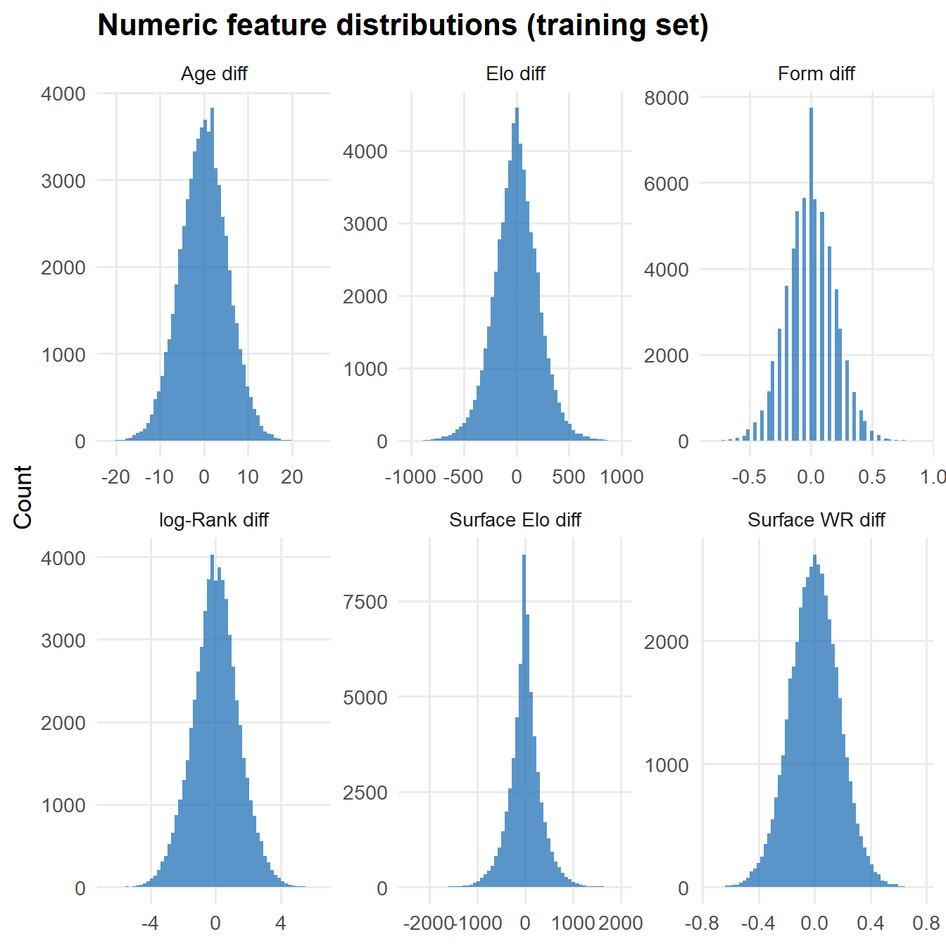
Each match appears twice — once with the actual winner labelled player 1, once flipped — giving the model a symmetric view of all feature combinations.
Tennis has inherent randomness — a player can be two-sets-to-love up and still lose, a knee twinge can cost a match, and best-of-five outcomes at Grand Slams carry more uncertainty than the scoreline suggests. Our model predicts the probability that the better player wins, not the exact score. The goal is calibration: a match predicted at 70% should be won by player 1 around 70% of the time across many such matches.
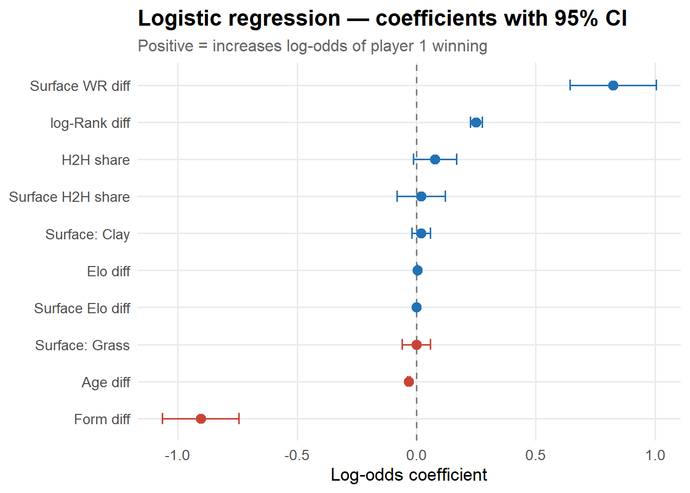
Model 1 — Logistic regression
Logistic regression directly models the log-odds of player 1 winning as a linear combination of features:
Strengths: Naturally well-calibrated (minimises log-loss), coefficients are directly interpretable as marginal log-odds effects, and it runs instantly. It works well here because the dominant signal — Elo difference — is approximately linear on the log-odds scale.
Limitations: Assumes all features act additively on log-odds. It cannot capture interactions like “H2H matters more when two players have similar Elo ratings” or “surface win rate is more predictive for clay specialists than for all-rounders”.
Model 2 — XGBoost
Gradient boosted trees build an ensemble of shallow decision trees where each tree corrects the residuals of the previous ones. The key advantages for this problem:
Automatic interactions: trees naturally split on multiple features at once, learning that the effect of Elo advantage depends on H2H and surface
Non-linearity: a large Elo gap means a near-certain win; a small gap makes every other feature count more — trees capture this threshold behaviour
Native NA handling: surface win rate and form are missing for new players; XGBoost learns the optimal direction to route these cases
Regularisation: depth limits, subsampling, and L2 penalties prevent overfitting despite a moderately sized feature set
Trade-off: Gradient boosted trees are not interpretable by default. We recover interpretability via SHAP values (see below).
The Elo-only baseline
Before adding any extra features, Elo’s own expected win probability is already a strong predictor. Establishing this baseline tells us exactly how much value each additional feature adds.
SHAP (SHapley Additive exPlanations) allocates each prediction’s deviation from the average prediction fairly among all features, using Shapley values from cooperative game theory. For player 1’s win probability in a specific match:
\[
\hat{f}(x) = \phi_0 + \sum_{i=1}^{p} \phi_i
\]
where \(\phi_0\) is the baseline (average prediction over training data) and each \(\phi_i\) is the SHAP contribution of feature \(i\) for this specific match. For tree models, exact SHAP values can be computed efficiently — xgboost implements this natively.
All numeric features carry the expected sign. Note that Surface WR diff and Surface H2H share add independent information beyond the overall Elo and H2H features: they capture whether a player has historically performed better or worse than their rating predicts on this surface and against this specific opponent.
The baseline Elo model is already remarkably competitive — a reminder that most of the predictable signal in tennis comes from the skill gap between players. The logistic model adds modest gains from surface H2H, form, and other features. XGBoost improves further by exploiting interactions and non-linear thresholds.
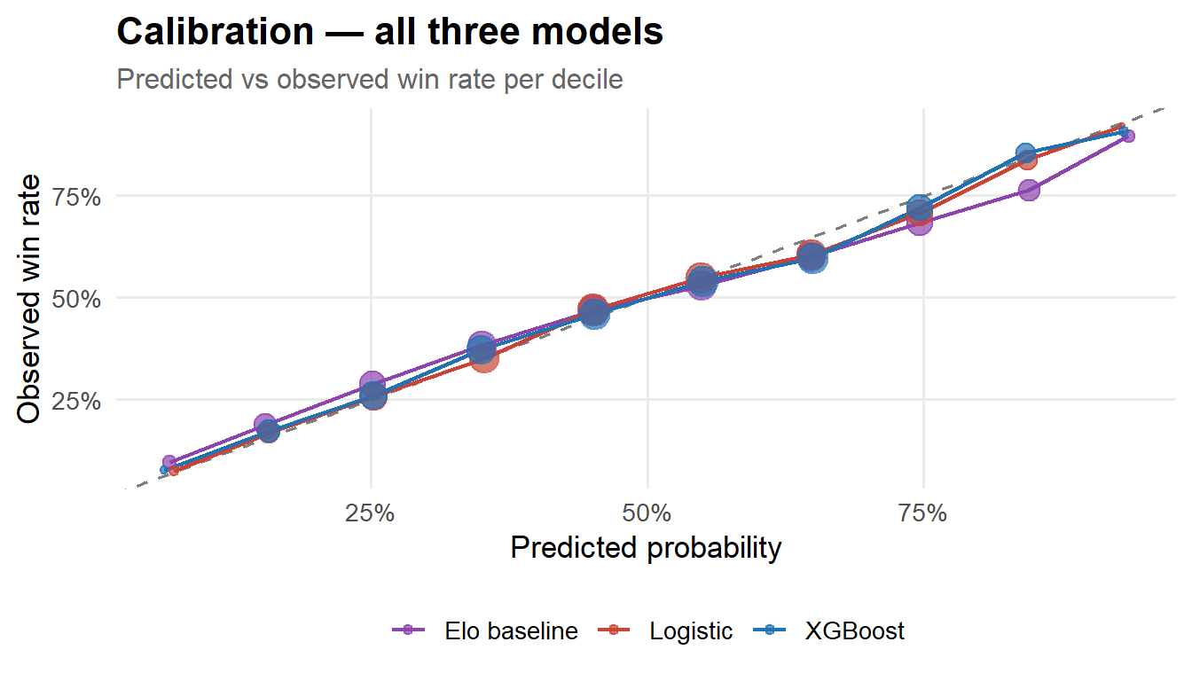
Calibration
Code
bind_rows( test |>mutate(prob=prob_elo, model="Elo baseline"), test |>mutate(prob=prob_glm, model="Logistic"), test |>mutate(prob=prob_xgb, model="XGBoost")) |>mutate(bin =cut(prob, breaks=seq(0,1,0.1), include.lowest=TRUE, right=FALSE)) |>group_by(model, bin) |>summarise(mean_pred=mean(prob), obs_rate=mean(p1_won), n=n(), .groups="drop") |>ggplot(aes(mean_pred, obs_rate, colour=model)) +geom_abline(linetype="dashed", colour="grey50") +geom_line(linewidth=0.8) +geom_point(aes(size=n), alpha=0.7) +scale_colour_manual(values=c("Elo baseline"="#8E44AD","Logistic"="#CB4335","XGBoost"="#2171B5")) +scale_x_continuous(labels=percent) +scale_y_continuous(labels=percent) +scale_size_continuous(labels=comma, name="n", guide="none") +labs(title="Calibration — all three models",subtitle="Predicted vs observed win rate per decile",x="Predicted probability", y="Observed win rate", colour=NULL)
All three models are well-calibrated near the centre of the distribution; divergence at the tails reflects the relative scarcity of extreme predictions in the test set.
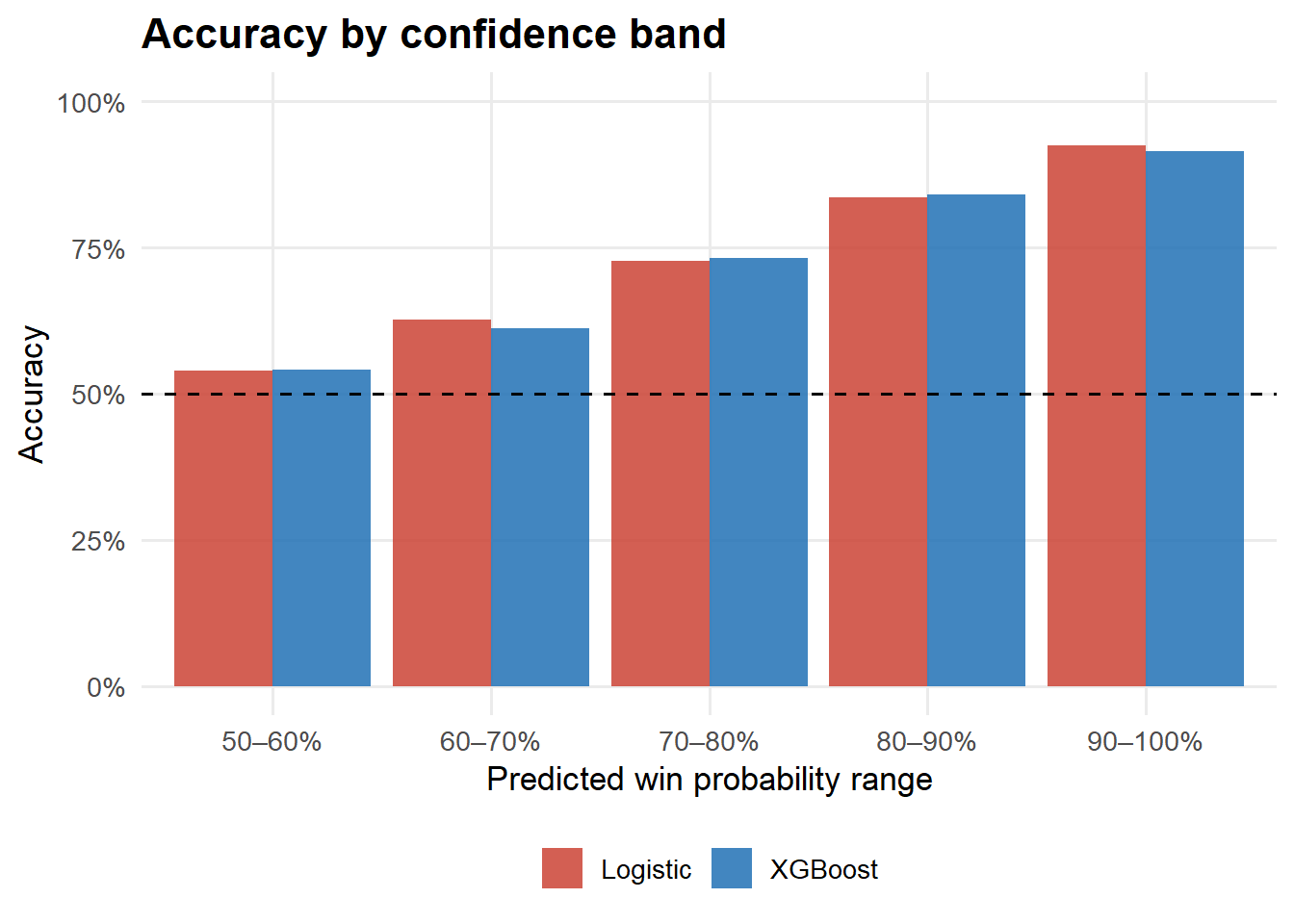
Accuracy by confidence band
Code
bind_rows( test |>mutate(prob=prob_glm, pred=(prob>0.5)*1L, model="Logistic"), test |>mutate(prob=prob_xgb, pred=(prob>0.5)*1L, model="XGBoost")) |>mutate(conf =abs(prob -0.5),bucket =cut(conf, breaks=c(0,0.1,0.2,0.3,0.4,0.5),labels=c("50–60%","60–70%","70–80%","80–90%","90–100%")) ) |>group_by(model, bucket) |>summarise(acc=mean(pred==p1_won), n=n(), .groups="drop") |>ggplot(aes(bucket, acc, fill=model)) +geom_col(position="dodge", alpha=0.85) +geom_hline(yintercept=0.5, linetype="dashed") +scale_fill_manual(values=c("Logistic"="#CB4335","XGBoost"="#2171B5")) +scale_y_continuous(labels=percent, limits=c(0,1)) +labs(title="Accuracy by confidence band",x="Predicted win probability range", y="Accuracy", fill=NULL)
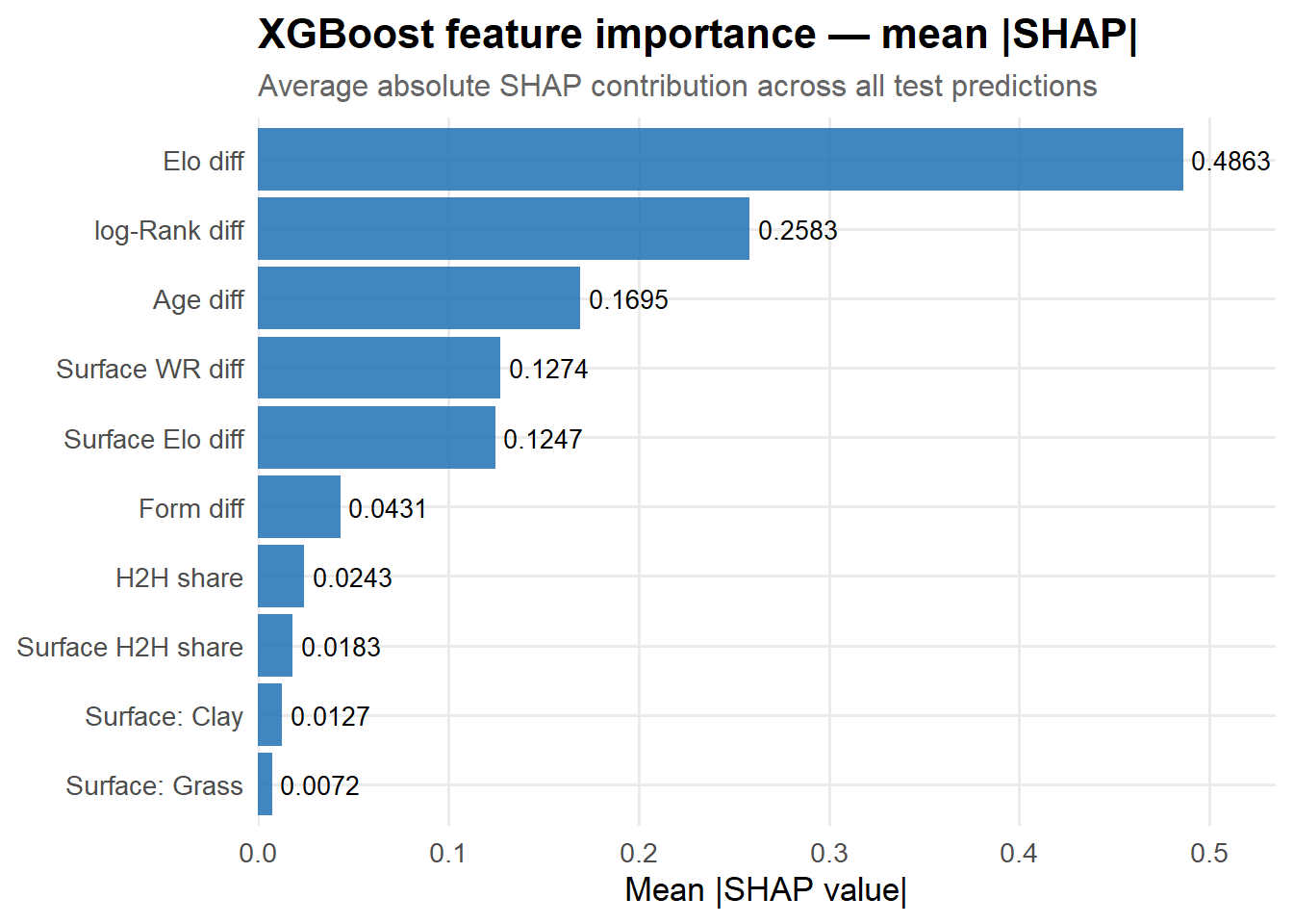
Feature Importance via SHAP
SHAP values answer why the model predicts what it predicts. We compute exact SHAP values for the XGBoost model on the full test set using xgboost’s native tree-path algorithm — no approximations needed.
Code
# predcontrib = TRUE returns SHAP matrix: (n × p+1), last col = baselineshap_mat <-predict(fit_xgb, dtest, predcontrib=TRUE)n_feat <-length(FEAT_NAMES)shap_vals <- shap_mat[, 1:n_feat]colnames(shap_vals) <- FEAT_NAMESfeat_vals <- X_test# Mean absolute SHAP per feature (global importance)mean_abs_shap <-colMeans(abs(shap_vals), na.rm=TRUE)
Global feature importance
Code
tibble(feature=FEAT_NAMES, importance=mean_abs_shap) |>mutate(feature=fct_reorder(feature, importance)) |>ggplot(aes(importance, feature)) +geom_col(fill="#2171B5", alpha=0.85) +geom_text(aes(label=round(importance,4)), hjust=-0.1, size=3.5) +scale_x_continuous(expand=expansion(mult=c(0,0.1))) +labs(title="XGBoost feature importance — mean |SHAP|",subtitle="Average absolute SHAP contribution across all test predictions",x="Mean |SHAP value|", y=NULL)
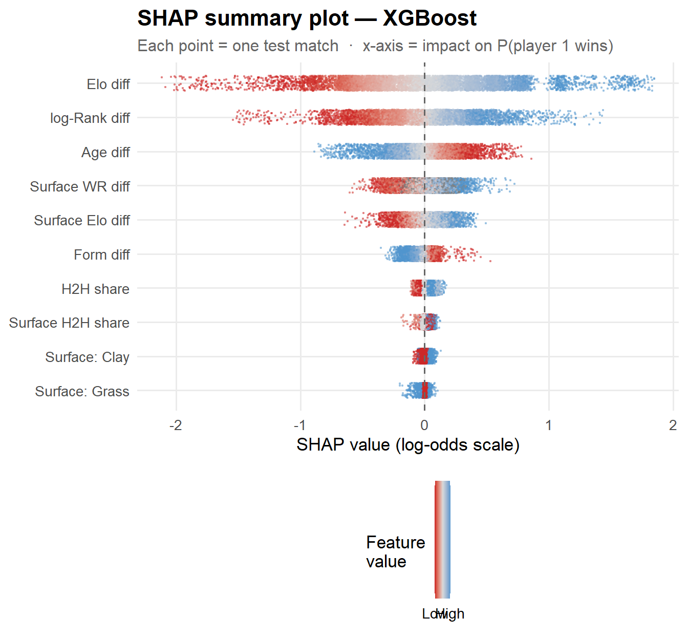
SHAP summary (beeswarm) plot
Each point is one test match. The position on the x-axis shows how much that feature pushed the prediction toward player 1 (positive) or player 2 (negative). The colour shows the raw feature value — blue = high, red = low.
Code
# Build long format for beeswarmset.seed(99)beeswarm_df <-map_dfr(FEAT_NAMES, function(f) { sv <- shap_vals[, f] fv <- feat_vals[, f]# Robust 5–95th percentile normalisation for colour lo <-quantile(fv, 0.05, na.rm=TRUE) hi <-quantile(fv, 0.95, na.rm=TRUE) fv_s <-pmin(pmax((fv - lo) / (hi - lo +1e-9), 0), 1)tibble(feature=f, shap=sv, feat_val=fv_s,mean_abs=mean(abs(sv), na.rm=TRUE))}) |>mutate(feature =fct_reorder(feature, mean_abs))beeswarm_df |>ggplot(aes(shap, feature, colour=feat_val)) +geom_jitter(height=0.22, size=0.35, alpha=0.35) +geom_vline(xintercept=0, linetype="dashed", colour="grey40") +scale_colour_gradient2(low="firebrick3", mid="grey85", high="steelblue3",midpoint=0.5, limits=c(0,1),breaks=c(0,1), labels=c("Low","High"),name="Feature\nvalue" ) +guides(colour=guide_colourbar(barheight=6, barwidth=0.8)) +labs(title="SHAP summary plot — XGBoost",subtitle="Each point = one test match · x-axis = impact on P(player 1 wins)",x="SHAP value (log-odds scale)", y=NULL)
Reading the plot: Elo difference dominates — a high Elo advantage (blue) pushes strongly positive. Surface Elo difference and log-Rank difference follow. Form difference and surface win rate contribute smaller but consistent effects. The H2H features matter most when players are well-matched and have a long history together.
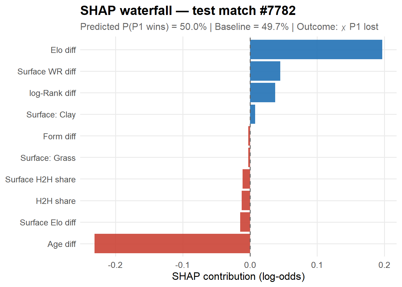
SHAP waterfall — a single prediction
A waterfall plot shows how each feature pushes a specific prediction above or below the baseline. The most interesting predictions to decompose are the close calls — when the model is near 50/50 every feature matters. We pick the test match closest to 50% win probability.
Code
# Use the test row closest to 50-50 (most interesting prediction to decompose)match_idx <-which.min(abs(test$prob_xgb -0.5))baseline <-mean(predict(fit_xgb, dtrain))shap_single <- shap_vals[match_idx, ]pred_prob <- test$prob_xgb[match_idx]outcome_lbl <-if_else(test$p1_won[match_idx] ==1L, "✓ P1 won", "✗ P1 lost")tibble(feature=FEAT_NAMES, shap=shap_single) |>arrange(abs(shap)) |>mutate(feature =fct_reorder(feature, shap),dir =if_else(shap >=0, "positive", "negative") ) |>ggplot(aes(shap, feature, fill=dir)) +geom_col(alpha=0.9) +geom_vline(xintercept=0, linetype="dashed", colour="grey40") +scale_fill_manual(values=c("positive"="#2171B5","negative"="#CB4335"), guide="none") +labs(title =sprintf("SHAP waterfall — test match #%d", match_idx),subtitle =sprintf("Predicted P(P1 wins) = %.1f%% | Baseline = %.1f%% | Outcome: %s",100*pred_prob, 100*plogis(qlogis(baseline)), outcome_lbl),x ="SHAP contribution (log-odds)", y =NULL )
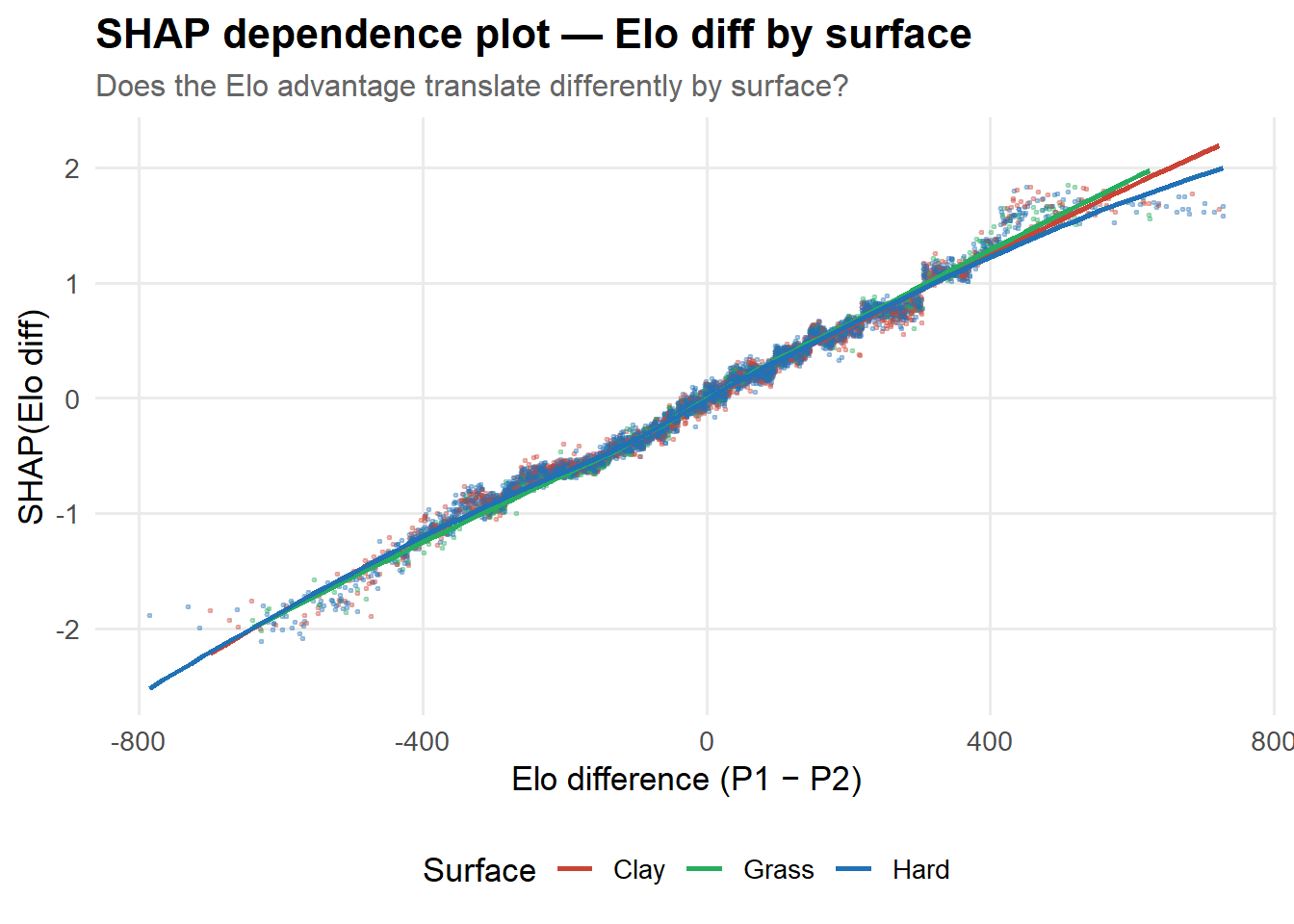
SHAP dependence — does surface change the Elo effect?
Code
tibble(elo_diff = feat_vals[,"Elo diff"],shap_elo = shap_vals[,"Elo diff"],surf_clay = feat_vals[,"Surface: Clay"],surf_grass = feat_vals[,"Surface: Grass"]) |>mutate(surface =case_when( surf_clay ==1~"Clay", surf_grass ==1~"Grass",TRUE~"Hard" )) |>ggplot(aes(elo_diff, shap_elo, colour=surface)) +geom_point(size=0.4, alpha=0.3) +geom_smooth(method="loess", se=FALSE, linewidth=1) +scale_colour_manual(values=surface_cols) +labs(title ="SHAP dependence plot — Elo diff by surface",subtitle ="Does the Elo advantage translate differently by surface?",x ="Elo difference (P1 − P2)", y ="SHAP(Elo diff)",colour ="Surface" )
The dependence plot reveals whether the Elo advantage is more decisive on one surface than another. On clay, where longer rallies reward consistent baseline play, a given Elo gap may contribute more to the prediction than on grass, where variance is higher.
Example Predictions
The XGBoost model is used for final predictions (higher AUC), with logistic regression probabilities shown as a comparison.