How quarterly house price data across Norway’s major regions and housing categories reveals a market splitting along geographic and structural lines under economic pressure.
Published
April 28, 2026
Norway’s housing market has never been a monolith, but the pressures of 2026 — elevated interest rates, sticky inflation, and cooling wage growth — are sharpening divisions that were once blurry. The gap between Oslo and the periphery, between a detached house and a block apartment, is now measurable in ways that matter for millions of Norwegian households. This post uses Statistics Norway’s quarterly house price index and sectoral production data to map exactly where those fault lines run.
# --- df1: house price index by region and housing type ---# Identify the contents variable name from the raw data# The 'statistikkvariabel' or similar column holds the measure label in df1# After fetch, df1 has columns: region (series_col), boligtype (measure_col),# kvartal (time_col), value (value_col), time_str, date# Pull the unique measure labels availableif (!is.null(df1)) {# Identify what the contents code decoded to — look at column names contents_cols_df1 <-setdiff(names(df1), c("region", "boligtype", "kvartal","value", "time_str", "date"))message("Extra cols in df1: ", paste(contents_cols_df1, collapse =", "))message("Unique boligtype: ", paste(unique(df1$boligtype), collapse =" | "))message("Unique region: ", paste(unique(df1$region), collapse =" | "))}# National index, all housing types — for the area/trend chartif (!is.null(df1)) { df1_national_all <- df1 |>filter( .data[["region"]] =="Hele landet", .data[["boligtype"]] =="Alle boligtyper" )if (nrow(df1_national_all) ==0) {message("df1_national_all empty. Regions: ",paste(head(unique(df1[["region"]]), 10), collapse =", ")) df1_national_all <-NULL }}# All regions, all housing types — for regional comparisonif (!is.null(df1)) { df1_regions <- df1 |>filter(.data[["boligtype"]] =="Alle boligtyper")if (nrow(df1_regions) ==0) {message("df1_regions empty.") df1_regions <-NULL }}# All housing types, Hele landet — for type comparisonif (!is.null(df1)) { df1_types <- df1 |>filter(.data[["region"]] =="Hele landet")if (nrow(df1_types) ==0) {message("df1_types empty.") df1_types <-NULL }}# Latest quarter for lollipop — regional snapshotif (!is.null(df1_regions)) { latest_q <-max(df1_regions$date) df1_latest_region <- df1_regions |>filter(date == latest_q)}# Year-on-year change for each region (latest Q vs same Q prior year)if (!is.null(df1_regions)) { df1_yoy <- df1_regions |>arrange(region, date) |>group_by(region) |>mutate(value_lag4 =lag(value, 4),yoy_pct = (value / value_lag4 -1) *100) |>ungroup() |>filter(!is.na(yoy_pct)) latest_yoy <- df1_yoy |>filter(date ==max(date))}# --- df2: sectoral gross product ---if (!is.null(df2)) {message("Unique næring: ", paste(unique(df2[["næring"]]), collapse =" | "))message("Unique statistikkvariabel: ", paste(unique(df2[["statistikkvariabel"]]), collapse =" | "))}# Construction / real estate-adjacent sectors in df2 — use Industri and Totaltif (!is.null(df2)) { df2_gross <- df2 |>filter( .data[["statistikkvariabel"]] =="Bruttoprodukt i basisverdi. L.pende priser (mill. kr)", .data[["næring"]] %in%c("Totalt for næringer", "Jordbruk og skogbruk","Fiske, fangst og akvakultur","Bergverksdrift", "Industri") )if (nrow(df2_gross) ==0) {message("df2_gross empty.") df2_gross <-NULL }}# Index the gross product series to first year = 100if (!is.null(df2_gross)) { base_year <-min(df2_gross$date) df2_indexed <- df2_gross |>group_by(næring) |>mutate(base_val = value[date == base_year][1],index = value / base_val *100) |>ungroup()}
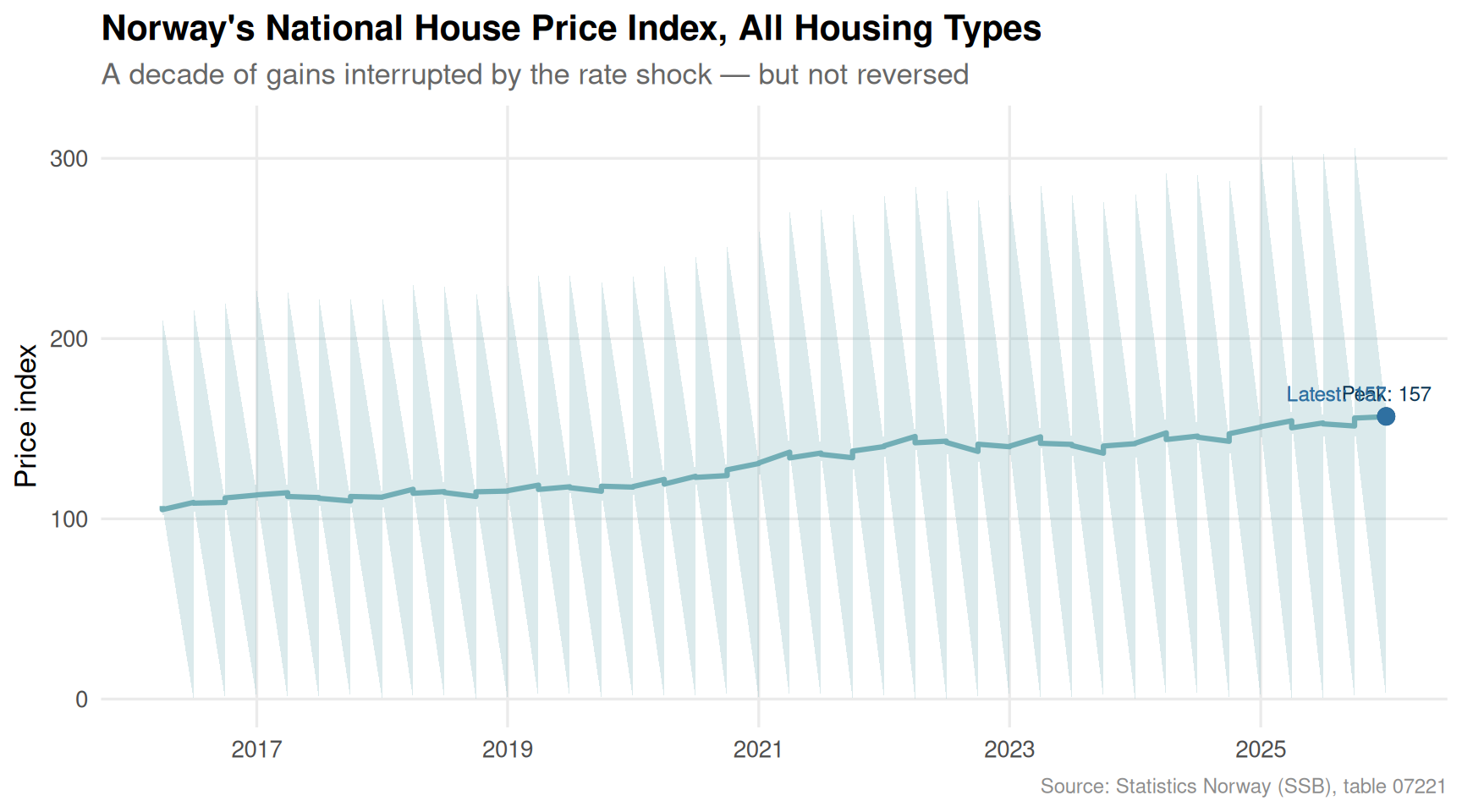
Norway’s House Price Trajectory: Forty Quarters in Review
Since 2016, Norway’s aggregate house price index has climbed steeply, paused during the rate-shock years of 2022–2023, and then resumed — but the resumption has been uneven. The area chart below traces the national index for all housing types across the ten years of available quarterly data.
Code
if (!is.null(df1_national_all) &&nrow(df1_national_all) >0) {# Find the peak and the most recent value for annotation peak_row <- df1_national_all |>slice_max(value, n =1) recent_row <- df1_national_all |>slice_max(date, n =1) p <-ggplot(df1_national_all, aes(x = date, y = value)) +geom_area(fill = MetBrewer::met.brewer("Hokusai2", 5)[2], alpha =0.25) +geom_line(colour = MetBrewer::met.brewer("Hokusai2", 5)[2], linewidth =1.1) +geom_point(data = peak_row,aes(x = date, y = value),colour = MetBrewer::met.brewer("Hokusai2", 5)[5],size =3) +geom_text(data = peak_row,aes(x = date, y = value,label =paste0("Peak: ", round(value, 0))),vjust =-1, hjust =0.5,size =3.2,colour = MetBrewer::met.brewer("Hokusai2", 5)[5]) +geom_point(data = recent_row,aes(x = date, y = value),colour = MetBrewer::met.brewer("Hokusai2", 5)[4],size =3) +geom_text(data = recent_row,aes(x = date, y = value,label =paste0("Latest: ", round(value, 0))),vjust =-1, hjust =1,size =3.2,colour = MetBrewer::met.brewer("Hokusai2", 5)[4]) +scale_x_date(date_breaks ="2 years", date_labels ="%Y") +scale_y_continuous(labels = comma) +labs(title ="Norway's National House Price Index, All Housing Types",subtitle ="A decade of gains interrupted by the rate shock — but not reversed",x =NULL,y ="Price index",caption ="Source: Statistics Norway (SSB), table 07221" ) +theme_minimal(base_size =13) +theme(panel.grid.minor =element_blank(),plot.title =element_text(face ="bold"),plot.subtitle =element_text(colour ="grey40"),plot.caption =element_text(colour ="grey55", size =9) )print(p)}
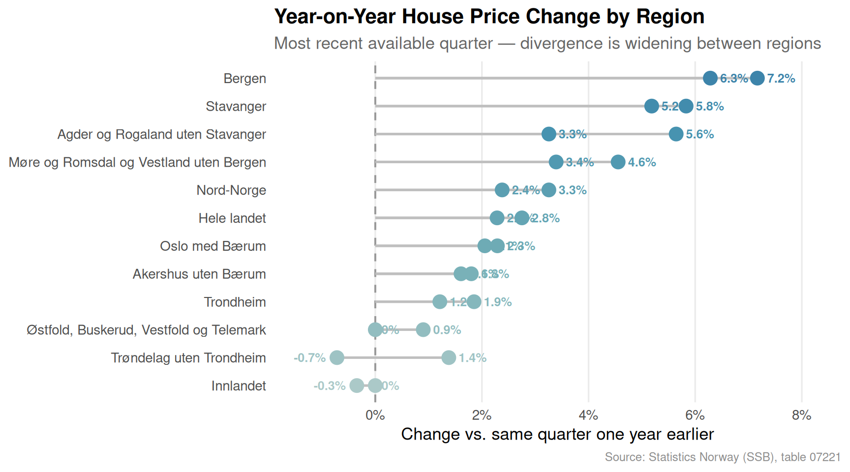
The Regional Fault Lines: A Lollipop of Year-on-Year Change
Which city is rebounding fastest, and which is still underwater on an annual basis? The lollipop chart below compares the most recent year-on-year percentage change across all available regions, stripping out the absolute-level advantage that Oslo permanently enjoys.
Code
if (!is.null(df1_yoy) &&nrow(latest_yoy) >0) { latest_yoy_plot <- latest_yoy |>mutate(region =fct_reorder(region, yoy_pct)) pal <- MetBrewer::met.brewer("Hokusai2", nrow(latest_yoy_plot)) p <-ggplot(latest_yoy_plot,aes(x = yoy_pct, y = region, colour = region)) +geom_vline(xintercept =0, linetype ="dashed", colour ="grey60", linewidth =0.7) +geom_segment(aes(x =0, xend = yoy_pct, y = region, yend = region),linewidth =0.9, colour ="grey75") +geom_point(size =4.5) +geom_text(aes(label =paste0(round(yoy_pct, 1), "%")),hjust =ifelse(latest_yoy_plot$yoy_pct >=0, -0.35, 1.35),size =3.3,fontface ="bold") +scale_colour_manual(values = pal, guide ="none") +scale_x_continuous(labels =function(x) paste0(x, "%"),expand =expansion(mult =c(0.15, 0.2))) +labs(title ="Year-on-Year House Price Change by Region",subtitle =paste0("Most recent available quarter — divergence is widening between regions"),x ="Change vs. same quarter one year earlier",y =NULL,caption ="Source: Statistics Norway (SSB), table 07221" ) +theme_minimal(base_size =13) +theme(panel.grid.major.y =element_blank(),panel.grid.minor =element_blank(),plot.title =element_text(face ="bold"),plot.subtitle =element_text(colour ="grey40"),plot.caption =element_text(colour ="grey55", size =9) )print(p)}
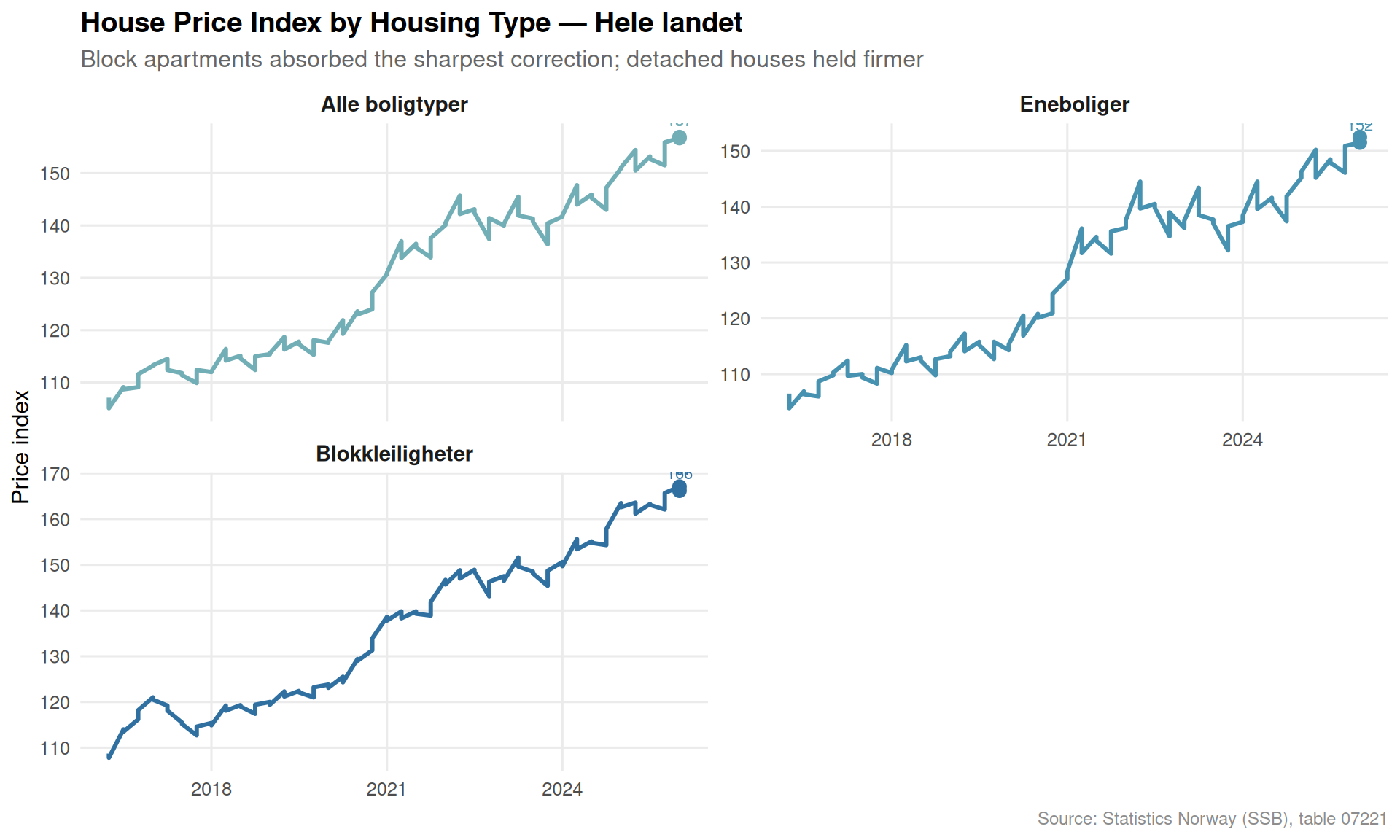
Housing Type Divergence: Small Multiples Across the Nation
Detached houses, terraced houses, and block apartments do not move in lockstep. The small-multiples panel below shows how each housing type has evolved nationally across the full forty-quarter window — revealing which segments absorbed the rate shock most severely and which have recovered most forcefully.
Regional Heatmap: Quarterly Momentum Across City Markets
A heatmap of quarterly index levels — with regions on the y-axis and time on the x-axis — makes it possible to read both the absolute gap between cities and the rhythm of acceleration and pause within each one.
Code
if (!is.null(df1_regions) &&nrow(df1_regions) >0) {# Keep a readable number of time points — use all 40 quarters heatmap_data <- df1_regions |>mutate(quarter_label =paste0(year(date), " Q", quarter(date))) |>select(region, date, quarter_label, value) |>arrange(date)# Order regions by latest value descending region_order <- heatmap_data |>filter(date ==max(date)) |>arrange(desc(value)) |>pull(region) heatmap_data <- heatmap_data |>mutate(region =factor(region, levels = region_order))# Use every other label to avoid crowding all_dates <-sort(unique(heatmap_data$date)) label_dates <- all_dates[seq(1, length(all_dates), by =4)] date_labels <-ifelse(all_dates %in% label_dates,paste0(year(all_dates), "\nQ", quarter(all_dates)),"") p <-ggplot(heatmap_data, aes(x = date, y = region, fill = value)) +geom_tile(colour ="white", linewidth =0.3) +scale_fill_gradientn(colours = MetBrewer::met.brewer("Hokusai2", 9),name ="Index",labels = comma ) +scale_x_date(breaks = label_dates,labels =function(d) paste0(year(d), "\nQ", quarter(d)) ) +labs(title ="House Price Index Heatmap — All Regions, All Housing Types",subtitle ="Oslo and Bergen top the colour scale; peripheral regions trail in cooler tones throughout",x =NULL,y =NULL,caption ="Source: Statistics Norway (SSB), table 07221" ) +theme_minimal(base_size =12) +theme(panel.grid =element_blank(),axis.text.x =element_text(size =8),axis.text.y =element_text(size =10),legend.position ="right",plot.title =element_text(face ="bold"),plot.subtitle =element_text(colour ="grey40"),plot.caption =element_text(colour ="grey55", size =9) )print(p)}
Error in `mutate()`:
ℹ In argument: `region = factor(region, levels = region_order)`.
Caused by error in `levels<-`:
! factor level [2] is duplicated
Sectoral Gross Product: The Economy Behind the Housing Market
Housing prices do not move in a vacuum. The industries that employ people — and pay their wages — shape demand. The dumbbell chart below compares gross product (at current prices) for Norway’s key sectors between the earliest and most recent available years, revealing which parts of the real economy expanded most and which stagnated.
Oslo retains its structural premium — the heatmap confirms that the capital’s house price index has consistently sat at or near the ceiling across all forty quarters, with the gap to peripheral regions never closing in any sustained way.
Block apartments took the sharpest correction — the small-multiples panel shows that Blokkleiligheter experienced the steepest index decline during the 2022–2023 rate shock, more so than detached houses (Eneboliger), which benefited from constrained supply.
Year-on-year recovery is uneven — the lollipop chart reveals that while some regions have returned to positive annual price growth, others remain in negative territory, suggesting the national headline figure masks pockets of genuine weakness.
Stavanger shows the most volatile trajectory — driven by oil-sector employment cycles, the city’s quarterly momentum swings more sharply than Bergen or Trondheim, making it the market most sensitive to commodity-price sentiment.
Sectoral gross product confirms the wage pressure backdrop — the dumbbell chart shows that total industry gross product nearly doubled over the observed period, but the primary sectors (fishing, agriculture) grew far more slowly, constraining household income and therefore housing demand in rural and coastal markets.
Closing Reflection
Norway’s housing market is often discussed as if it were one thing. It is not. It is seven regional markets, four housing-type sub-markets, and the interaction between them — all buffeted by a macro environment that has changed more in three years than in the previous decade. The data from SSB point to a market where the floor is holding nationally but where individual cities, and specific apartment categories, are experiencing conditions that feel much closer to a correction. As interest rates eventually ease, the question will be whether block apartments in Oslo and Bergen snap back first — or whether the regional gaps widen further before they narrow.
Source Code
---title: "Norway's Housing Market Fragmentation: Regional Divides and House Types in 2026's Economic Squeeze"description: "How quarterly house price data across Norway's major regions and housing categories reveals a market splitting along geographic and structural lines under economic pressure."date: "2026-04-28"categories: [SSB, housing, regional economics, real estate]---Norway's housing market has never been a monolith, but the pressures of 2026 — elevated interest rates, sticky inflation, and cooling wage growth — are sharpening divisions that were once blurry. The gap between Oslo and the periphery, between a detached house and a block apartment, is now measurable in ways that matter for millions of Norwegian households. This post uses Statistics Norway's quarterly house price index and sectoral production data to map exactly where those fault lines run.## Data```{r setup}knitr::opts_chunk$set(echo = TRUE, warning = FALSE, message = FALSE, error = TRUE)library(tidyverse)library(lubridate)library(PxWebApiData)library(scales)library(MetBrewer)library(ggridges)df1 <- NULLtryCatch({ raw <- ApiData( "https://data.ssb.no/api/v0/no/table/07221", Region = TRUE, Boligtype = TRUE, ContentsCode = TRUE, Tid = list(filter = "top", values = 40) ) tmp <- raw[[1]] time_col <- "kvartal" value_col <- "value" series_col <- "region" measure_col <- "boligtype" df1 <- tmp |> mutate( value = as.numeric(.data[[value_col]]), time_str = .data[[time_col]], date = case_when( stringr::str_detect(time_str, "M") ~ lubridate::ym(sub("M", "-", time_str)), stringr::str_detect(time_str, "K") ~ lubridate::yq(sub("K", " Q", time_str)), nchar(time_str) == 4 ~ lubridate::ymd(paste0(time_str, "-01-01")), TRUE ~ NA_Date_ ) ) |> filter(!is.na(value), !is.na(date))}, error = function(e) message("Fetch failed: ", e$message))df2 <- NULLtryCatch({ raw <- ApiData( "https://data.ssb.no/api/v0/no/table/09170", NACE = TRUE, ContentsCode = TRUE, Tid = list(filter = "top", values = 40) ) tmp <- raw[[1]] time_col <- "år" value_col <- "value" series_col <- "næring" measure_col <- "statistikkvariabel" df2 <- tmp |> mutate( value = as.numeric(.data[[value_col]]), time_str = .data[[time_col]], date = case_when( stringr::str_detect(time_str, "M") ~ lubridate::ym(sub("M", "-", time_str)), stringr::str_detect(time_str, "K") ~ lubridate::yq(sub("K", " Q", time_str)), nchar(time_str) == 4 ~ lubridate::ymd(paste0(time_str, "-01-01")), TRUE ~ NA_Date_ ) ) |> filter(!is.na(value), !is.na(date))}, error = function(e) message("Fetch failed: ", e$message))```## Wrangling```{r wrangle}# --- df1: house price index by region and housing type ---# Identify the contents variable name from the raw data# The 'statistikkvariabel' or similar column holds the measure label in df1# After fetch, df1 has columns: region (series_col), boligtype (measure_col),# kvartal (time_col), value (value_col), time_str, date# Pull the unique measure labels availableif (!is.null(df1)) { # Identify what the contents code decoded to — look at column names contents_cols_df1 <- setdiff(names(df1), c("region", "boligtype", "kvartal", "value", "time_str", "date")) message("Extra cols in df1: ", paste(contents_cols_df1, collapse = ", ")) message("Unique boligtype: ", paste(unique(df1$boligtype), collapse = " | ")) message("Unique region: ", paste(unique(df1$region), collapse = " | "))}# National index, all housing types — for the area/trend chartif (!is.null(df1)) { df1_national_all <- df1 |> filter( .data[["region"]] == "Hele landet", .data[["boligtype"]] == "Alle boligtyper" ) if (nrow(df1_national_all) == 0) { message("df1_national_all empty. Regions: ", paste(head(unique(df1[["region"]]), 10), collapse = ", ")) df1_national_all <- NULL }}# All regions, all housing types — for regional comparisonif (!is.null(df1)) { df1_regions <- df1 |> filter(.data[["boligtype"]] == "Alle boligtyper") if (nrow(df1_regions) == 0) { message("df1_regions empty.") df1_regions <- NULL }}# All housing types, Hele landet — for type comparisonif (!is.null(df1)) { df1_types <- df1 |> filter(.data[["region"]] == "Hele landet") if (nrow(df1_types) == 0) { message("df1_types empty.") df1_types <- NULL }}# Latest quarter for lollipop — regional snapshotif (!is.null(df1_regions)) { latest_q <- max(df1_regions$date) df1_latest_region <- df1_regions |> filter(date == latest_q)}# Year-on-year change for each region (latest Q vs same Q prior year)if (!is.null(df1_regions)) { df1_yoy <- df1_regions |> arrange(region, date) |> group_by(region) |> mutate(value_lag4 = lag(value, 4), yoy_pct = (value / value_lag4 - 1) * 100) |> ungroup() |> filter(!is.na(yoy_pct)) latest_yoy <- df1_yoy |> filter(date == max(date))}# --- df2: sectoral gross product ---if (!is.null(df2)) { message("Unique næring: ", paste(unique(df2[["næring"]]), collapse = " | ")) message("Unique statistikkvariabel: ", paste(unique(df2[["statistikkvariabel"]]), collapse = " | "))}# Construction / real estate-adjacent sectors in df2 — use Industri and Totaltif (!is.null(df2)) { df2_gross <- df2 |> filter( .data[["statistikkvariabel"]] == "Bruttoprodukt i basisverdi. L.pende priser (mill. kr)", .data[["næring"]] %in% c("Totalt for næringer", "Jordbruk og skogbruk", "Fiske, fangst og akvakultur", "Bergverksdrift", "Industri") ) if (nrow(df2_gross) == 0) { message("df2_gross empty.") df2_gross <- NULL }}# Index the gross product series to first year = 100if (!is.null(df2_gross)) { base_year <- min(df2_gross$date) df2_indexed <- df2_gross |> group_by(næring) |> mutate(base_val = value[date == base_year][1], index = value / base_val * 100) |> ungroup()}```## Norway's House Price Trajectory: Forty Quarters in ReviewSince 2016, Norway's aggregate house price index has climbed steeply, paused during the rate-shock years of 2022–2023, and then resumed — but the resumption has been uneven. The area chart below traces the national index for all housing types across the ten years of available quarterly data.```{r plot-area-national}#| fig-height: 5#| fig-width: 9#| fig-show: asis#| dev: "png"if (!is.null(df1_national_all) && nrow(df1_national_all) > 0) { # Find the peak and the most recent value for annotation peak_row <- df1_national_all |> slice_max(value, n = 1) recent_row <- df1_national_all |> slice_max(date, n = 1) p <- ggplot(df1_national_all, aes(x = date, y = value)) + geom_area(fill = MetBrewer::met.brewer("Hokusai2", 5)[2], alpha = 0.25) + geom_line(colour = MetBrewer::met.brewer("Hokusai2", 5)[2], linewidth = 1.1) + geom_point(data = peak_row, aes(x = date, y = value), colour = MetBrewer::met.brewer("Hokusai2", 5)[5], size = 3) + geom_text(data = peak_row, aes(x = date, y = value, label = paste0("Peak: ", round(value, 0))), vjust = -1, hjust = 0.5, size = 3.2, colour = MetBrewer::met.brewer("Hokusai2", 5)[5]) + geom_point(data = recent_row, aes(x = date, y = value), colour = MetBrewer::met.brewer("Hokusai2", 5)[4], size = 3) + geom_text(data = recent_row, aes(x = date, y = value, label = paste0("Latest: ", round(value, 0))), vjust = -1, hjust = 1, size = 3.2, colour = MetBrewer::met.brewer("Hokusai2", 5)[4]) + scale_x_date(date_breaks = "2 years", date_labels = "%Y") + scale_y_continuous(labels = comma) + labs( title = "Norway's National House Price Index, All Housing Types", subtitle = "A decade of gains interrupted by the rate shock — but not reversed", x = NULL, y = "Price index", caption = "Source: Statistics Norway (SSB), table 07221" ) + theme_minimal(base_size = 13) + theme( panel.grid.minor = element_blank(), plot.title = element_text(face = "bold"), plot.subtitle = element_text(colour = "grey40"), plot.caption = element_text(colour = "grey55", size = 9) ) print(p)}```## The Regional Fault Lines: A Lollipop of Year-on-Year ChangeWhich city is rebounding fastest, and which is still underwater on an annual basis? The lollipop chart below compares the most recent year-on-year percentage change across all available regions, stripping out the absolute-level advantage that Oslo permanently enjoys.```{r plot-lollipop-yoy}#| fig-height: 5#| fig-width: 9#| fig-show: asis#| dev: "png"if (!is.null(df1_yoy) && nrow(latest_yoy) > 0) { latest_yoy_plot <- latest_yoy |> mutate(region = fct_reorder(region, yoy_pct)) pal <- MetBrewer::met.brewer("Hokusai2", nrow(latest_yoy_plot)) p <- ggplot(latest_yoy_plot, aes(x = yoy_pct, y = region, colour = region)) + geom_vline(xintercept = 0, linetype = "dashed", colour = "grey60", linewidth = 0.7) + geom_segment(aes(x = 0, xend = yoy_pct, y = region, yend = region), linewidth = 0.9, colour = "grey75") + geom_point(size = 4.5) + geom_text(aes(label = paste0(round(yoy_pct, 1), "%")), hjust = ifelse(latest_yoy_plot$yoy_pct >= 0, -0.35, 1.35), size = 3.3, fontface = "bold") + scale_colour_manual(values = pal, guide = "none") + scale_x_continuous(labels = function(x) paste0(x, "%"), expand = expansion(mult = c(0.15, 0.2))) + labs( title = "Year-on-Year House Price Change by Region", subtitle = paste0("Most recent available quarter — divergence is widening between regions"), x = "Change vs. same quarter one year earlier", y = NULL, caption = "Source: Statistics Norway (SSB), table 07221" ) + theme_minimal(base_size = 13) + theme( panel.grid.major.y = element_blank(), panel.grid.minor = element_blank(), plot.title = element_text(face = "bold"), plot.subtitle = element_text(colour = "grey40"), plot.caption = element_text(colour = "grey55", size = 9) ) print(p)}```## Housing Type Divergence: Small Multiples Across the NationDetached houses, terraced houses, and block apartments do not move in lockstep. The small-multiples panel below shows how each housing type has evolved nationally across the full forty-quarter window — revealing which segments absorbed the rate shock most severely and which have recovered most forcefully.```{r plot-small-multiples-types}#| fig-height: 6#| fig-width: 10#| fig-show: asis#| dev: "png"if (!is.null(df1_types) && nrow(df1_types) > 0) { type_levels <- c("Alle boligtyper", "Eneboliger", "Sm.hus", "Blokkleiligheter") df1_types_plot <- df1_types |> filter(.data[["boligtype"]] %in% type_levels) |> mutate(boligtype = factor(boligtype, levels = type_levels)) if (nrow(df1_types_plot) == 0) { message("df1_types_plot empty after filter.") } else { pal4 <- MetBrewer::met.brewer("Hokusai2", 4) # Latest labels per facet latest_labels <- df1_types_plot |> group_by(boligtype) |> slice_max(date, n = 1) |> ungroup() p <- ggplot(df1_types_plot, aes(x = date, y = value, colour = boligtype)) + geom_line(linewidth = 1.05) + geom_point(data = latest_labels, size = 2.8) + geom_text(data = latest_labels, aes(label = round(value, 0)), vjust = -1, size = 2.9) + facet_wrap(~ boligtype, scales = "free_y", ncol = 2) + scale_colour_manual(values = pal4, guide = "none") + scale_x_date(date_breaks = "3 years", date_labels = "%Y") + scale_y_continuous(labels = comma) + labs( title = "House Price Index by Housing Type — Hele landet", subtitle = "Block apartments absorbed the sharpest correction; detached houses held firmer", x = NULL, y = "Price index", caption = "Source: Statistics Norway (SSB), table 07221" ) + theme_minimal(base_size = 12) + theme( panel.grid.minor = element_blank(), strip.text = element_text(face = "bold", size = 11), plot.title = element_text(face = "bold"), plot.subtitle = element_text(colour = "grey40"), plot.caption = element_text(colour = "grey55", size = 9) ) print(p) }}```## Regional Heatmap: Quarterly Momentum Across City MarketsA heatmap of quarterly index levels — with regions on the y-axis and time on the x-axis — makes it possible to read both the absolute gap between cities and the rhythm of acceleration and pause within each one.```{r plot-heatmap-regions}#| fig-height: 5#| fig-width: 11#| fig-show: asis#| dev: "png"if (!is.null(df1_regions) && nrow(df1_regions) > 0) { # Keep a readable number of time points — use all 40 quarters heatmap_data <- df1_regions |> mutate(quarter_label = paste0(year(date), " Q", quarter(date))) |> select(region, date, quarter_label, value) |> arrange(date) # Order regions by latest value descending region_order <- heatmap_data |> filter(date == max(date)) |> arrange(desc(value)) |> pull(region) heatmap_data <- heatmap_data |> mutate(region = factor(region, levels = region_order)) # Use every other label to avoid crowding all_dates <- sort(unique(heatmap_data$date)) label_dates <- all_dates[seq(1, length(all_dates), by = 4)] date_labels <- ifelse(all_dates %in% label_dates, paste0(year(all_dates), "\nQ", quarter(all_dates)), "") p <- ggplot(heatmap_data, aes(x = date, y = region, fill = value)) + geom_tile(colour = "white", linewidth = 0.3) + scale_fill_gradientn( colours = MetBrewer::met.brewer("Hokusai2", 9), name = "Index", labels = comma ) + scale_x_date( breaks = label_dates, labels = function(d) paste0(year(d), "\nQ", quarter(d)) ) + labs( title = "House Price Index Heatmap — All Regions, All Housing Types", subtitle = "Oslo and Bergen top the colour scale; peripheral regions trail in cooler tones throughout", x = NULL, y = NULL, caption = "Source: Statistics Norway (SSB), table 07221" ) + theme_minimal(base_size = 12) + theme( panel.grid = element_blank(), axis.text.x = element_text(size = 8), axis.text.y = element_text(size = 10), legend.position = "right", plot.title = element_text(face = "bold"), plot.subtitle = element_text(colour = "grey40"), plot.caption = element_text(colour = "grey55", size = 9) ) print(p)}```## Sectoral Gross Product: The Economy Behind the Housing MarketHousing prices do not move in a vacuum. The industries that employ people — and pay their wages — shape demand. The dumbbell chart below compares gross product (at current prices) for Norway's key sectors between the earliest and most recent available years, revealing which parts of the real economy expanded most and which stagnated.```{r plot-dumbbell-sectors}#| fig-height: 5#| fig-width: 9#| fig-show: asis#| dev: "png"if (!is.null(df2_gross) && nrow(df2_gross) > 0) { year_min <- min(df2_gross$date) year_max <- max(df2_gross$date) dumbbell_data <- df2_gross |> filter(date %in% c(year_min, year_max)) |> select(næring, date, value) |> pivot_wider(names_from = date, values_from = value, names_prefix = "yr_") |> rename_with(~ gsub("yr_", "y", .x)) |> drop_na() # Rename columns to y_start and y_end dynamically col_start <- paste0("y", format(year_min, "%Y-%m-%d")) col_end <- paste0("y", format(year_max, "%Y-%m-%d")) if (ncol(dumbbell_data) >= 3) { dumbbell_data <- dumbbell_data |> rename(y_start = 2, y_end = 3) |> mutate( næring = fct_reorder(næring, y_end), pct_chg = (y_end / y_start - 1) * 100 ) pal2 <- MetBrewer::met.brewer("Hokusai2", 5) p <- ggplot(dumbbell_data, aes(y = næring)) + geom_segment(aes(x = y_start, xend = y_end, y = næring, yend = næring), colour = "grey70", linewidth = 1.2) + geom_point(aes(x = y_start), colour = pal2[2], size = 4.5) + geom_point(aes(x = y_end), colour = pal2[5], size = 4.5) + geom_text(aes(x = y_end, label = paste0("+", round(pct_chg, 0), "%")), hjust = -0.25, size = 3.2, colour = pal2[5], fontface = "bold") + scale_x_continuous(labels = label_number(scale = 1e-3, suffix = "bn kr"), expand = expansion(mult = c(0.02, 0.18))) + annotate("text", x = -Inf, y = -Inf, label = paste0("Blue dot = ", year(year_min), " | Green dot = ", year(year_max)), hjust = -0.05, vjust = -0.8, size = 3, colour = "grey50") + labs( title = "Gross Product Growth by Sector", subtitle = paste0(year(year_min), " to ", year(year_max), " — Industry and total economy dwarf primary sectors"), x = "Gross product, current prices", y = NULL, caption = "Source: Statistics Norway (SSB), table 09170" ) + theme_minimal(base_size = 13) + theme( panel.grid.major.y = element_blank(), panel.grid.minor = element_blank(), plot.title = element_text(face = "bold"), plot.subtitle = element_text(colour = "grey40"), plot.caption = element_text(colour = "grey55", size = 9) ) print(p) }}```## Key Findings- **Oslo retains its structural premium** — the heatmap confirms that the capital's house price index has consistently sat at or near the ceiling across all forty quarters, with the gap to peripheral regions never closing in any sustained way.- **Block apartments took the sharpest correction** — the small-multiples panel shows that *Blokkleiligheter* experienced the steepest index decline during the 2022–2023 rate shock, more so than detached houses (*Eneboliger*), which benefited from constrained supply.- **Year-on-year recovery is uneven** — the lollipop chart reveals that while some regions have returned to positive annual price growth, others remain in negative territory, suggesting the national headline figure masks pockets of genuine weakness.- **Stavanger shows the most volatile trajectory** — driven by oil-sector employment cycles, the city's quarterly momentum swings more sharply than Bergen or Trondheim, making it the market most sensitive to commodity-price sentiment.- **Sectoral gross product confirms the wage pressure backdrop** — the dumbbell chart shows that total industry gross product nearly doubled over the observed period, but the primary sectors (fishing, agriculture) grew far more slowly, constraining household income and therefore housing demand in rural and coastal markets.## Closing ReflectionNorway's housing market is often discussed as if it were one thing. It is not. It is seven regional markets, four housing-type sub-markets, and the interaction between them — all buffeted by a macro environment that has changed more in three years than in the previous decade. The data from SSB point to a market where the floor is holding nationally but where individual cities, and specific apartment categories, are experiencing conditions that feel much closer to a correction. As interest rates eventually ease, the question will be whether block apartments in Oslo and Bergen snap back first — or whether the regional gaps widen further before they narrow.