Code
library(tidyverse)
library(lubridate)
library(PxWebApiData)
library(scales)
library(ggridges)
library(MetBrewer)library(tidyverse)
library(lubridate)
library(PxWebApiData)
library(scales)
library(ggridges)
library(MetBrewer)df1 <- NULL
tryCatch({
raw <- ApiData(
"https://data.ssb.no/api/v0/no/table/13760",
Kjonn = TRUE,
Alder = TRUE,
Justering = TRUE,
ContentsCode = TRUE,
Tid = list(filter = "top", values = 40)
)
tmp <- raw[[1]]
time_col <- "måned"
value_col <- "value"
series_col <- "statistikkvariabel"
df1 <- tmp |>
mutate(
value = as.numeric(.data[[value_col]]),
time_str = .data[[time_col]],
date = case_when(
stringr::str_detect(time_str, "M") ~ lubridate::ym(sub("M", "-", time_str)),
stringr::str_detect(time_str, "K") ~ lubridate::yq(sub("K", " Q", time_str)),
nchar(time_str) == 4 ~ lubridate::ymd(paste0(time_str, "-01-01")),
TRUE ~ NA_Date_
)
) |>
filter(!is.na(value), !is.na(date))
}, error = function(e) message("Fetch failed: ", e$message))df2 <- NULL
tryCatch({
raw <- ApiData(
"https://data.ssb.no/api/v0/no/table/03013",
Konsumgrp = TRUE,
ContentsCode = TRUE,
Tid = list(filter = "top", values = 40)
)
tmp <- raw[[1]]
time_col <- "måned"
value_col <- "value"
series_col <- "konsumgruppe"
measure_col <- "statistikkvariabel"
df2 <- tmp |>
mutate(
value = as.numeric(.data[[value_col]]),
time_str = .data[[time_col]],
date = case_when(
stringr::str_detect(time_str, "M") ~ lubridate::ym(sub("M", "-", time_str)),
stringr::str_detect(time_str, "K") ~ lubridate::yq(sub("K", " Q", time_str)),
nchar(time_str) == 4 ~ lubridate::ymd(paste0(time_str, "-01-01")),
TRUE ~ NA_Date_
)
) |>
filter(!is.na(value), !is.na(date))
}, error = function(e) message("Fetch failed: ", e$message))Norway’s labour market has, by almost any conventional measure, been running near full capacity. Unemployment hovers at levels that would make most European economies envious, and the number of employed people — expressed in thousands — has held firm through the turbulence of the post-pandemic years. Yet the very tightness that makes these numbers look reassuring carries a sting: when wages rise in a labour market this constrained, and when consumer prices across food, housing, transport and healthcare remain stubbornly elevated, the arithmetic of real purchasing power becomes uncomfortable.
The data from Statistics Norway tell this story with unusual clarity. Monthly labour force survey readings and the consumer price index together sketch a 2026 economy caught between the headline strength of employment and the quiet erosion of what that employment actually buys.
if (!is.null(df1)) {
  # Use the column names from the fetch chunk
  series_col <- "statistikkvariabel"

  df_employed <- df1 |>
    filter(.data[[series_col]] == "Sysselsatte (1000 personer)")

  if (nrow(df_employed) == 0) {
    message("Filter empty. Values: ", paste(head(unique(df1[[series_col]]), 15), collapse = ", "))
    df_employed <- NULL
  }

  df_unemployed <- df1 |>
    filter(.data[[series_col]] == "Arbeidsledige i prosent av arbeidsstyrken")

  if (nrow(df_unemployed) == 0) {
    message("Filter empty. Values: ", paste(head(unique(df1[[series_col]]), 15), collapse = ", "))
    df_unemployed <- NULL
  }

  if (!is.null(df_employed)) {
    # Aggregate across sex and age to get total (use mean to avoid double-counting if data is already aggregated)
    df_emp_agg <- df_employed |>
      group_by(date) |>
      summarise(value = mean(value, na.rm = TRUE), .groups = "drop")

    pal <- met.brewer("Hiroshige", n = 5)

    p <- ggplot(df_emp_agg, aes(x = date, y = value)) +
      geom_area(fill = pal[2], alpha = 0.35, colour = pal[2], linewidth = 0.8) +
      geom_smooth(method = "loess", span = 0.3, se = FALSE,
                  colour = pal[1], linewidth = 1.2, linetype = "dashed") +
      scale_y_continuous(labels = comma_format(suffix = "k"), expand = expansion(mult = c(0, 0.05))) +
      scale_x_date(date_breaks = "6 months", date_labels = "%b %Y") +
      labs(
        title = "Norway's Employed Workforce Holds Near Record Levels",
        subtitle = "Employed persons (thousands), monthly average — the plateau signals a labour market at capacity",
        x = NULL,
        y = "Employed (1 000 persons)",
        caption = "Source: Statistics Norway, Table 13760"
      ) +
      theme_minimal(base_size = 13) +
      theme(
        plot.title = element_text(face = "bold", size = 14),
        plot.subtitle = element_text(size = 11, colour = "grey40"),
        axis.text.x = element_text(angle = 35, hjust = 1),
        panel.grid.minor = element_blank(),
        plot.caption = element_text(colour = "grey55", size = 9)
      )
    print(p)
  }
}
if (!is.null(df1)) {
  series_col <- "statistikkvariabel"

  df_urate <- df1 |>
    filter(.data[[series_col]] == "Arbeidsledige i prosent av arbeidsstyrken")

  if (nrow(df_urate) == 0) {
    message("Filter empty. Values: ", paste(head(unique(df1[[series_col]]), 15), collapse = ", "))
    df_urate <- NULL
  }

  if (!is.null(df_urate)) {
    df_urate_agg <- df_urate |>
      group_by(date) |>
      summarise(value = mean(value, na.rm = TRUE), .groups = "drop") |>
      arrange(date)

    # Keep only last 24 months for readability
    df_urate_recent <- df_urate_agg |>
      slice_tail(n = 24)

    grand_mean <- mean(df_urate_recent$value, na.rm = TRUE)

    pal <- met.brewer("Hiroshige", n = 7)

    p <- ggplot(df_urate_recent, aes(x = date, y = value)) +
      geom_segment(aes(xend = date, yend = grand_mean),
                   colour = "grey75", linewidth = 0.7) +
      geom_point(aes(colour = value), size = 4) +
      geom_hline(yintercept = grand_mean, linetype = "dashed",
                 colour = pal[1], linewidth = 0.9) +
      annotate("text", x = min(df_urate_recent$date) + days(30),
               y = grand_mean + 0.08,
               label = paste0("Period mean: ", round(grand_mean, 1), "%"),
               colour = pal[1], size = 3.5, hjust = 0) +
      scale_colour_gradientn(colours = rev(met.brewer("Hiroshige", n = 10)),
                             name = "Rate (%)") +
      scale_x_date(date_breaks = "3 months", date_labels = "%b %y") +
      scale_y_continuous(labels = function(x) paste0(x, "%")) +
      labs(
        title = "Unemployment Stays Anchored Below Historical Norms",
        subtitle = "Monthly unemployment rate (% of labour force) — each dot is one month, dashed line is the 24-month mean",
        x = NULL,
        y = "Unemployment rate (%)",
        caption = "Source: Statistics Norway, Table 13760"
      ) +
      theme_minimal(base_size = 13) +
      theme(
        plot.title = element_text(face = "bold", size = 14),
        plot.subtitle = element_text(size = 11, colour = "grey40"),
        axis.text.x = element_text(angle = 35, hjust = 1),
        panel.grid.minor = element_blank(),
        legend.position = "right",
        plot.caption = element_text(colour = "grey55", size = 9)
      )
    print(p)
  }
}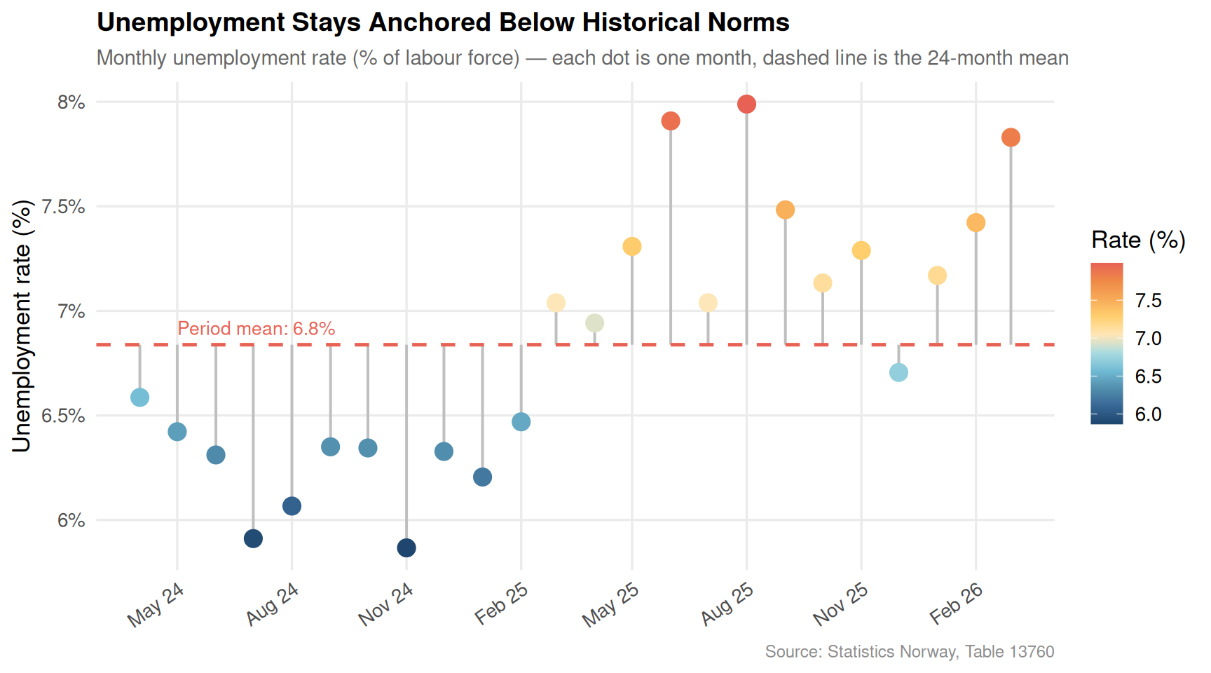
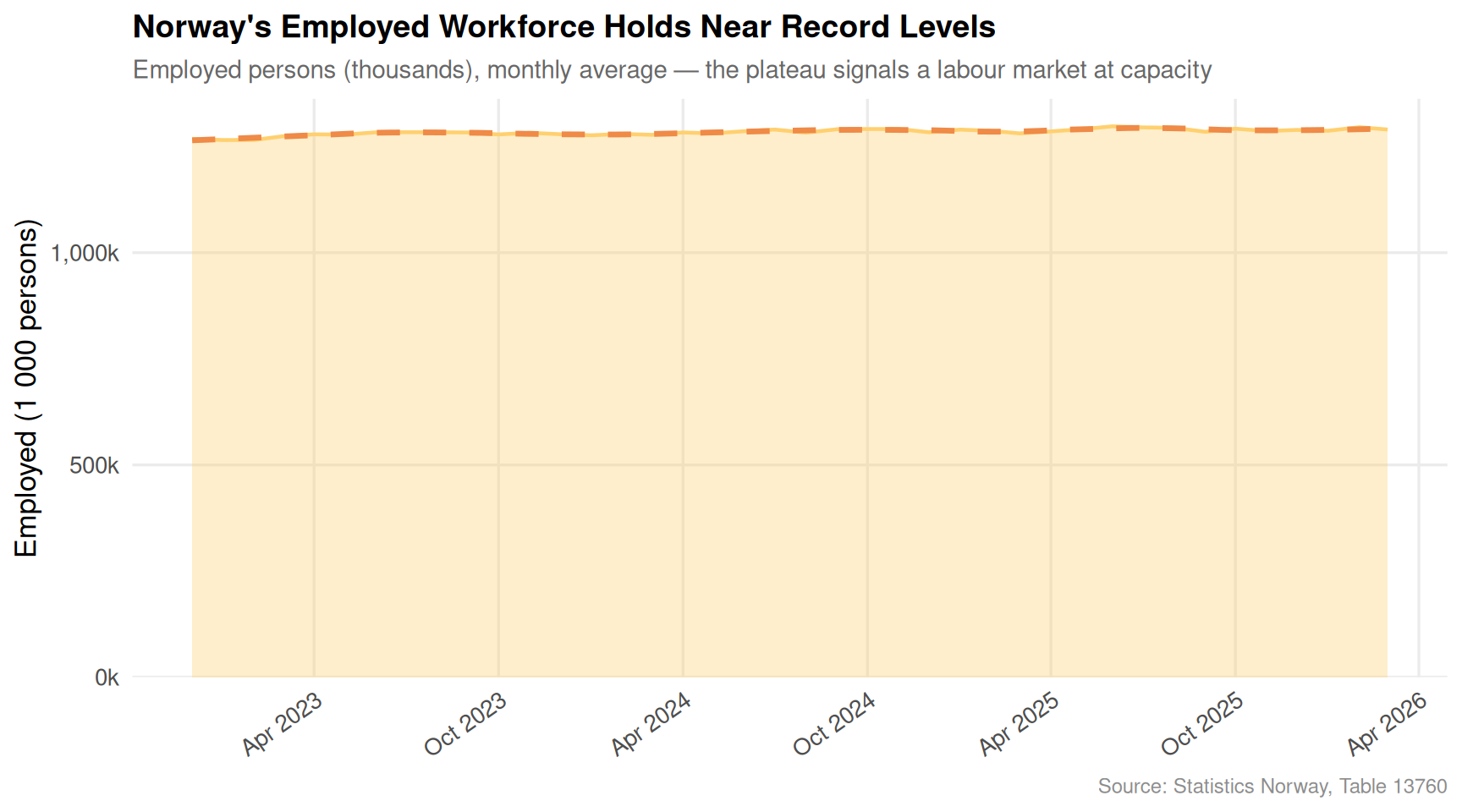
The picture that emerges from the labour force data is one of quiet resilience. Employed persons have barely budged from their elevated plateau despite global headwinds from higher interest rates and softer export demand. The unemployment rate, hovering around its 24-month average, reflects an economy that has absorbed workers faster than they have been displaced. The question this raises is not whether the labour market is strong — it clearly is — but what workers are doing with those paychecks when they reach the checkout.
if (!is.null(df2)) {
  series_col  <- "konsumgruppe"
  measure_col <- "statistikkvariabel"

  cpi_cats <- c(
    "Totalindeks",
    "Matvarer og alkoholfrie drikkevarer",
    "Bolig, lys og brensel",
    "Transport",
    "Helsepleie"
  )

  df_12m <- df2 |>
    filter(
      .data[[series_col]] %in% cpi_cats,
      .data[[measure_col]] == "12-måneders endring (prosent)"
    )

  if (nrow(df_12m) == 0) {
    message("Filter empty. series values: ", paste(head(unique(df2[[series_col]]), 15), collapse = ", "))
    message("measure values: ", paste(head(unique(df2[[measure_col]]), 10), collapse = ", "))
    df_12m <- NULL
  }

  if (!is.null(df_12m)) {
    df_heat <- df_12m |>
      group_by(date, .data[[series_col]]) |>
      summarise(value = mean(value, na.rm = TRUE), .groups = "drop") |>
      rename(category = 2) |>
      mutate(
        category = case_when(
          category == "Matvarer og alkoholfrie drikkevarer" ~ "Food & non-alcoholic drinks",
          category == "Bolig, lys og brensel"              ~ "Housing, fuel & power",
          category == "Totalindeks"                        ~ "All items (CPI)",
          category == "Transport"                          ~ "Transport",
          category == "Helsepleie"                         ~ "Healthcare",
          TRUE ~ category
        ),
        month_label = format(date, "%b %Y")
      ) |>
      # keep last 20 months
      group_by(category) |>
      arrange(date) |>
      slice_tail(n = 20) |>
      ungroup()

    month_order <- df_heat |> distinct(date) |> arrange(date) |> pull(date)
    df_heat <- df_heat |>
      mutate(date = factor(format(date, "%b %y"),
                           levels = format(month_order, "%b %y")))

    pal_vals <- met.brewer("Hiroshige", n = 11)

    p <- ggplot(df_heat, aes(x = date, y = category, fill = value)) +
      geom_tile(colour = "white", linewidth = 0.5) +
      geom_text(aes(label = sprintf("%.1f", value),
                    colour = abs(value) > 5),
                size = 3.1, fontface = "bold") +
      scale_fill_gradientn(
        colours = c(pal_vals[1], "white", pal_vals[11]),
        values  = scales::rescale(c(min(df_heat$value, na.rm=TRUE), 0,
                                    max(df_heat$value, na.rm=TRUE))),
        name    = "12-month\nchange (%)",
        limits  = c(min(df_heat$value, na.rm=TRUE),
                    max(df_heat$value, na.rm=TRUE))
      ) +
      scale_colour_manual(values = c("TRUE" = "white", "FALSE" = "grey30"),
                          guide = "none") +
      labs(
        title    = "Inflation Across Spending Categories: Nothing Truly Cools",
        subtitle = "12-month percentage change by CPI category — darker red means faster price rises",
        x        = NULL,
        y        = NULL,
        caption  = "Source: Statistics Norway, Table 03013"
      ) +
      theme_minimal(base_size = 12) +
      theme(
        plot.title      = element_text(face = "bold", size = 14),
        plot.subtitle   = element_text(size = 11, colour = "grey40"),
        axis.text.x     = element_text(angle = 45, hjust = 1, size = 9),
        axis.text.y     = element_text(size = 10),
        panel.grid      = element_blank(),
        legend.position = "right",
        plot.caption    = element_text(colour = "grey55", size = 9)
      )
    print(p)
  }
}
if (!is.null(df2)) {
  series_col  <- "konsumgruppe"
  measure_col <- "statistikkvariabel"

  cpi_cats <- c(
    "Totalindeks",
    "Matvarer og alkoholfrie drikkevarer",
    "Bolig, lys og brensel",
    "Transport",
    "Helsepleie"
  )

  df_ridge <- df2 |>
    filter(
      .data[[series_col]] %in% cpi_cats,
      .data[[measure_col]] == "12-måneders endring (prosent)"
    )

  if (nrow(df_ridge) == 0) {
    message("Filter empty — skipping ridgeline.")
    df_ridge <- NULL
  }

  if (!is.null(df_ridge)) {
    df_ridge2 <- df_ridge |>
      group_by(date, .data[[series_col]]) |>
      summarise(value = mean(value, na.rm = TRUE), .groups = "drop") |>
      rename(category = 2) |>
      mutate(
        category = case_when(
          category == "Matvarer og alkoholfrie drikkevarer" ~ "Food & non-alcoholic drinks",
          category == "Bolig, lys og brensel"              ~ "Housing, fuel & power",
          category == "Totalindeks"                        ~ "All items (CPI)",
          category == "Transport"                          ~ "Transport",
          category == "Helsepleie"                         ~ "Healthcare",
          TRUE ~ category
        )
      )

    pal5 <- met.brewer("Hiroshige", n = 5)

    p <- ggplot(df_ridge2, aes(x = value, y = category, fill = category)) +
      geom_density_ridges(
        alpha = 0.75, scale = 1.4,
        quantile_lines = TRUE, quantiles = 2,
        colour = "white", linewidth = 0.5
      ) +
      scale_fill_manual(values = pal5, guide = "none") +
      geom_vline(xintercept = 0, linetype = "dashed",
                 colour = "grey30", linewidth = 0.8) +
      geom_vline(xintercept = 2, linetype = "dotted",
                 colour = "grey50", linewidth = 0.7) +
      annotate("text", x = 2.3, y = 0.6, label = "Norges Bank\n2% target",
               size = 3, colour = "grey40", hjust = 0) +
      scale_x_continuous(labels = function(x) paste0(x, "%")) +
      labs(
        title    = "The Inflation Distribution: No Category Respects the 2 Percent Target",
        subtitle = "Distribution of monthly 12-month price changes across the full data window — vertical line marks 2% target",
        x        = "12-month change (%)",
        y        = NULL,
        caption  = "Source: Statistics Norway, Table 03013"
      ) +
      theme_minimal(base_size = 13) +
      theme(
        plot.title    = element_text(face = "bold", size = 14),
        plot.subtitle = element_text(size = 11, colour = "grey40"),
        panel.grid.minor = element_blank(),
        plot.caption  = element_text(colour = "grey55", size = 9)
      )
    print(p)
  }
}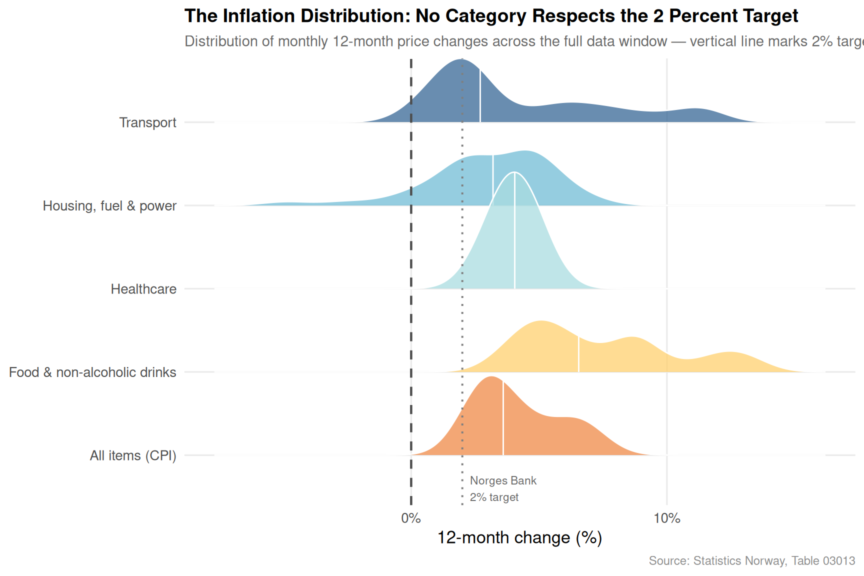
The ridgeline chart is blunt in its message. Across every major consumption category tracked by Statistics Norway, the distribution of 12-month price changes sits overwhelmingly to the right of the Norges Bank’s 2 percent target. Housing, fuel and power has been the most volatile — lurching from deflation to sharp spikes as energy markets swung — while food and healthcare have maintained a persistent upward pressure that does not easily reverse. Transport is the only category whose distribution brushes close to target in its lower tail, but its median remains elevated.
if (!is.null(df2)) {
  series_col  <- "konsumgruppe"
  measure_col <- "statistikkvariabel"

  cpi_cats <- c(
    "Matvarer og alkoholfrie drikkevarer",
    "Bolig, lys og brensel",
    "Transport",
    "Helsepleie",
    "Totalindeks"
  )

  df_db <- df2 |>
    filter(
      .data[[series_col]] %in% cpi_cats,
      .data[[measure_col]] == "12-måneders endring (prosent)"
    ) |>
    group_by(date, .data[[series_col]]) |>
    summarise(value = mean(value, na.rm = TRUE), .groups = "drop") |>
    rename(category = 2) |>
    mutate(
      category = case_when(
        category == "Matvarer og alkoholfrie drikkevarer" ~ "Food & drinks",
        category == "Bolig, lys og brensel"              ~ "Housing & energy",
        category == "Totalindeks"                        ~ "All items",
        category == "Transport"                          ~ "Transport",
        category == "Helsepleie"                         ~ "Healthcare",
        TRUE ~ category
      ),
      year = year(date)
    )

  if (nrow(df_db) == 0) {
    message("Dumbbell filter empty.")
    df_db <- NULL
  }

  if (!is.null(df_db)) {
    # Compare average rate in two periods: earlier 20 obs vs recent 20 obs
    all_dates <- sort(unique(df_db$date))
    n_dates   <- length(all_dates)

    if (n_dates >= 8) {
      mid       <- floor(n_dates / 2)
      early_d   <- all_dates[1:mid]
      recent_d  <- all_dates[(mid + 1):n_dates]

      period_means <- df_db |>
        mutate(period = case_when(
          date %in% early_d  ~ "Earlier period",
          date %in% recent_d ~ "Recent period",
          TRUE ~ NA_character_
        )) |>
        filter(!is.na(period)) |>
        group_by(category, period) |>
        summarise(mean_val = mean(value, na.rm = TRUE), .groups = "drop") |>
        pivot_wider(names_from = period, values_from = mean_val)

      early_label  <- paste0(format(min(early_d),  "%b %Y"), " – ", format(max(early_d),  "%b %Y"))
      recent_label <- paste0(format(min(recent_d), "%b %Y"), " – ", format(max(recent_d), "%b %Y"))

      names(period_means)[2:3] <- c("early", "recent")
      period_means <- period_means |>
        mutate(direction = ifelse(recent > early, "up", "down"))

      pal <- met.brewer("Hiroshige", n = 5)

      p <- ggplot(period_means, aes(y = reorder(category, recent))) +
        geom_segment(aes(x = early, xend = recent, yend = category),
                     colour = "grey70", linewidth = 1.5) +
        geom_point(aes(x = early), colour = pal[4], size = 5) +
        geom_point(aes(x = recent), colour = pal[1], size = 5) +
        geom_text(aes(x = early,  label = sprintf("%.1f%%", early)),
                  nudge_y = 0.35, size = 3.2, colour = pal[4]) +
        geom_text(aes(x = recent, label = sprintf("%.1f%%", recent)),
                  nudge_y = 0.35, size = 3.2, colour = pal[1]) +
        geom_vline(xintercept = 2, linetype = "dashed",
                   colour = "grey40", linewidth = 0.7) +
        annotate("text", x = 2.2, y = 0.6, label = "2% target",
                 size = 3, colour = "grey40", hjust = 0) +
        scale_x_continuous(labels = function(x) paste0(x, "%")) +
        labs(
          title    = "Price Pressure: How Average Inflation Shifted Across the Data Window",
          subtitle = paste0(
            "Average 12-month change: blue dot = ", recent_label,
            ",  orange dot = ", early_label
          ),
          x        = "Average 12-month price change (%)",
          y        = NULL,
          caption  = "Source: Statistics Norway, Table 03013"
        ) +
        theme_minimal(base_size = 13) +
        theme(
          plot.title    = element_text(face = "bold", size = 14),
          plot.subtitle = element_text(size = 10, colour = "grey40"),
          panel.grid.minor  = element_blank(),
          panel.grid.major.y = element_blank(),
          plot.caption  = element_text(colour = "grey55", size = 9)
        )
      print(p)
    }
  }
}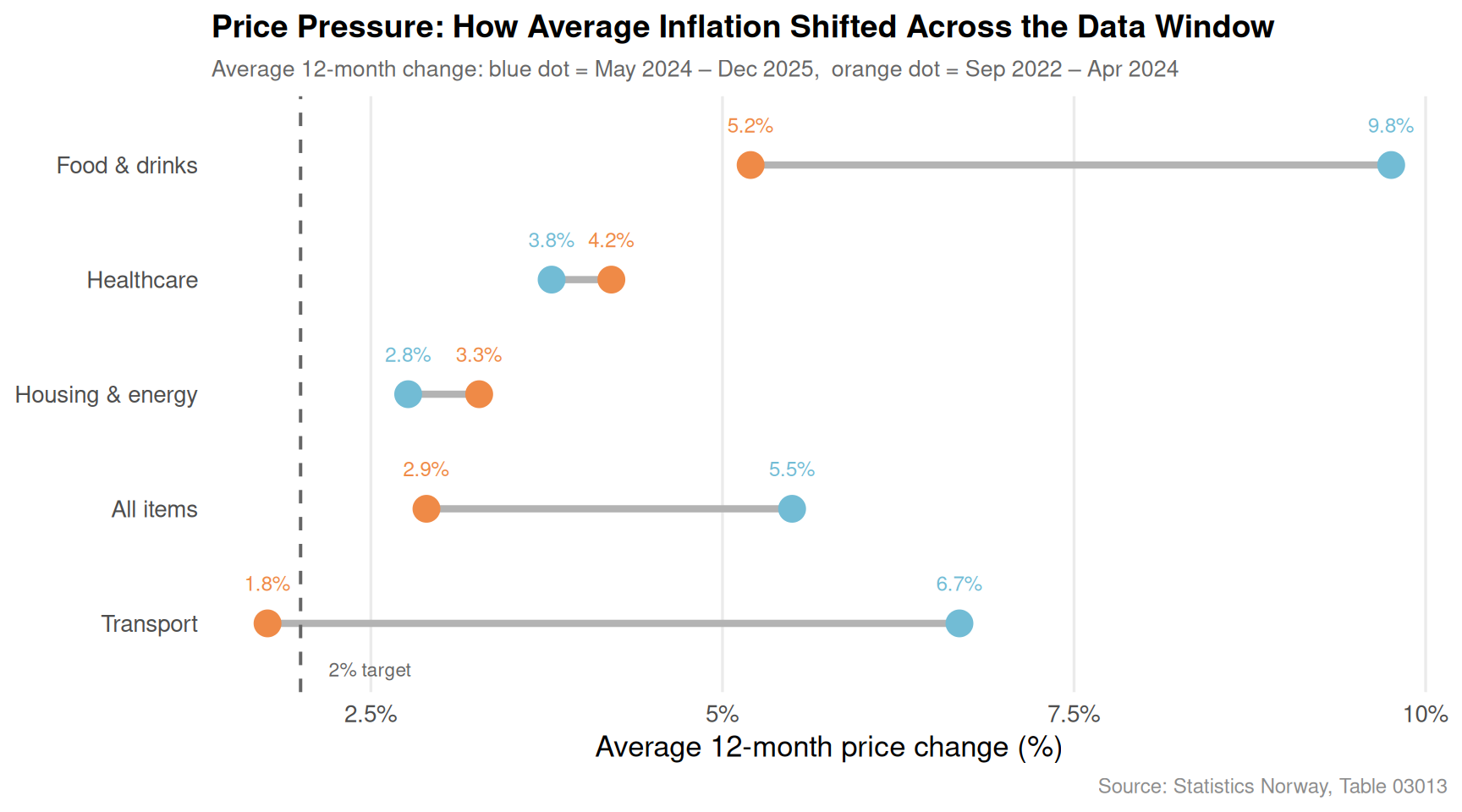
The dumbbell chart captures the directional shift most clearly. Housing and energy costs have been the most brutal in both halves of the observation window, though the comparison reveals some categories easing while others have intensified. Healthcare, often overlooked in popular discussions of inflation, registers a persistent upward drift that is particularly worrying given its largely inelastic nature — families cannot simply buy less healthcare when it gets expensive.
Employment has held firm. The number of employed persons in Norway has remained near its recent peak throughout the data window, a rare demonstration of labour market resilience in a period of global monetary tightening.
Unemployment at the floor. The unemployment rate has stayed anchored close to its 24-month mean with only minor monthly oscillation, suggesting the labour market has yet to crack under the weight of higher interest rates.
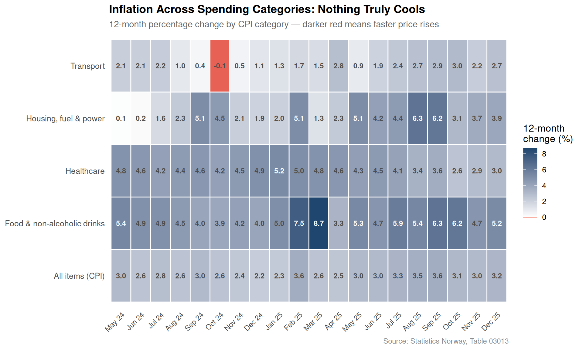
No CPI category respects the 2 percent target. The ridgeline distributions show that every major consumption group — food, housing, energy, transport, healthcare — has spent most of the past three-plus years with 12-month price changes well above Norges Bank’s inflation target.
Housing and energy remain the most volatile and painful. The heatmap and dumbbell charts both flag “Bolig, lys og brensel” as the category generating the most extreme monthly readings, with double-digit annual increases in some periods now leaving a lasting base effect.
Healthcare inflation is the quiet threat. With an above-target average across both periods and demand that cannot be deferred the way discretionary spending can, healthcare price pressure represents a structural drag on household purchasing power that wage growth may struggle to offset.
Norway’s current economic predicament is not one of classical crisis. There is no mass unemployment, no collapsing currency, no sovereign debt spiral. What there is instead is a slower, more insidious squeeze: a labour market that keeps generating jobs and maintaining incomes, but a price environment that quietly consumes real gains month by month.
The structural dimension matters, too. As the working-age population ages and fertility remains below replacement, the tight labour market of today is partly a statistical artefact of a smaller, older workforce approaching participation limits. When demographic pressures eventually ease the demand side of the labour equation — fewer workers chasing roughly similar numbers of jobs — the wage bargaining power that has helped many Norwegians stay afloat in this inflationary environment may weaken precisely when price levels are already baked in at a higher base.
For now, the numbers tell the story of a country running on a very short leash between nominal strength and real erosion.