Code
library(tidyverse)
library(lubridate)
library(PxWebApiData)
library(scales)
library(MetBrewer)
library(ggridges)library(tidyverse)
library(lubridate)
library(PxWebApiData)
library(scales)
library(MetBrewer)
library(ggridges)df1 <- NULL
tryCatch({
raw <- ApiData(
"https://data.ssb.no/api/v0/no/table/09190",
Makrost = TRUE,
ContentsCode = TRUE,
Tid = list(filter = "top", values = 40)
)
tmp <- raw[[1]]
time_col <- "kvartal"
value_col <- "value"
series_col <- "makrostørrelse"
measure_col <- "statistikkvariabel"
df1 <- tmp |>
mutate(
value = as.numeric(.data[[value_col]]),
time_str = .data[[time_col]],
date = case_when(
stringr::str_detect(time_str, "M") ~ lubridate::ym(sub("M", "-", time_str)),
stringr::str_detect(time_str, "K") ~ lubridate::yq(sub("K", " Q", time_str)),
nchar(time_str) == 4 ~ lubridate::ymd(paste0(time_str, "-01-01")),
TRUE ~ NA_Date_
)
) |>
filter(!is.na(value), !is.na(date))
}, error = function(e) message("Fetch failed: ", e$message))df2 <- NULL
tryCatch({
raw <- ApiData(
"https://data.ssb.no/api/v0/no/table/03013",
Konsumgrp = TRUE,
ContentsCode = TRUE,
Tid = list(filter = "top", values = 40)
)
tmp <- raw[[1]]
time_col <- "måned"
value_col <- "value"
series_col <- "konsumgruppe"
measure_col <- "statistikkvariabel"
df2 <- tmp |>
mutate(
value = as.numeric(.data[[value_col]]),
time_str = .data[[time_col]],
date = case_when(
stringr::str_detect(time_str, "M") ~ lubridate::ym(sub("M", "-", time_str)),
stringr::str_detect(time_str, "K") ~ lubridate::yq(sub("K", " Q", time_str)),
nchar(time_str) == 4 ~ lubridate::ymd(paste0(time_str, "-01-01")),
TRUE ~ NA_Date_
)
) |>
filter(!is.na(value), !is.na(date))
}, error = function(e) message("Fetch failed: ", e$message))Something broke in Norwegian household consumption around 2022 and the reverberations have not fully settled. The combination of global supply shocks, energy price explosions, and the fastest interest rate hiking cycle in a generation squeezed Norwegian families from multiple directions simultaneously. Spending volumes fell even as nominal spending rose — the classic inflation trap. This post examines exactly which categories bore the heaviest burden, where prices ran hottest, and whether any relief has emerged in the most recent data from Statistics Norway.
The story told by the national accounts (table 09190) and the Consumer Price Index (table 03013) together is more nuanced than a simple headline inflation number. Some categories — food, energy, housing — saw price surges that crushed real spending. Others, particularly services and leisure, showed surprising resilience in volume even as prices climbed. Understanding this disaggregation matters for anyone trying to read Norway’s economic trajectory into 2026.
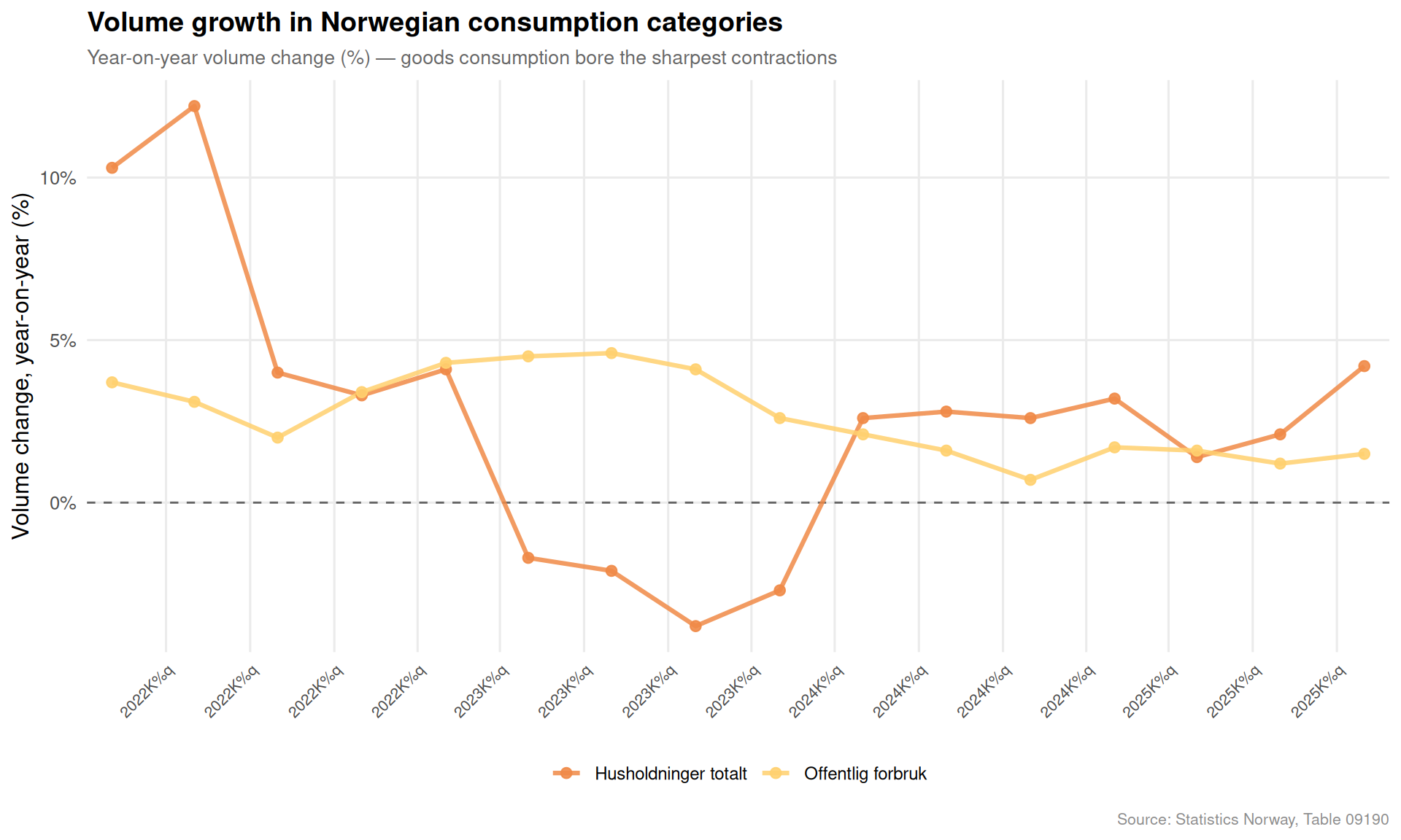
The first question is which consumption categories have seen their real volumes contract. Volume change year-on-year strips out price effects and reveals whether Norwegians are actually buying less.
if (!is.null(df1)) {
  # Filter: volume change measure, household-related series
  vol_series <- c(
    "Konsum i husholdninger og ideelle organisasjoner",
    "Konsum i husholdninger",
    "Varekonsum",
    "Tjenestekonsum",
    "Konsum i offentlig forvaltning"
  )

  df_vol <- df1 |>
    filter(
      .data[["statistikkvariabel"]] == "Volumendring fra samme periode året før (prosent)",
      .data[["makrostørrelse"]] %in% vol_series
    )

  if (nrow(df_vol) == 0) {
    message("Filter empty. Values: ",
            paste(head(unique(df1[["makrostørrelse"]]), 15), collapse = ", "))
    df_vol <- NULL
  }

  if (!is.null(df_vol)) {
    # Use the most recent 16 quarters
    df_vol_plot <- df_vol |>
      group_by(.data[["makrostørrelse"]]) |>
      arrange(date) |>
      slice_tail(n = 16) |>
      ungroup() |>
      mutate(
        label_short = case_when(
          makrostørrelse == "Konsum i husholdninger og ideelle organisasjoner" ~ "Husholdninger totalt",
          makrostørrelse == "Konsum i husholdninger" ~ "Husholdninger (ex. ideelle)",
          makrostørrelse == "Varekonsum" ~ "Varekonsum",
          makrostørrelse == "Tjenestekonsum" ~ "Tjenestekonsum",
          makrostørrelse == "Konsum i offentlig forvaltning" ~ "Offentlig forbruk",
          TRUE ~ makrostørrelse
        ),
        positive = value >= 0
      )

    pal <- met.brewer("Hiroshige", n = 5)

    p1 <- ggplot(df_vol_plot, aes(x = date, y = value, colour = label_short)) +
      geom_hline(yintercept = 0, colour = "grey40", linewidth = 0.5, linetype = "dashed") +
      geom_line(linewidth = 1.1, alpha = 0.85) +
      geom_point(size = 2.2, alpha = 0.9) +
      scale_colour_manual(values = pal) +
      scale_x_date(date_labels = "%YK%q", date_breaks = "3 months",
                   expand = expansion(mult = 0.02)) +
      scale_y_continuous(labels = function(x) paste0(x, "%")) +
      labs(
        title = "Volume growth in Norwegian consumption categories",
        subtitle = "Year-on-year volume change (%) — goods consumption bore the sharpest contractions",
        x = NULL,
        y = "Volume change, year-on-year (%)",
        colour = NULL,
        caption = "Source: Statistics Norway, Table 09190"
      ) +
      theme_minimal(base_size = 12) +
      theme(
        legend.position = "bottom",
        legend.text = element_text(size = 9),
        panel.grid.minor = element_blank(),
        axis.text.x = element_text(angle = 45, hjust = 1, size = 8),
        plot.title = element_text(face = "bold", size = 14),
        plot.subtitle = element_text(colour = "grey40", size = 10),
        plot.caption = element_text(colour = "grey55", size = 8)
      )

    print(p1)
  }
}
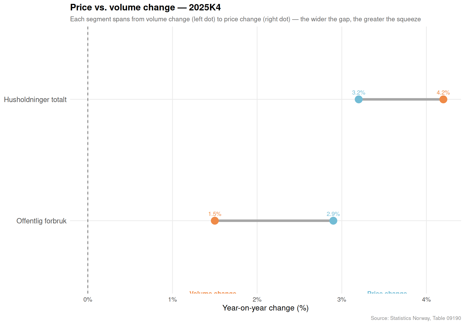
The clearest way to visualise the inflation trap is to place price change and volume change side by side for the same category in the same period. When prices rise while volumes fall, households are paying more for less.
if (!is.null(df1)) {
  target_series <- c(
    "Konsum i husholdninger og ideelle organisasjoner",
    "Varekonsum",
    "Tjenestekonsum",
    "Konsum i offentlig forvaltning"
  )

  df_price <- df1 |>
    filter(
      .data[["statistikkvariabel"]] == "Prisendring fra samme periode året før (prosent)",
      .data[["makrostørrelse"]] %in% target_series
    )

  df_volume <- df1 |>
    filter(
      .data[["statistikkvariabel"]] == "Volumendring fra samme periode året før (prosent)",
      .data[["makrostørrelse"]] %in% target_series
    )

  # Get most recent available quarter common to both
  latest_common <- intersect(
    unique(df_price$time_str),
    unique(df_volume$time_str)
  ) |> sort() |> tail(1)

  df_db <- bind_rows(
    df_price |> filter(time_str == latest_common) |>
      mutate(type = "Prisendring"),
    df_volume |> filter(time_str == latest_common) |>
      mutate(type = "Volumendring")
  ) |>
    mutate(
      label_short = case_when(
        makrostørrelse == "Konsum i husholdninger og ideelle organisasjoner" ~ "Husholdninger totalt",
        makrostørrelse == "Varekonsum" ~ "Varekonsum",
        makrostørrelse == "Tjenestekonsum" ~ "Tjenestekonsum",
        makrostørrelse == "Konsum i offentlig forvaltning" ~ "Offentlig forbruk",
        TRUE ~ makrostørrelse
      )
    )

  if (nrow(df_db) == 0) {
    message("Dumbbell filter empty.")
    df_db <- NULL
  }

  if (!is.null(df_db)) {
    df_wide <- df_db |>
      select(label_short, type, value) |>
      pivot_wider(names_from = type, values_from = value)

    p2 <- ggplot(df_wide) +
      geom_segment(
        aes(x = Volumendring, xend = Prisendring,
            y = reorder(label_short, Prisendring)),
        colour = "grey65", linewidth = 1.8
      ) +
      geom_point(
        aes(x = Volumendring, y = reorder(label_short, Prisendring)),
        colour = met.brewer("Hiroshige", n = 2)[1], size = 5
      ) +
      geom_point(
        aes(x = Prisendring, y = reorder(label_short, Prisendring)),
        colour = met.brewer("Hiroshige", n = 2)[2], size = 5
      ) +
      geom_vline(xintercept = 0, linetype = "dashed", colour = "grey40", linewidth = 0.5) +
      geom_text(
        aes(x = Volumendring, y = reorder(label_short, Prisendring),
            label = paste0(round(Volumendring, 1), "%")),
        vjust = -1.1, size = 3.2, colour = met.brewer("Hiroshige", n = 2)[1]
      ) +
      geom_text(
        aes(x = Prisendring, y = reorder(label_short, Prisendring),
            label = paste0(round(Prisendring, 1), "%")),
        vjust = -1.1, size = 3.2, colour = met.brewer("Hiroshige", n = 2)[2]
      ) +
      annotate("text", x = min(df_wide$Volumendring, na.rm = TRUE) - 0.3,
               y = 0.4, label = "Volume change", colour = met.brewer("Hiroshige", n = 2)[1],
               size = 3.5, fontface = "bold", hjust = 0) +
      annotate("text", x = max(df_wide$Prisendring, na.rm = TRUE) + 0.1,
               y = 0.4, label = "Price change", colour = met.brewer("Hiroshige", n = 2)[2],
               size = 3.5, fontface = "bold", hjust = 0) +
      scale_x_continuous(labels = function(x) paste0(x, "%")) +
      labs(
        title = paste0("Price vs. volume change — ", latest_common),
        subtitle = "Each segment spans from volume change (left dot) to price change (right dot) — the wider the gap, the greater the squeeze",
        x = "Year-on-year change (%)",
        y = NULL,
        caption = "Source: Statistics Norway, Table 09190"
      ) +
      theme_minimal(base_size = 12) +
      theme(
        panel.grid.minor = element_blank(),
        panel.grid.major.y = element_line(colour = "grey92"),
        plot.title = element_text(face = "bold", size = 14),
        plot.subtitle = element_text(colour = "grey40", size = 10),
        plot.caption = element_text(colour = "grey55", size = 8),
        axis.text.y = element_text(size = 11)
      )

    print(p2)
  }
}
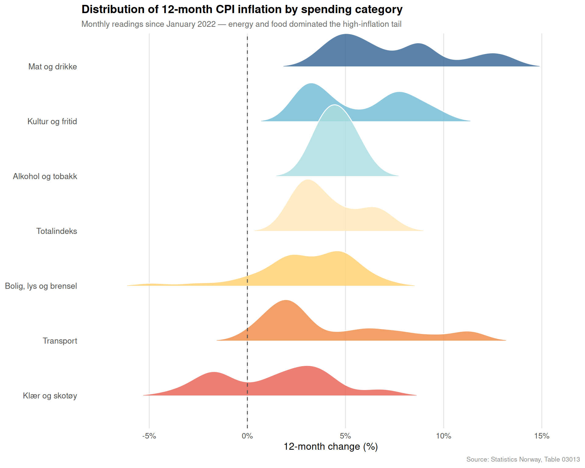
The Consumer Price Index provides monthly granularity that the quarterly national accounts cannot. Looking at the distribution of 12-month inflation readings across major spending categories over the past three years reveals not just peak values but the persistence and shape of each category’s price surge.
if (!is.null(df2)) {
  cpi_series <- c(
    "Totalindeks",
    "Matvarer og alkoholfrie drikkevarer",
    "Alkoholholdige drikkevarer og tobakk",
    "Klær og skotøy",
    "Bolig, lys og brensel",
    "Transport",
    "Kultur og fritid"
  )

  df_12m <- df2 |>
    filter(
      .data[["statistikkvariabel"]] == "12-måneders endring (prosent)",
      .data[["konsumgruppe"]] %in% cpi_series
    )

  if (nrow(df_12m) == 0) {
    message("Ridgeline filter empty. Values: ",
            paste(head(unique(df2[["konsumgruppe"]]), 15), collapse = ", "))
    df_12m <- NULL
  }

  if (!is.null(df_12m)) {
    has_monthly <- any(stringr::str_detect(df_12m$time_str, "M\\d{2}"), na.rm = TRUE)

    if (has_monthly) {
      df_ridge <- df_12m |>
        filter(date >= as.Date("2022-01-01")) |>
        mutate(
          category_label = case_when(
            konsumgruppe == "Totalindeks" ~ "Totalindeks",
            konsumgruppe == "Matvarer og alkoholfrie drikkevarer" ~ "Mat og drikke",
            konsumgruppe == "Alkoholholdige drikkevarer og tobakk" ~ "Alkohol og tobakk",
            konsumgruppe == "Klær og skotøy" ~ "Klær og skotøy",
            konsumgruppe == "Bolig, lys og brensel" ~ "Bolig, lys og brensel",
            konsumgruppe == "Transport" ~ "Transport",
            konsumgruppe == "Kultur og fritid" ~ "Kultur og fritid",
            TRUE ~ konsumgruppe
          ),
          # Reorder: highest median inflation at top
          category_label = fct_reorder(category_label, value, .fun = median, .desc = FALSE)
        )

      ridge_pal <- met.brewer("Hiroshige", n = 7)

      p3 <- ggplot(df_ridge, aes(x = value, y = category_label, fill = category_label)) +
        geom_density_ridges(
          alpha = 0.82,
          scale = 1.3,
          rel_min_height = 0.01,
          bandwidth = 0.8,
          colour = "white"
        ) +
        geom_vline(xintercept = 0, colour = "grey30", linewidth = 0.5, linetype = "dashed") +
        scale_fill_manual(values = ridge_pal, guide = "none") +
        scale_x_continuous(
          labels = function(x) paste0(x, "%"),
          breaks = seq(-10, 25, by = 5)
        ) +
        labs(
          title = "Distribution of 12-month CPI inflation by spending category",
          subtitle = "Monthly readings since January 2022 — energy and food dominated the high-inflation tail",
          x = "12-month change (%)",
          y = NULL,
          caption = "Source: Statistics Norway, Table 03013"
        ) +
        theme_minimal(base_size = 12) +
        theme(
          panel.grid.minor = element_blank(),
          panel.grid.major.y = element_blank(),
          panel.grid.major.x = element_line(colour = "grey90"),
          plot.title = element_text(face = "bold", size = 14),
          plot.subtitle = element_text(colour = "grey40", size = 10),
          plot.caption = element_text(colour = "grey55", size = 8),
          axis.text.y = element_text(size = 10)
        )

      print(p3)
    } else {
      message("Monthly data not detected — skipping ridgeline chart.")
    }
  }
}
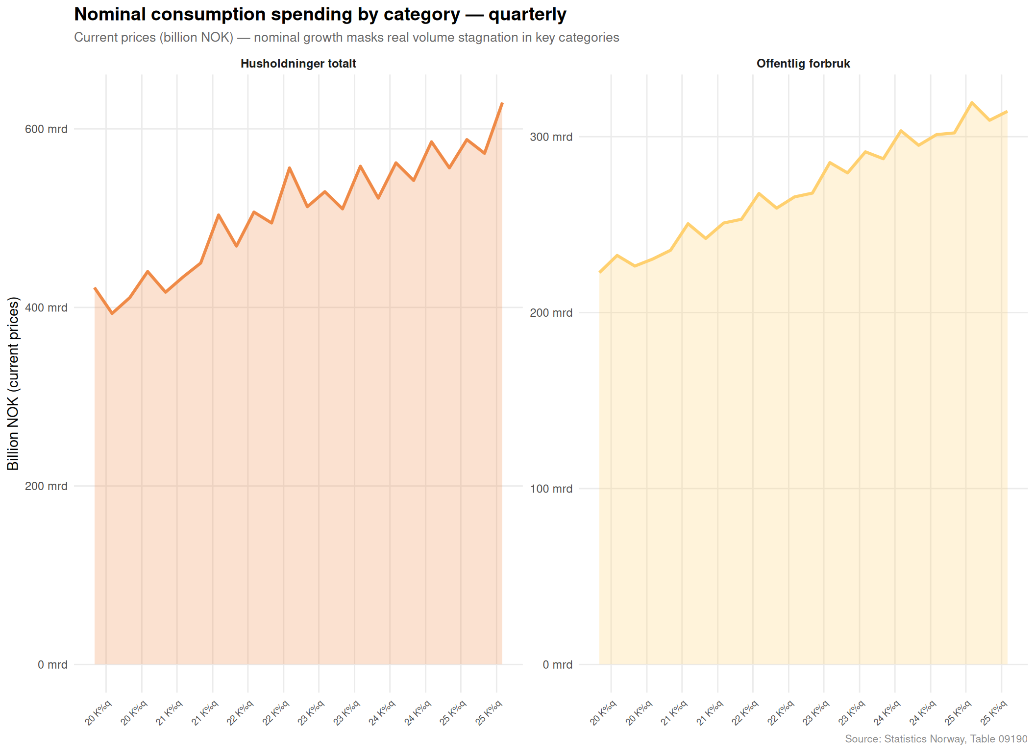
Looking at nominal spending levels — current prices in billions of kroner — across the main consumption categories reveals which ones have grown fastest in cash terms and where spending appears to be plateauing.
if (!is.null(df1)) {
  nom_series <- c(
    "Konsum i husholdninger og ideelle organisasjoner",
    "Konsum i husholdninger",
    "Varekonsum",
    "Tjenestekonsum",
    "Konsum i offentlig forvaltning"
  )

  df_nom <- df1 |>
    filter(
      .data[["statistikkvariabel"]] == "Løpende priser (mill. kr)",
      .data[["makrostørrelse"]] %in% nom_series
    )

  if (nrow(df_nom) == 0) {
    message("Small multiples filter empty. Values: ",
            paste(head(unique(df1[["makrostørrelse"]]), 15), collapse = ", "))
    df_nom <- NULL
  }

  if (!is.null(df_nom)) {
    df_nom_plot <- df_nom |>
      group_by(.data[["makrostørrelse"]]) |>
      arrange(date) |>
      slice_tail(n = 24) |>
      ungroup() |>
      mutate(
        label_short = case_when(
          makrostørrelse == "Konsum i husholdninger og ideelle organisasjoner" ~ "Husholdninger totalt",
          makrostørrelse == "Konsum i husholdninger" ~ "Husholdninger\n(ex. ideelle)",
          makrostørrelse == "Varekonsum" ~ "Varekonsum",
          makrostørrelse == "Tjenestekonsum" ~ "Tjenestekonsum",
          makrostørrelse == "Konsum i offentlig forvaltning" ~ "Offentlig forbruk",
          TRUE ~ makrostørrelse
        ),
        value_bn = value / 1000  # convert mill. kr to bn. kr
      )

    sm_pal <- met.brewer("Hiroshige", n = 5)
    names(sm_pal) <- unique(df_nom_plot$label_short)

    p4 <- ggplot(df_nom_plot, aes(x = date, y = value_bn, fill = label_short, colour = label_short)) +
      geom_area(alpha = 0.25) +
      geom_line(linewidth = 1.1) +
      facet_wrap(~ label_short, scales = "free_y", ncol = 3) +
      scale_fill_manual(values = sm_pal, guide = "none") +
      scale_colour_manual(values = sm_pal, guide = "none") +
      scale_x_date(date_labels = "%y K%q", date_breaks = "6 months") +
      scale_y_continuous(labels = function(x) paste0(round(x, 0), " mrd")) +
      labs(
        title = "Nominal consumption spending by category — quarterly",
        subtitle = "Current prices (billion NOK) — nominal growth masks real volume stagnation in key categories",
        x = NULL,
        y = "Billion NOK (current prices)",
        caption = "Source: Statistics Norway, Table 09190"
      ) +
      theme_minimal(base_size = 11) +
      theme(
        strip.text = element_text(face = "bold", size = 9),
        panel.grid.minor = element_blank(),
        axis.text.x = element_text(angle = 45, hjust = 1, size = 7),
        plot.title = element_text(face = "bold", size = 14),
        plot.subtitle = element_text(colour = "grey40", size = 10),
        plot.caption = element_text(colour = "grey55", size = 8)
      )

    print(p4)
  }
}
A clean summary of where inflation stands right now — the most recent monthly reading for each major spending category in the CPI.
if (!is.null(df2)) {
  cpi_series2 <- c(
    "Totalindeks",
    "Matvarer og alkoholfrie drikkevarer",
    "Alkoholholdige drikkevarer og tobakk",
    "Klær og skotøy",
    "Bolig, lys og brensel",
    "Transport",
    "Kultur og fritid"
  )

  df_latest_cpi <- df2 |>
    filter(
      .data[["statistikkvariabel"]] == "12-måneders endring (prosent)",
      .data[["konsumgruppe"]] %in% cpi_series2
    )

  if (nrow(df_latest_cpi) == 0) {
    message("Lollipop filter empty. Values: ",
            paste(head(unique(df2[["konsumgruppe"]]), 15), collapse = ", "))
    df_latest_cpi <- NULL
  }

  if (!is.null(df_latest_cpi)) {
    df_lollipop <- df_latest_cpi |>
      group_by(.data[["konsumgruppe"]]) |>
      filter(date == max(date)) |>
      ungroup() |>
      mutate(
        category_label = case_when(
          konsumgruppe == "Totalindeks" ~ "Totalindeks",
          konsumgruppe == "Matvarer og alkoholfrie drikkevarer" ~ "Mat og alkoholfrie drikker",
          konsumgruppe == "Alkoholholdige drikkevarer og tobakk" ~ "Alkohol og tobakk",
          konsumgruppe == "Klær og skotøy" ~ "Klær og skotøy",
          konsumgruppe == "Bolig, lys og brensel" ~ "Bolig, lys og brensel",
          konsumgruppe == "Transport" ~ "Transport",
          konsumgruppe == "Kultur og fritid" ~ "Kultur og fritid",
          TRUE ~ konsumgruppe
        ),
        category_label = fct_reorder(category_label, value),
        above_total = value > value[konsumgruppe == "Totalindeks"]
      )

    latest_month <- format(max(df_lollipop$date), "%B %Y")

    total_val <- df_lollipop |>
      filter(konsumgruppe == "Totalindeks") |>
      pull(value)

    lol_col_high <- met.brewer("Hiroshige", n = 5)[1]
    lol_col_low  <- met.brewer("Hiroshige", n = 5)[4]
    lol_col_ref  <- "grey50"

    p5 <- ggplot(df_lollipop, aes(x = value, y = category_label)) +
      geom_vline(xintercept = 0, colour = "grey70", linewidth = 0.5, linetype = "dashed") +
      geom_vline(xintercept = total_val, colour = "grey50", linewidth = 0.8, linetype = "dotted") +
      annotate(
        "text", x = total_val + 0.15, y = 0.6,
        label = paste0("Totalindeks: ", round(total_val, 1), "%"),
        colour = "grey40", size = 3.2, hjust = 0, fontface = "italic"
      ) +
      geom_segment(
        aes(x = 0, xend = value, y = category_label, yend = category_label,
            colour = above_total),
        linewidth = 1.5, alpha = 0.75
      ) +
      geom_point(
        aes(colour = above_total),
        size = 5
      ) +
      geom_text(
        aes(label = paste0(round(value, 1), "%")),
        hjust = -0.35, size = 3.4, fontface = "bold", colour = "grey20"
      ) +
      scale_colour_manual(
        values = c("TRUE" = lol_col_high, "FALSE" = lol_col_low),
        labels = c("TRUE" = "Above headline", "FALSE" = "Below headline"),
        name = NULL
      ) +
      scale_x_continuous(
        labels = function(x) paste0(x, "%"),
        expand = expansion(mult = c(0.05, 0.12))
      ) +
      labs(
        title = paste0("12-month CPI change by spending category — ", latest_month),
        subtitle = "Categories above the dotted line (headline rate) are pushing overall inflation upward",
        x = "12-month change (%)",
        y = NULL,
        caption = "Source: Statistics Norway, Table 03013"
      ) +
      theme_minimal(base_size = 12) +
      theme(
        legend.position = "bottom",
        panel.grid.major.y = element_blank(),
        panel.grid.minor = element_blank(),
        panel.grid.major.x = element_line(colour = "grey92"),
        plot.title = element_text(face = "bold", size = 14),
        plot.subtitle = element_text(colour = "grey40", size = 10),
        plot.caption = element_text(colour = "grey55", size = 8),
        axis.text.y = element_text(size = 11)
      )

    print(p5)
  }
}
Error in `scale_y_continuous()`:
! Discrete value supplied to a continuous scale.
ℹ Example values: Totalindeks, Mat og alkoholfrie drikker, Alkohol og tobakk,
Klær og skotøy, and Bolig, lys og brensel.Goods consumption collapsed in real terms while service consumption proved far more resilient — Norwegian households cut back on physical purchases but maintained spending on services such as restaurants, travel and cultural activities even as prices rose.
The price-volume scissors effect was most severe in goods: price increases in the high single digits coincided with volume contractions, meaning households were simultaneously poorer in real terms and paying more in nominal terms.
Energy and housing dominated the CPI distribution’s upper tail, with monthly 12-month readings for “Bolig, lys og brensel” reaching extreme values during 2022–2023 before cooling somewhat — yet the distribution remains skewed well above other categories.
Food inflation proved more persistent than energy inflation: while energy prices have partially normalised, food price readings have remained elevated and above the headline rate for an extended period, creating a sustained drag on lower-income households.
Public consumption grew steadily in nominal terms throughout the period, providing a stabilising force in the aggregate GDP accounts even as private household spending stagnated in real terms — a deliberate fiscal buffer that has cushioned the domestic demand slowdown.
The fracture in Norwegian household consumption is not merely a statistical curiosity — it represents a genuine redistribution of welfare. When prices rise faster than volumes fall, the aggregate national accounts can look deceptively healthy even as millions of households experience material hardship. The divergence between goods and services consumption suggests a rational but painful adjustment: Norwegians have cut the things they can cut (physical goods, discretionary purchases) while maintaining the things they cannot easily do without (housing, transport, food).
The broader question is whether the disinflation now showing in some categories will feed through quickly enough to restore real purchasing power before the cumulative damage to household balance sheets becomes self-reinforcing. With interest rates still elevated and the housing market under pressure, Norway’s consumption engine has more repairing to do before it hums again at full capacity.