Code
library(tidyverse)
library(lubridate)
library(PxWebApiData)
library(scales)
library(ggridges)
library(MetBrewer)library(tidyverse)
library(lubridate)
library(PxWebApiData)
library(scales)
library(ggridges)
library(MetBrewer)Norway’s economy presents a genuine puzzle. Unemployment remains historically low, the labour force is broadly intact, and wages have risen. Yet household spending — adjusted for inflation — tells a far grimmer story. Real consumption has barely moved for several years, eroded by persistent price increases across food, services, and everyday goods. How can people be employed and still feel poorer? The answer lies in the gap between nominal and real: a gap that statistics reveal with uncomfortable clarity.
df1 <- NULL
tryCatch({
  raw <- ApiData(
    "https://data.ssb.no/api/v0/no/table/09190",
    Makrost = TRUE,
    Tid = list(filter = "top", values = 40)
  )
  tmp          <- raw[[1]]
  time_col     <- "kvartal"
  value_col    <- "value"
  series_col   <- "makrostørrelse"
  measure_col  <- "statistikkvariabel"
  df1 <- tmp |>
    mutate(
      value    = as.numeric(.data[[value_col]]),
      time_str = .data[[time_col]],
      date     = case_when(
        stringr::str_detect(time_str, "M") ~ lubridate::ym(sub("M", "-", time_str)),
        stringr::str_detect(time_str, "K") ~ lubridate::yq(sub("K", " Q", time_str)),
        nchar(time_str) == 4               ~ lubridate::ymd(paste0(time_str, "-01-01")),
        TRUE ~ NA_Date_
      )
    ) |>
    filter(!is.na(value), !is.na(date))
}, error = function(e) message("Fetch failed: ", e$message))df2 <- NULL
tryCatch({
raw <- ApiData(
"https://data.ssb.no/api/v0/no/table/05110",
ArbStyrkStatus = TRUE,
Kjonn = TRUE,
Alder = TRUE,
Tid = list(filter = "top", values = 40)
)
tmp <- raw[[1]]
time_col <- "kvartal"
value_col <- "value"
series_col <- "arbeidsstyrkestatus"
measure_col <- "statistikkvariabel"
df2 <- tmp |>
mutate(
value = as.numeric(.data[[value_col]]),
time_str = .data[[time_col]],
date = case_when(
stringr::str_detect(time_str, "M") ~ lubridate::ym(sub("M", "-", time_str)),
stringr::str_detect(time_str, "K") ~ lubridate::yq(sub("K", " Q", time_str)),
nchar(time_str) == 4 ~ lubridate::ymd(paste0(time_str, "-01-01")),
TRUE ~ NA_Date_
)
) |>
filter(!is.na(value), !is.na(date))
}, error = function(e) message("Fetch failed: ", e$message))df3 <- NULL
tryCatch({
raw <- ApiData(
"https://data.ssb.no/api/v0/no/table/14700",
VareTjenesteGrp = TRUE,
Tid = list(filter = "top", values = 40)
)
tmp <- raw[[1]]
time_col <- "måned"
value_col <- "value"
series_col <- "vare- og tjenestegruppe"
measure_col <- "statistikkvariabel"
df3 <- tmp |>
mutate(
value = as.numeric(.data[[value_col]]),
time_str = .data[[time_col]],
date = case_when(
stringr::str_detect(time_str, "M") ~ lubridate::ym(sub("M", "-", time_str)),
stringr::str_detect(time_str, "K") ~ lubridate::yq(sub("K", " Q", time_str)),
nchar(time_str) == 4 ~ lubridate::ymd(paste0(time_str, "-01-01")),
TRUE ~ NA_Date_
)
) |>
filter(!is.na(value), !is.na(date))
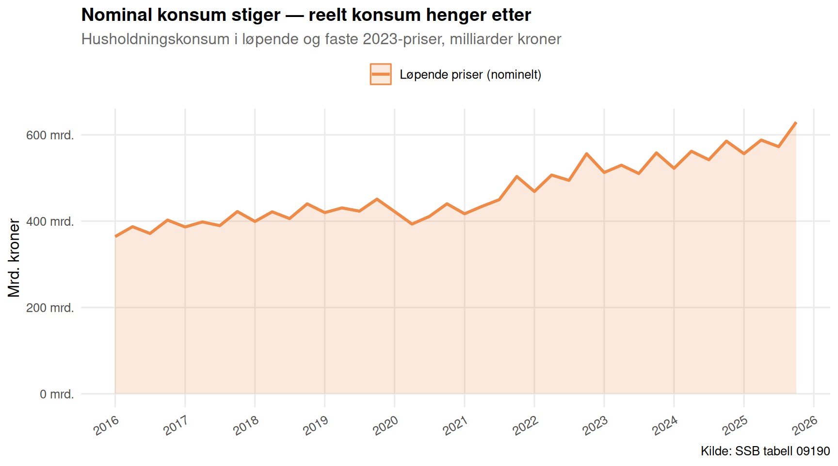
}, error = function(e) message("Fetch failed: ", e$message))The most powerful way to see the household squeeze is to place nominal and real household consumption side by side. At current prices, spending looks healthy — a gently rising line. At fixed 2023 prices, the picture dims considerably, revealing quarters where real consumption has barely advanced or even retreated. The gap between those two lines is, in effect, the amount inflation has stolen from Norwegian living standards.
if (!is.null(df1)) {
  pal <- met.brewer("Hiroshige", n = 4)

  df1_hush <- df1 |>
    filter(
      .data[["makrostørrelse"]] == "Konsum i husholdninger og ideelle organisasjoner",
      .data[["statistikkvariabel"]] %in% c(
        "Løpende priser (mill. kr)",
        "Faste 2023-priser (mill. kr)"
      )
    )

  if (nrow(df1_hush) == 0) {
    message("Filter empty. Values: ",
            paste(head(unique(df1[["makrostørrelse"]]), 15), collapse = ", "))
    df1_hush <- NULL
  }

  if (!is.null(df1_hush)) {
    df1_hush <- df1_hush |>
      mutate(measure_label = case_when(
        .data[["statistikkvariabel"]] == "Løpende priser (mill. kr)"    ~ "Løpende priser (nominelt)",
        .data[["statistikkvariabel"]] == "Faste 2023-priser (mill. kr)" ~ "Faste 2023-priser (reelt)"
      ))

    p1 <- ggplot(df1_hush, aes(x = date, y = value / 1000, colour = measure_label, fill = measure_label)) +
      geom_area(alpha = 0.18, position = "identity") +
      geom_line(linewidth = 1.1) +
      scale_colour_manual(values = c("Løpende priser (nominelt)" = pal[1],
                                     "Faste 2023-priser (reelt)"  = pal[4])) +
      scale_fill_manual(values  = c("Løpende priser (nominelt)" = pal[1],
                                     "Faste 2023-priser (reelt)"  = pal[4])) +
      scale_x_date(date_breaks = "1 year", date_labels = "%Y") +
      scale_y_continuous(labels = label_number(suffix = " mrd.", big.mark = " ")) +
      labs(
        title    = "Nominal konsum stiger — reelt konsum henger etter",
        subtitle = "Husholdningskonsum i løpende og faste 2023-priser, milliarder kroner",
        x        = NULL,
        y        = "Mrd. kroner",
        colour   = NULL,
        fill     = NULL,
        caption  = "Kilde: SSB tabell 09190"
      ) +
      theme_minimal(base_size = 12) +
      theme(
        legend.position  = "top",
        panel.grid.minor = element_blank(),
        plot.title       = element_text(face = "bold", size = 14),
        plot.subtitle    = element_text(colour = "grey40"),
        axis.text.x      = element_text(angle = 30, hjust = 1)
      )
    print(p1)
  }
}
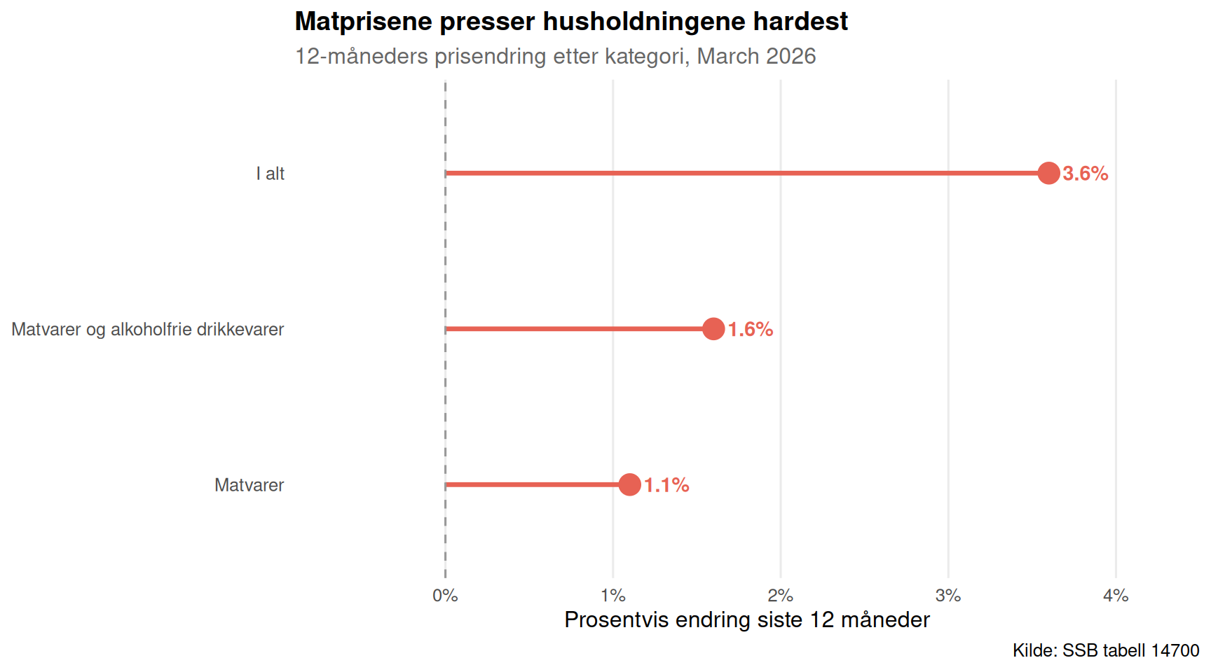
Consumer prices are the engine behind the squeeze. The SSB consumer price index (14700) tracks dozens of categories monthly, making it possible to see exactly where price pressure has been most acute. The 12-month change for food and non-alcoholic beverages is a particularly sharp signal — households have limited ability to substitute away from bread, cereals, and basic foodstuffs, so persistent food inflation bites hardest at the bottom of the income distribution.
if (!is.null(df3)) {
  has_monthly <- any(stringr::str_detect(df3$time_str, "M\\d{2}"), na.rm = TRUE)

  if (has_monthly) {
    pal2 <- met.brewer("Hiroshige", n = 6)

    df3_12m <- df3 |>
      filter(.data[["statistikkvariabel"]] == "12-måneders endring (prosent)") |>
      filter(.data[["vare- og tjenestegruppe"]] %in% c(
        "I alt",
        "Matvarer og alkoholfrie drikkevarer",
        "Brød og kornprodukter",
        "Matvarer"
      ))

    if (nrow(df3_12m) == 0) {
      message("Filter empty. Values: ",
              paste(head(unique(df3[["vare- og tjenestegruppe"]]), 15), collapse = ", "))
      df3_12m <- NULL
    }

    if (!is.null(df3_12m)) {
      # Get the most recent date with all four series
      latest_date <- df3_12m |>
        group_by(date) |>
        summarise(n = n(), .groups = "drop") |>
        filter(n == max(n)) |>
        slice_max(date, n = 1) |>
        pull(date)

      df3_snap <- df3_12m |>
        filter(date == latest_date) |>
        arrange(value) |>
        mutate(
          category = factor(.data[["vare- og tjenestegruppe"]],
                            levels = .data[["vare- og tjenestegruppe"]]),
          colour_flag = if_else(value > 0, "opp", "ned")
        )

      p2 <- ggplot(df3_snap, aes(x = value, y = category, colour = colour_flag)) +
        geom_segment(aes(x = 0, xend = value, y = category, yend = category),
                     linewidth = 1.2) +
        geom_point(size = 5) +
        geom_vline(xintercept = 0, colour = "grey60", linetype = "dashed") +
        geom_text(aes(label = paste0(round(value, 1), "%")),
                  hjust = if_else(df3_snap$value >= 0, -0.3, 1.3),
                  size = 3.8, fontface = "bold") +
        scale_colour_manual(values = c("opp" = pal2[1], "ned" = pal2[6]),
                            guide = "none") +
        scale_x_continuous(labels = label_number(suffix = "%"),
                           expand = expansion(mult = c(0.25, 0.25))) +
        labs(
          title    = "Matprisene presser husholdningene hardest",
          subtitle = paste0("12-måneders prisendring etter kategori, ", format(latest_date, "%B %Y")),
          x        = "Prosentvis endring siste 12 måneder",
          y        = NULL,
          caption  = "Kilde: SSB tabell 14700"
        ) +
        theme_minimal(base_size = 12) +
        theme(
          panel.grid.minor  = element_blank(),
          panel.grid.major.y = element_blank(),
          plot.title        = element_text(face = "bold", size = 14),
          plot.subtitle     = element_text(colour = "grey40")
        )
      print(p2)
    }
  }
}
The most decisive indicator of the consumer squeeze is the volume change in household consumption compared with the same quarter a year earlier. When this figure dips below zero, Norwegians are literally buying less in real terms — not just paying more for the same things. A small-multiples view across the sub-categories of household consumption (goods versus services) reveals where the belt-tightening has landed.
if (!is.null(df1)) {
  pal3 <- met.brewer("Hiroshige", n = 5)

  df1_vol <- df1 |>
    filter(
      .data[["makrostørrelse"]] %in% c(
        "Konsum i husholdninger og ideelle organisasjoner",
        "Konsum i husholdninger",
        "Varekonsum",
        "Tjenestekonsum"
      ),
      .data[["statistikkvariabel"]] == "Volumendring fra samme periode året før (prosent)"
    )

  if (nrow(df1_vol) == 0) {
    message("Filter empty. Values: ",
            paste(head(unique(df1[["makrostørrelse"]]), 15), collapse = ", "))
    df1_vol <- NULL
  }

  if (!is.null(df1_vol)) {
    df1_vol <- df1_vol |>
      mutate(
        series_label = .data[["makrostørrelse"]],
        bar_colour   = if_else(value >= 0, pal3[1], pal3[5])
      )

    p3 <- ggplot(df1_vol, aes(x = date, y = value, fill = value >= 0)) +
      geom_col(width = 70) +
      geom_hline(yintercept = 0, colour = "grey30", linewidth = 0.5) +
      facet_wrap(~ series_label, ncol = 2, scales = "free_y") +
      scale_fill_manual(values = c(`TRUE` = pal3[1], `FALSE` = pal3[5]),
                        guide = "none") +
      scale_x_date(date_breaks = "2 years", date_labels = "%Y") +
      scale_y_continuous(labels = label_number(suffix = "%")) +
      labs(
        title    = "Varekonsumet faller — tjenestekonsumet holder stand",
        subtitle = "Volumendring fra samme kvartal året før, prosent",
        x        = NULL,
        y        = "Volumendring (%)",
        caption  = "Kilde: SSB tabell 09190"
      ) +
      theme_minimal(base_size = 11) +
      theme(
        panel.grid.minor  = element_blank(),
        strip.text        = element_text(face = "bold", size = 9),
        plot.title        = element_text(face = "bold", size = 14),
        plot.subtitle     = element_text(colour = "grey40"),
        axis.text.x       = element_text(angle = 30, hjust = 1)
      )
    print(p3)
  }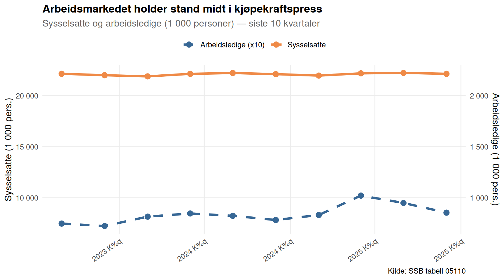
}If consumption is falling in real terms, conventional economics predicts rising unemployment. Norway largely defies that prediction. The Labour Force Survey (table 05110) shows the employed population, the labour force, and the unemployed across ten quarters. A dumbbell chart comparing employed versus unemployed persons — aggregated across sexes, for the working-age population — makes the paradox vivid: the labour market has remained unusually resilient even as real spending weakened.
if (!is.null(df2)) {
  pal4 <- met.brewer("Hiroshige", n = 5)

  # Filter to total across sexes and ages, persons (1 000)
  df2_agg <- df2 |>
    filter(
      .data[["arbeidsstyrkestatus"]] %in% c("Sysselsatte", "Arbeidsledige"),
      .data[["statistikkvariabel"]] == "Personer (1 000 personer)"
    )

  if (nrow(df2_agg) == 0) {
    message("Filter empty. df2 series_col values: ",
            paste(head(unique(df2[["arbeidsstyrkestatus"]]), 15), collapse = ", "))
    df2_agg <- NULL
  }

  if (!is.null(df2_agg)) {
    # Aggregate over kjønn and alder to get totals
    df2_tot <- df2_agg |>
      group_by(date, time_str, .data[["arbeidsstyrkestatus"]]) |>
      summarise(value = sum(value, na.rm = TRUE), .groups = "drop")

    # Keep the last 10 quarters for readability
    recent_dates <- df2_tot |>
      distinct(date) |>
      arrange(desc(date)) |>
      slice_head(n = 10) |>
      pull(date)

    df2_wide <- df2_tot |>
      filter(date %in% recent_dates) |>
      pivot_wider(names_from = "arbeidsstyrkestatus", values_from = value) |>
      arrange(date) |>
      mutate(quarter_label = format(date, "%Y K%q"))

    # Dumbbell: employed on right, unemployed scaled on left
    # Show employed in thousands and unemployed on same panel
    df2_long <- df2_tot |>
      filter(date %in% recent_dates) |>
      mutate(quarter_label = format(date, "%Y K%q")) |>
      mutate(quarter_label = factor(quarter_label, levels = rev(sort(unique(quarter_label)))))

    p4 <- ggplot() +
      geom_line(
        data = df2_long |> filter(.data[["arbeidsstyrkestatus"]] == "Sysselsatte"),
        aes(x = date, y = value, colour = "Sysselsatte"),
        linewidth = 1.4
      ) +
      geom_point(
        data = df2_long |> filter(.data[["arbeidsstyrkestatus"]] == "Sysselsatte"),
        aes(x = date, y = value, colour = "Sysselsatte"),
        size = 3
      ) +
      geom_line(
        data = df2_long |> filter(.data[["arbeidsstyrkestatus"]] == "Arbeidsledige"),
        aes(x = date, y = value * 10, colour = "Arbeidsledige (x10)"),
        linewidth = 1.4, linetype = "dashed"
      ) +
      geom_point(
        data = df2_long |> filter(.data[["arbeidsstyrkestatus"]] == "Arbeidsledige"),
        aes(x = date, y = value * 10, colour = "Arbeidsledige (x10)"),
        size = 3
      ) +
      scale_colour_manual(
        values = c("Sysselsatte" = pal4[1], "Arbeidsledige (x10)" = pal4[5])
      ) +
      scale_x_date(date_breaks = "6 months", date_labels = "%Y K%q") +
      scale_y_continuous(
        name     = "Sysselsatte (1 000 pers.)",
        labels   = label_number(big.mark = " "),
        sec.axis = sec_axis(~ . / 10,
                            name   = "Arbeidsledige (1 000 pers.)",
                            labels = label_number(big.mark = " "))
      ) +
      labs(
        title    = "Arbeidsmarkedet holder stand midt i kjøpekraftspress",
        subtitle = "Sysselsatte og arbeidsledige (1 000 personer) — siste 10 kvartaler",
        x        = NULL,
        colour   = NULL,
        caption  = "Kilde: SSB tabell 05110"
      ) +
      theme_minimal(base_size = 12) +
      theme(
        legend.position   = "top",
        panel.grid.minor  = element_blank(),
        plot.title        = element_text(face = "bold", size = 14),
        plot.subtitle     = element_text(colour = "grey40"),
        axis.text.x       = element_text(angle = 35, hjust = 1)
      )
    print(p4)
  }
}
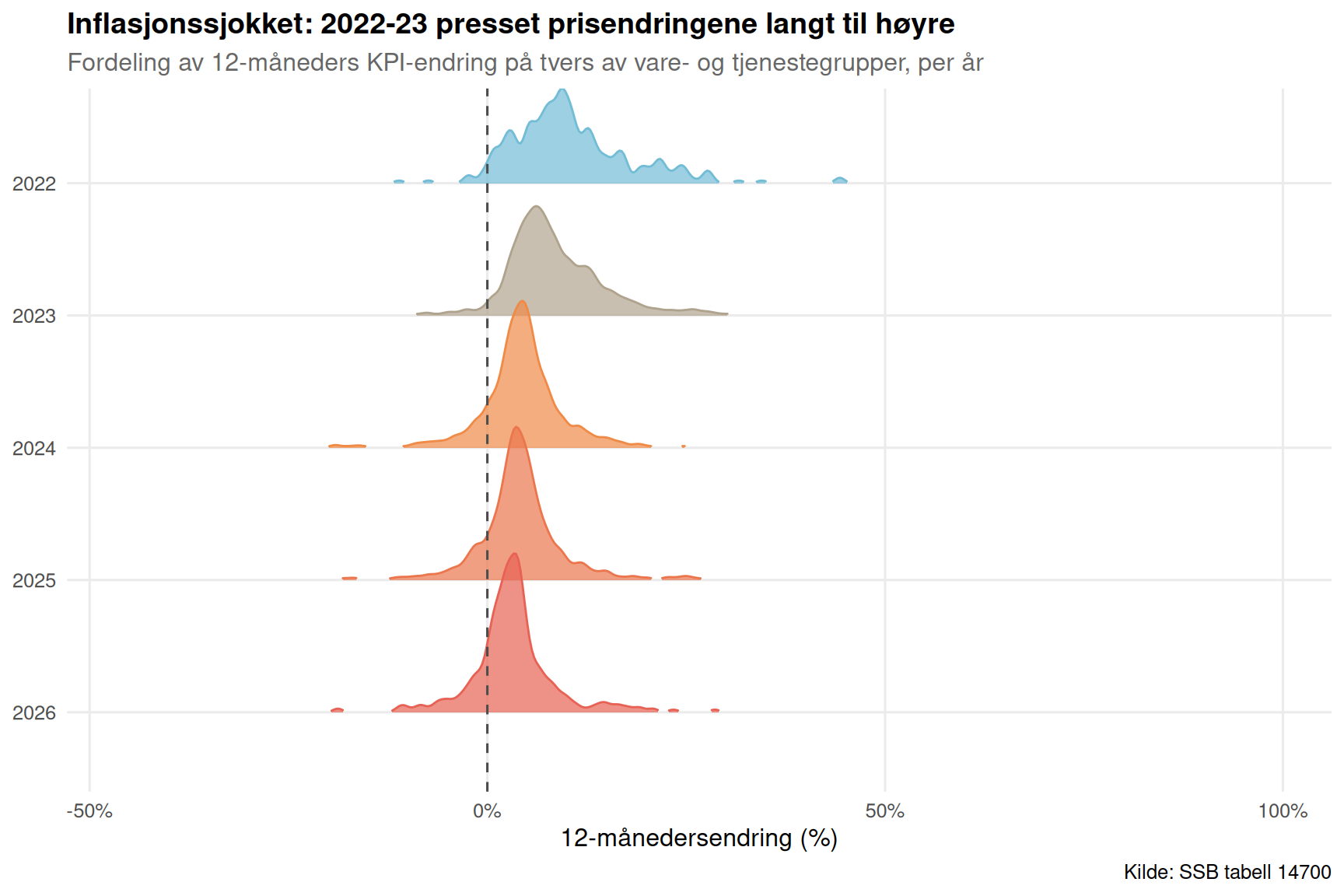
Monthly price data from table 14700 allows a final, textural look at how inflation has distributed itself over time. A ridgeline chart — one ridge per year of available data — shows the distribution of monthly 12-month price changes across the tracked categories. Years with wide, right-skewed distributions were the worst for households; a narrowing distribution would signal relief arriving.
if (!is.null(df3)) {
  has_monthly <- any(stringr::str_detect(df3$time_str, "M\\d{2}"), na.rm = TRUE)

  if (has_monthly) {
    pal5 <- met.brewer("Hiroshige", n = 8)

    df3_ridge <- df3 |>
      filter(.data[["statistikkvariabel"]] == "12-måneders endring (prosent)") |>
      mutate(year = as.integer(format(date, "%Y"))) |>
      filter(year >= 2019, !is.na(value))

    if (nrow(df3_ridge) == 0) {
      message("Ridge filter empty.")
      df3_ridge <- NULL
    }

    if (!is.null(df3_ridge)) {
      years_present <- sort(unique(df3_ridge$year))
      year_pal <- setNames(
        colorRampPalette(c(pal5[6], pal5[2], pal5[1]))(length(years_present)),
        as.character(years_present)
      )

      df3_ridge <- df3_ridge |>
        mutate(year_f = factor(year, levels = rev(years_present)))

      p5 <- ggplot(df3_ridge, aes(x = value, y = year_f, fill = year_f, colour = year_f)) +
        geom_density_ridges(
          alpha       = 0.7,
          bandwidth   = 0.6,
          scale       = 1.2,
          rel_min_height = 0.01
        ) +
        geom_vline(xintercept = 0, colour = "grey30", linetype = "dashed") +
        scale_fill_manual(values  = rev(year_pal), guide = "none") +
        scale_colour_manual(values = rev(year_pal), guide = "none") +
        scale_x_continuous(labels = label_number(suffix = "%")) +
        labs(
          title    = "Inflasjonssjokket: 2022-23 presset prisendringene langt til høyre",
          subtitle = "Fordeling av 12-måneders KPI-endring på tvers av vare- og tjenestegrupper, per år",
          x        = "12-månedersendring (%)",
          y        = NULL,
          caption  = "Kilde: SSB tabell 14700"
        ) +
        theme_minimal(base_size = 12) +
        theme(
          panel.grid.minor = element_blank(),
          plot.title       = element_text(face = "bold", size = 14),
          plot.subtitle    = element_text(colour = "grey40")
        )
      print(p5)
    }
  }
}
The nominal-real gap is widening. Household consumption measured at current prices continues rising, but at fixed 2023 prices the trajectory is far flatter — meaning a growing share of every krone spent goes to inflation rather than additional goods or services.
Goods consumption has contracted in real terms. The volume change series for “Varekonsum” has dipped negative in multiple quarters, while “Tjenestekonsum” has been more resilient, reflecting the difficulty of cutting services like heating and transport.
Food inflation remains elevated. The 12-month change in consumer prices for food and non-alcoholic beverages has consistently outpaced overall inflation, hitting households for whom food represents a fixed and unavoidable cost.
The labour market paradox holds. Despite the purchasing power squeeze, employment levels have remained near historic highs and unemployment has not risen sharply — an unusual combination that reflects structural labour market strength, high unionisation rates, and coordinated wage bargaining.
The inflation peak appears to have shifted right-skewed distributions back toward normal. The ridgeline analysis suggests that 2022-23 represented the worst years for price dispersion; more recent data shows some narrowing, though food prices remain a persistent outlier.
Norway’s consumption paradox is ultimately a story about the limits of aggregate statistics. The headline numbers — employment up, GDP stable — paint a reassuring portrait. But descend one level to real household consumption and the picture darkens. Ordinary Norwegians have been compelled to spend more for less, a quiet erosion of living standards that does not show up in unemployment queues but does show up in retail turnover, savings rates, and household confidence surveys.
The durability of the labour market is genuine and important: it prevents the paradox from tipping into outright recession. But it also masks how unevenly the inflation burden has been distributed. Low-income households spending a higher share of income on food and necessities have absorbed far larger real losses than the aggregates suggest. The numbers are clear. The policy response remains less so.