Code
knitr::opts_chunk$set(echo=TRUE, warning=FALSE, message=FALSE, error=TRUE)Norway has spent decades as a model welfare state, yet beneath the surface two quiet forces are reshaping its future. Birth rates have been falling for a generation, and consumer prices have surged in recent years. Together, they tell a story of a society caught between demographic exhaustion and cost-of-living pressure — a squeeze that hits hardest the families most needed for Norway’s long-term sustainability.
Two SSB datasets drive this analysis. Table 05803 provides annual vital statistics — births, deaths, marriages, and migration — stretching back four decades. Table 14700 gives monthly consumer price index readings disaggregated by goods and services category. Together they allow us to place the birth-rate trajectory alongside price trends that shape the economic environment for family formation.
knitr::opts_chunk$set(echo=TRUE, warning=FALSE, message=FALSE, error=TRUE)library(tidyverse)
library(lubridate)
library(PxWebApiData)
library(scales)
library(MetBrewer)
library(ggridges)df1 <- NULL
tryCatch({
raw <- ApiData(
"https://data.ssb.no/api/v0/no/table/05803",
ContentsCode = TRUE,
Tid = list(filter = "top", values = 40)
)
tmp <- raw[[1]]
time_col <- "år"
value_col <- "value"
series_col <- "statistikkvariabel"
df1 <- tmp |>
mutate(
value = as.numeric(.data[[value_col]]),
time_str = .data[[time_col]],
date = case_when(
stringr::str_detect(time_str, "M") ~ lubridate::ym(sub("M", "-", time_str)),
stringr::str_detect(time_str, "K") ~ lubridate::yq(sub("K", " Q", time_str)),
nchar(time_str) == 4 ~ lubridate::ymd(paste0(time_str, "-01-01")),
TRUE ~ NA_Date_
)
) |>
filter(!is.na(value), !is.na(date))
}, error = function(e) message("Fetch failed: ", e$message))df2 <- NULL
tryCatch({
raw <- ApiData(
"https://data.ssb.no/api/v0/no/table/14700",
VareTjenesteGrp = TRUE,
ContentsCode = TRUE,
Tid = list(filter = "top", values = 40)
)
tmp <- raw[[1]]
time_col <- "m.ned"
value_col <- "value"
series_col <- "vare- og tjenestegruppe"
measure_col <- "statistikkvariabel"
if (is.na(time_col)) stop("Cannot detect column: ", paste(names(tmp), collapse=", "))
df2 <- tmp |>
mutate(
value = as.numeric(.data[[value_col]]),
time_str = .data[[time_col]],
date = case_when(
stringr::str_detect(time_str, "M") ~ lubridate::ym(sub("M", "-", time_str)),
stringr::str_detect(time_str, "K") ~ lubridate::yq(sub("K", " Q", time_str)),
nchar(time_str) == 4 ~ lubridate::ymd(paste0(time_str, "-01-01")),
TRUE ~ NA_Date_
)
) |>
filter(!is.na(value), !is.na(date))
}, error = function(e) message("Fetch failed: ", e$message))# --- df1 wrangling ---
# Extract key vital statistics series
vital_series <- c(
"Levendefødte i alt",
"Døde i alt",
"Innflyttinger",
"Utflyttinger",
"Inngåtte ekteskap",
"Skilsmisser"
)
df1_vital <- NULL
if (!is.null(df1)) {
df1_vital <- df1 |>
filter(.data[["statistikkvariabel"]] %in% vital_series) |>
mutate(year = year(date))
}
# Natural increase: births minus deaths
df1_balance <- NULL
if (!is.null(df1)) {
df1_balance <- df1 |>
filter(.data[["statistikkvariabel"]] %in% c("Levendefødte i alt", "Døde i alt")) |>
select(year = time_str, series = statistikkvariabel, value) |>
pivot_wider(names_from = series, values_from = value) |>
rename(births = `Levendefødte i alt`, deaths = `Døde i alt`) |>
mutate(
year = as.integer(year),
natural_increase = births - deaths
) |>
filter(!is.na(births), !is.na(deaths))
}
# --- df2 wrangling ---
# 12-month change for key categories
df2_12m <- NULL
if (!is.null(df2)) {
df2_12m <- df2 |>
filter(.data[["statistikkvariabel"]] == "12-m.neders endring (prosent)") |>
filter(!is.na(value))
}
# Check monthly pattern
has_monthly <- FALSE
if (!is.null(df2)) {
has_monthly <- any(stringr::str_detect(df2$time_str, "M\\d{2}"), na.rm = TRUE)
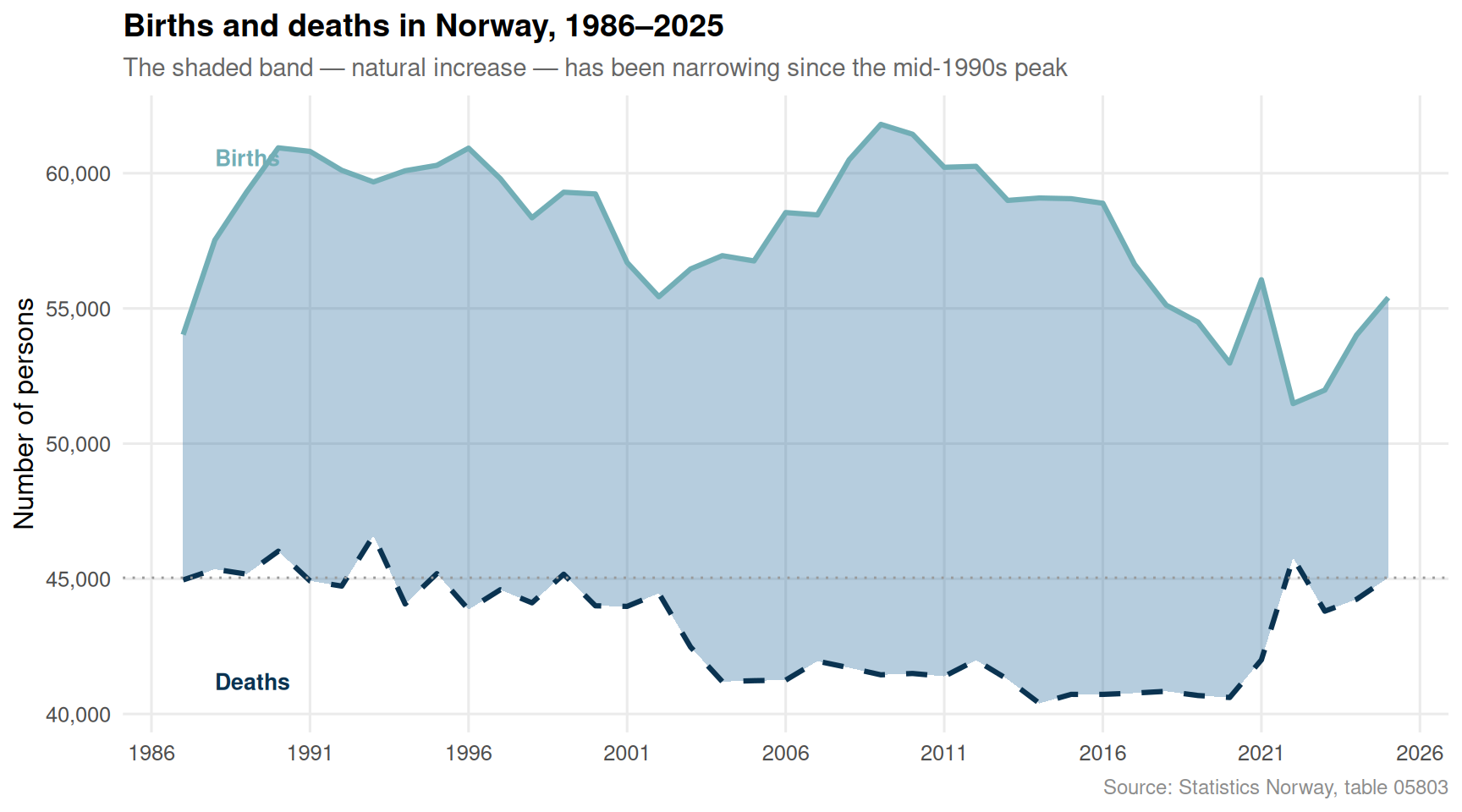
}Norway’s birth count peaked around the mid-1990s and has been sliding ever since. The chart below tracks live births and deaths across four decades, with natural increase — the difference between the two — shaded to reveal how the gap has narrowed.
if (!is.null(df1_balance) && nrow(df1_balance) > 0) {

  palette_vals <- met.brewer("Hokusai2", n = 3)

  p <- ggplot(df1_balance, aes(x = year)) +
    geom_ribbon(
      aes(ymin = deaths, ymax = births, fill = "Natural increase"),
      alpha = 0.35
    ) +
    geom_line(aes(y = births, colour = "Live births"), linewidth = 1.1) +
    geom_line(aes(y = deaths, colour = "Deaths"), linewidth = 1.1, linetype = "dashed") +
    geom_hline(
      yintercept = df1_balance$deaths[which.min(abs(df1_balance$year - max(df1_balance$year)))],
      colour = "grey60", linetype = "dotted", linewidth = 0.5
    ) +
    annotate(
      "text",
      x = min(df1_balance$year) + 1,
      y = max(df1_balance$births, na.rm = TRUE) * 0.98,
      label = "Births",
      colour = palette_vals[1], fontface = "bold", hjust = 0, size = 3.5
    ) +
    annotate(
      "text",
      x = min(df1_balance$year) + 1,
      y = min(df1_balance$deaths, na.rm = TRUE) * 1.02,
      label = "Deaths",
      colour = palette_vals[3], fontface = "bold", hjust = 0, size = 3.5
    ) +
    scale_colour_manual(
      values = c("Live births" = palette_vals[1], "Deaths" = palette_vals[3]),
      guide = "none"
    ) +
    scale_fill_manual(
      values = c("Natural increase" = palette_vals[2]),
      guide = "none"
    ) +
    scale_y_continuous(labels = label_comma()) +
    scale_x_continuous(breaks = seq(1986, 2026, by = 5)) +
    labs(
      title = "Births and deaths in Norway, 1986–2025",
      subtitle = "The shaded band — natural increase — has been narrowing since the mid-1990s peak",
      x = NULL, y = "Number of persons",
      caption = "Source: Statistics Norway, table 05803"
    ) +
    theme_minimal(base_size = 12) +
    theme(
      plot.title = element_text(face = "bold", size = 14),
      plot.subtitle = element_text(colour = "grey40", size = 11),
      panel.grid.minor = element_blank(),
      plot.caption = element_text(colour = "grey55", size = 9)
    )

  print(p)
}
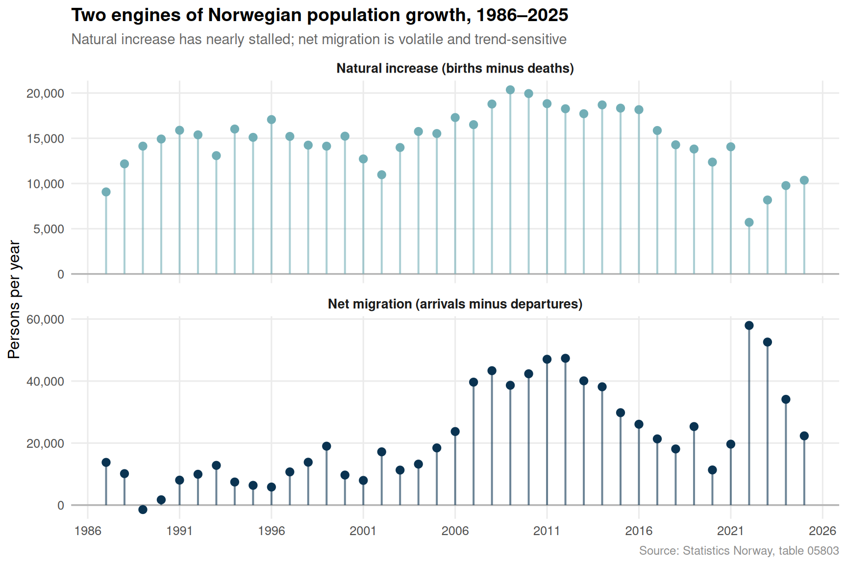
Net migration has long cushioned Norway’s natural population decline, but migration flows are volatile and politically contested. The lollipop chart below shows the annual net migration balance (arrivals minus departures) alongside the natural increase, making clear how dependent total population growth has become on inflows rather than births.
if (!is.null(df1) && nrow(df1) > 0) {

  df1_mig <- df1 |>
    filter(.data[["statistikkvariabel"]] %in% c("Innflyttinger", "Utflyttinger")) |>
    select(year = time_str, series = statistikkvariabel, value) |>
    pivot_wider(names_from = series, values_from = value) |>
    rename(arrivals = Innflyttinger, departures = Utflyttinger) |>
    mutate(
      year = as.integer(year),
      net_migration = arrivals - departures
    ) |>
    filter(!is.na(net_migration))

  # Join with natural increase
  df_combined <- NULL
  if (!is.null(df1_balance)) {
    df_combined <- df1_balance |>
      select(year, natural_increase) |>
      left_join(df1_mig |> select(year, net_migration), by = "year") |>
      pivot_longer(
        cols = c(natural_increase, net_migration),
        names_to = "component",
        values_to = "value"
      ) |>
      mutate(
        component = recode(component,
          natural_increase = "Natural increase (births minus deaths)",
          net_migration    = "Net migration (arrivals minus departures)"
        )
      )
  }

  if (!is.null(df_combined) && nrow(df_combined) > 0) {

    palette_lol <- met.brewer("Hokusai2", n = 4)

    p <- ggplot(df_combined, aes(x = year, y = value, colour = component)) +
      geom_hline(yintercept = 0, colour = "grey70", linewidth = 0.6) +
      geom_segment(
        aes(xend = year, yend = 0),
        linewidth = 0.7, alpha = 0.6
      ) +
      geom_point(size = 2.5) +
      facet_wrap(~ component, ncol = 1, scales = "free_y") +
      scale_colour_manual(
        values = c(
          "Natural increase (births minus deaths)" = palette_lol[1],
          "Net migration (arrivals minus departures)" = palette_lol[4]
        ),
        guide = "none"
      ) +
      scale_y_continuous(labels = label_comma()) +
      scale_x_continuous(breaks = seq(1986, 2026, by = 5)) +
      labs(
        title = "Two engines of Norwegian population growth, 1986–2025",
        subtitle = "Natural increase has nearly stalled; net migration is volatile and trend-sensitive",
        x = NULL, y = "Persons per year",
        caption = "Source: Statistics Norway, table 05803"
      ) +
      theme_minimal(base_size = 12) +
      theme(
        plot.title = element_text(face = "bold", size = 14),
        plot.subtitle = element_text(colour = "grey40", size = 11),
        strip.text = element_text(face = "bold", size = 10),
        panel.grid.minor = element_blank(),
        plot.caption = element_text(colour = "grey55", size = 9)
      )

    print(p)
  }
}
High and persistent inflation raises the cost of housing, food, and childcare — the core inputs to family life. The ridgeline chart below shows the distribution of 12-month price changes across major consumption categories for each year in the dataset, revealing how the inflation regime shifted markedly in recent years.
if (!is.null(df2_12m) && nrow(df2_12m) > 0 && has_monthly) {

  # Restrict to total or a small set of major categories to keep the chart legible
  top_cats <- df2_12m |>
    count(.data[["vare- og tjenestegruppe"]], sort = TRUE) |>
    slice_head(n = 8) |>
    pull(`vare- og tjenestegruppe`)

  df2_ridge <- df2_12m |>
    filter(.data[["vare- og tjenestegruppe"]] %in% top_cats) |>
    mutate(year_label = as.factor(year(date)))

  if (nrow(df2_ridge) > 0) {

    palette_ridge <- met.brewer("Hokusai2", n = length(unique(df2_ridge$year_label)))

    p <- ggplot(
      df2_ridge,
      aes(x = value, y = year_label, fill = year_label)
    ) +
      geom_density_ridges(
        alpha = 0.75,
        scale = 1.2,
        rel_min_height = 0.01,
        colour = "white",
        linewidth = 0.4
      ) +
      geom_vline(xintercept = 0, colour = "grey30", linetype = "dashed", linewidth = 0.7) +
      scale_fill_manual(values = palette_ridge, guide = "none") +
      scale_x_continuous(labels = label_number(suffix = "%")) +
      labs(
        title = "Distribution of 12-month consumer price changes by year",
        subtitle = "The inflation spike of 2022–2023 is visible as a rightward shift across all categories",
        x = "12-month price change (%)", y = NULL,
        caption = "Source: Statistics Norway, table 14700"
      ) +
      theme_minimal(base_size = 12) +
      theme(
        plot.title = element_text(face = "bold", size = 14),
        plot.subtitle = element_text(colour = "grey40", size = 11),
        panel.grid.minor = element_blank(),
        plot.caption = element_text(colour = "grey55", size = 9)
      )

    print(p)
  }
}A heatmap of average annual 12-month price changes, broken down by category, shows which parts of the household budget have been most exposed to inflation — and whether relief has arrived.
if (!is.null(df2_12m) && nrow(df2_12m) > 0 && has_monthly) {

  df2_heat <- df2_12m |>
    mutate(year = year(date)) |>
    group_by(year, category = .data[["vare- og tjenestegruppe"]]) |>
    summarise(avg_change = mean(value, na.rm = TRUE), .groups = "drop") |>
    filter(!is.na(avg_change))

  # Keep at most 10 categories for readability
  keep_cats <- df2_heat |>
    group_by(category) |>
    summarise(abs_mean = mean(abs(avg_change), na.rm = TRUE)) |>
    arrange(desc(abs_mean)) |>
    slice_head(n = 10) |>
    pull(category)

  df2_heat_sub <- df2_heat |>
    filter(category %in% keep_cats) |>
    mutate(
      category = stringr::str_wrap(category, width = 30)
    )

  if (nrow(df2_heat_sub) > 0) {

    p <- ggplot(df2_heat_sub, aes(x = year, y = category, fill = avg_change)) +
      geom_tile(colour = "white", linewidth = 0.4) +
      geom_text(
        aes(label = ifelse(abs(avg_change) >= 3, sprintf("%.1f", avg_change), "")),
        size = 2.8, colour = "white", fontface = "bold"
      ) +
      scale_fill_gradientn(
        colours = met.brewer("Hokusai2", n = 11, direction = -1),
        name = "Avg. 12m\nchange (%)",
        limits = c(
          -max(abs(df2_heat_sub$avg_change), na.rm = TRUE),
           max(abs(df2_heat_sub$avg_change), na.rm = TRUE)
        ),
        oob = scales::squish
      ) +
      scale_x_continuous(breaks = seq(2020, 2026, by = 1)) +
      labs(
        title = "Annual average 12-month price changes by category",
        subtitle = "Red tones signal cost pressure; labels appear where the change exceeds 3 percentage points",
        x = NULL, y = NULL,
        caption = "Source: Statistics Norway, table 14700"
      ) +
      theme_minimal(base_size = 11) +
      theme(
        plot.title = element_text(face = "bold", size = 14),
        plot.subtitle = element_text(colour = "grey40", size = 11),
        axis.text.y = element_text(size = 9),
        panel.grid = element_blank(),
        legend.title = element_text(size = 9),
        plot.caption = element_text(colour = "grey55", size = 9)
      )

    print(p)
  }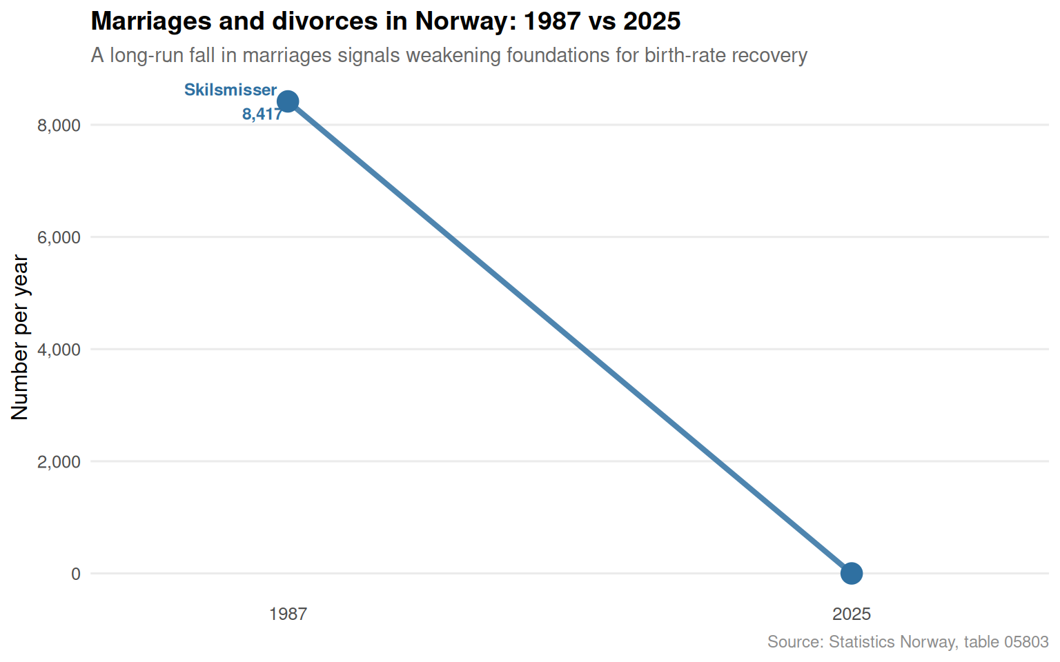
}Marriage rates are a leading indicator of birth trends in Norway, where most children are still born within or close to stable partnerships. The slope chart below compares marriages and divorces at the start and end of the available series, capturing structural change in partnership formation.
if (!is.null(df1) && nrow(df1) > 0) {

  df1_marr <- df1 |>
    filter(.data[["statistikkvariabel"]] %in% c("Inng.tte ekteskap", "Skilsmisser")) |>
    mutate(year = as.integer(time_str)) |>
    filter(!is.na(value))

  if (nrow(df1_marr) > 0) {

    year_min <- min(df1_marr$year, na.rm = TRUE)
    year_max <- max(df1_marr$year, na.rm = TRUE)

    df1_slope <- df1_marr |>
      filter(year %in% c(year_min, year_max)) |>
      mutate(
        endpoint = ifelse(year == year_min, "Start", "End"),
        endpoint = factor(endpoint, levels = c("Start", "End"))
      )

    # Guard
    if (nrow(df1_slope) == 0) {
      message("Slope filter empty.")
    } else {

      palette_slope <- met.brewer("Hokusai2", n = 2)

      p <- ggplot(
        df1_slope,
        aes(
          x = endpoint,
          y = value,
          group = statistikkvariabel,
          colour = statistikkvariabel
        )
      ) +
        geom_line(linewidth = 1.4, alpha = 0.85) +
        geom_point(size = 5) +
        geom_text(
          data = df1_slope |> filter(endpoint == "Start"),
          aes(label = paste0(statistikkvariabel, "\n", label_comma()(value))),
          hjust = 1.12, size = 3.2, fontface = "bold"
        ) +
        geom_text(
          data = df1_slope |> filter(endpoint == "End"),
          aes(label = label_comma()(value)),
          hjust = -0.18, size = 3.2, fontface = "bold"
        ) +
        scale_colour_manual(
          values = c(
            "Inng.tte ekteskap" = palette_slope[1],
            "Skilsmisser"       = palette_slope[2]
          ),
          guide = "none"
        ) +
        scale_y_continuous(labels = label_comma()) +
        scale_x_discrete(
          labels = c("Start" = as.character(year_min), "End" = as.character(year_max)),
          expand = expansion(mult = 0.35)
        ) +
        labs(
          title = paste0("Marriages and divorces in Norway: ", year_min, " vs ", year_max),
          subtitle = "A long-run fall in marriages signals weakening foundations for birth-rate recovery",
          x = NULL, y = "Number per year",
          caption = "Source: Statistics Norway, table 05803"
        ) +
        theme_minimal(base_size = 12) +
        theme(
          plot.title = element_text(face = "bold", size = 14),
          plot.subtitle = element_text(colour = "grey40", size = 11),
          panel.grid.minor = element_blank(),
          panel.grid.major.x = element_blank(),
          plot.caption = element_text(colour = "grey55", size = 9)
        )

      print(p)
    }
  }
}
The collision of demographic and economic forces in Norway is not yet a crisis, but its trajectory is clear. A welfare state designed around a growing tax base faces mounting pressure when the birth rate cannot sustain that base and migration flows are uncertain. The price squeeze of recent years has added urgency: families already reluctant to have children in an expensive country face additional financial headwinds precisely when the state most needs them to choose parenthood. Norway has the policy tools — generous parental leave, subsidised childcare, housing support — but whether they are sufficient to overcome a generation-long cultural and economic drift away from large families remains the defining demographic question of the coming decade.