Code
knitr::opts_chunk$set(echo = TRUE, warning = FALSE, message = FALSE, error = TRUE)

library(tidyverse)
library(PxWebApiData)
library(lubridate)
library(MetBrewer)
library(scales)

pal <- met.brewer("Juarez", 8)Norway has committed to steep emissions cuts, but the national aggregates hide a complex story. Which sectors actually delivered on climate promises, and which ones remain stuck in the fossil era? We dig into Statistics Norway’s emissions data to find out where progress happened — and where it didn’t.
knitr::opts_chunk$set(echo = TRUE, warning = FALSE, message = FALSE, error = TRUE)
library(tidyverse)
library(PxWebApiData)
library(lubridate)
library(MetBrewer)
library(scales)
pal <- met.brewer("Juarez", 8)We pull emissions data from SSB’s energy balance table (09288), focusing on total greenhouse gases across major economic sectors from 1990 to present. This gives us the full climate accounting picture across industries and households.
df_emissions <- NULL

tryCatch({
  raw <- ApiData(
    "https://data.ssb.no/api/v0/no/table/09288",
    NaringMiljo = TRUE,
    UtslpKomp = TRUE,
    Tid = list(filter = "top", values = 35)
  )
  tmp <- raw[[1]]
  message("Columns: ", paste(names(tmp), collapse = ", "))
  message("Rows fetched: ", nrow(tmp))
  print(head(tmp))

  # Detect sector column (næring)
  sector_col <- names(tmp)[grepl("n.ring|nace|industry|sektor|branch", names(tmp), ignore.case = TRUE)][1]
  if (is.na(sector_col)) stop("Cannot detect sector column — columns are: ", paste(names(tmp), collapse = ", "))

  # Detect component column (komponent)
  comp_col <- names(tmp)[grepl("komponent|contents|innhold|statistikkvariabel|variable|type", names(tmp), ignore.case = TRUE)][1]
  if (is.na(comp_col)) stop("Cannot detect component column — columns are: ", paste(names(tmp), collapse = ", "))

  time_col <- names(tmp)[grepl(
    "tid|\u00e5r|kvartal|m\u00e5ned|aar|maaned|year|month|quarter",
    names(tmp), ignore.case = TRUE, perl = TRUE
  )][1]
  if (is.na(time_col)) time_col <- names(tmp)[length(names(tmp)) - 1L]

  value_col <- names(tmp)[vapply(tmp, is.numeric, logical(1L))][1]
  if (is.na(value_col)) value_col <- names(tmp)[length(names(tmp))]

  df_emissions <- tmp |>
    mutate(
      value    = as.numeric(.data[[value_col]]),
      time_str = .data[[time_col]],
      sector   = .data[[sector_col]],
      component = .data[[comp_col]],
      date     = case_when(
        stringr::str_detect(time_str, "M") ~ lubridate::ym(sub("M", "-", time_str)),
        stringr::str_detect(time_str, "K") ~ lubridate::yq(sub("K", " Q", time_str)),
        nchar(time_str) == 4               ~ lubridate::ymd(paste0(time_str, "-01-01")),
        TRUE ~ NA_Date_
      ),
      year = year(date)
    ) |>
    filter(!is.na(value), !is.na(date))

  message("Clean rows after filter: ", nrow(df_emissions))
  if (nrow(df_emissions) == 0) stop("Data frame is empty after cleaning")
}, error = function(e) {
  message("DATA FETCH FAILED: ", e$message)
})
næring komponent
1 Alle næringer og husholdninger Klimagasser i alt
2 Alle næringer og husholdninger Klimagasser i alt
3 Alle næringer og husholdninger Klimagasser i alt
4 Alle næringer og husholdninger Klimagasser i alt
5 Alle næringer og husholdninger Klimagasser i alt
6 Alle næringer og husholdninger Klimagasser i alt
statistikkvariabel år value NAstatus
1 Utslipp til luft (1 000 tonn CO2-ekvivalenter, AR4) 1990 66024 <NA>
2 Utslipp til luft (1 000 tonn CO2-ekvivalenter, AR4) 1991 62000 <NA>
3 Utslipp til luft (1 000 tonn CO2-ekvivalenter, AR4) 1992 58912 <NA>
4 Utslipp til luft (1 000 tonn CO2-ekvivalenter, AR4) 1993 59658 <NA>
5 Utslipp til luft (1 000 tonn CO2-ekvivalenter, AR4) 1994 62143 <NA>
6 Utslipp til luft (1 000 tonn CO2-ekvivalenter, AR4) 1995 62777 <NA>Let’s start with the headline: how did each major sector’s emissions change from 1990 to the most recent year? A waterfall chart shows the winners and losers in Norway’s climate ledger.
if (!is.null(df_emissions)) {
  # Focus on total GHG (klimagasser i alt) and major sectors
  sector_change <- df_emissions |>
    filter(grepl("klimagasser i alt|all greenhouse", component, ignore.case = TRUE)) |>
    filter(!grepl("T\\.00|Alle n.ringer|All industries|husholdninger|households", sector, ignore.case = TRUE)) |>
    group_by(sector) |>
    filter(year == min(year) | year == max(year)) |>
    arrange(sector, year) |>
    summarise(
      start_year = min(year),
      end_year   = max(year),
      start_val  = first(value),
      end_val    = last(value),
      change     = end_val - start_val,
      .groups = "drop"
    ) |>
    filter(!is.na(change)) |>
    arrange(desc(abs(change))) |>
    slice_head(n = 10)

  # Build waterfall data
  sector_change <- sector_change |>
    mutate(
      sector_label = str_trunc(sector, 45),
      type = ifelse(change > 0, "increase", "decrease"),
      id = row_number(),
      end = cumsum(change),
      start = lag(end, default = 0)
    )

  p_waterfall <- ggplot(sector_change, aes(x = reorder(sector_label, change), y = change, fill = type)) +
    geom_col(width = 0.7, alpha = 0.9) +
    geom_hline(yintercept = 0, linewidth = 0.8, color = "gray30") +
    scale_fill_manual(values = c("increase" = pal[6], "decrease" = pal[2])) +
    coord_flip() +
    labs(
      title = "Norway's sectoral emissions ledger, 1990 to 2024",
      subtitle = "Oil and gas extraction cut deeply, but transport emissions barely budged",
      x = NULL,
      y = "Change in emissions (1,000 tonnes CO₂ equivalents)",
      caption = "Source: Statistics Norway (SSB table 09288) | Total greenhouse gases"
    ) +
    theme_minimal(base_size = 13) +
    theme(
      legend.position = "none",
      panel.grid.major.y = element_blank(),
      plot.title = element_text(face = "bold", size = 16),
      plot.subtitle = element_text(color = "gray40", size = 12)
    )

  print(p_waterfall)
}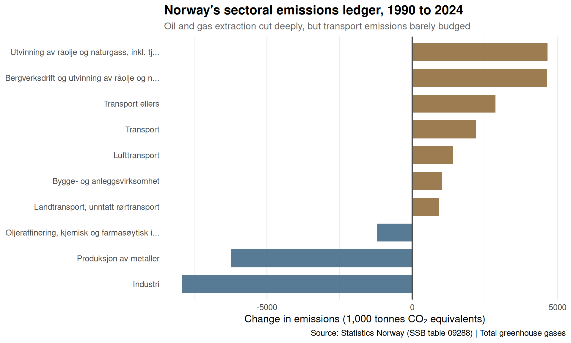
The chart reveals a striking pattern: Norway’s oil and gas sector made enormous cuts (likely driven by reduced flaring and methane leaks), but road transport — the emissions source closest to everyday Norwegians — shows negligible change over three decades.
Now let’s track the top emitting sectors over time to see when the reductions happened — and whether they’re accelerating or stalling.
if (!is.null(df_emissions)) {
  top_sectors <- df_emissions |>
    filter(grepl("klimagasser i alt", component, ignore.case = TRUE)) |>
    filter(!grepl("T\\.00|Alle n.ringer|husholdninger", sector, ignore.case = TRUE)) |>
    group_by(sector) |>
    summarise(total = sum(value, na.rm = TRUE), .groups = "drop") |>
    arrange(desc(total)) |>
    slice_head(n = 6) |>
    pull(sector)

  sector_trends <- df_emissions |>
    filter(grepl("klimagasser i alt", component, ignore.case = TRUE)) |>
    filter(sector %in% top_sectors) |>
    group_by(year, sector) |>
    summarise(value = sum(value, na.rm = TRUE), .groups = "drop") |>
    mutate(sector_label = str_trunc(sector, 40))

  p_area <- ggplot(sector_trends, aes(x = year, y = value, fill = sector_label)) +
    geom_area(alpha = 0.8, color = "white", linewidth = 0.3) +
    scale_fill_manual(values = pal) +
    scale_y_continuous(labels = comma_format()) +
    labs(
      title = "Top emitting sectors over time: Norway's climate stack",
      subtitle = "Oil and gas extraction dominated 1990s, but fell sharply after 2000",
      x = NULL,
      y = "Emissions (1,000 tonnes CO₂ eq.)",
      fill = "Sector",
      caption = "Source: SSB table 09288"
    ) +
    theme_minimal(base_size = 13) +
    theme(
      legend.position = "bottom",
      legend.text = element_text(size = 9),
      plot.title = element_text(face = "bold", size = 16),
      plot.subtitle = element_text(color = "gray40", size = 12)
    ) +
    guides(fill = guide_legend(nrow = 3, byrow = TRUE))

  print(p_area)
}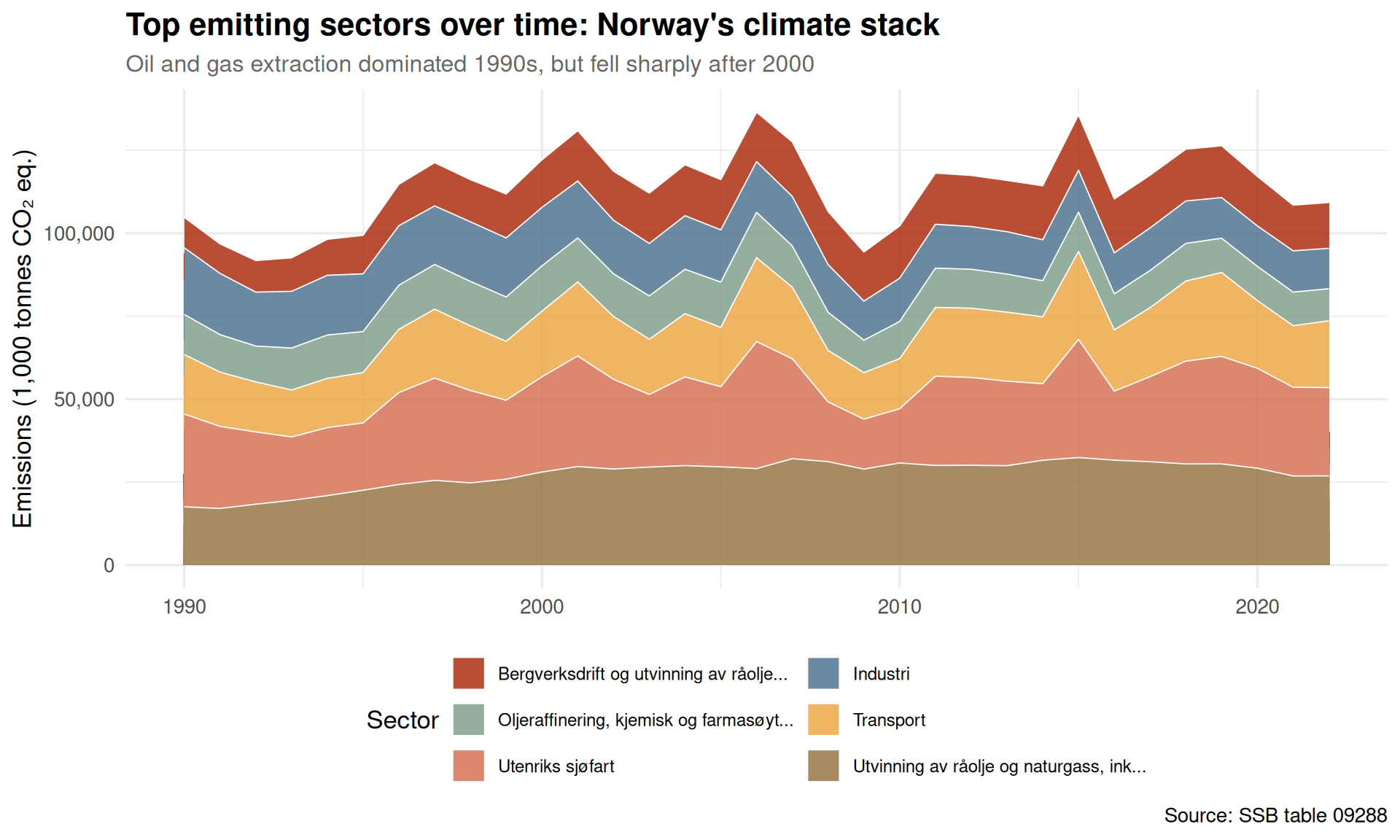
Oil and gas extraction peaked around 2000 and has declined significantly — a rare climate success story in a petro-state. But the other sectors (manufacturing, transport, households) remain stubbornly flat, forming a persistent emissions plateau.
Norway reports multiple greenhouse gases with different warming potentials. Let’s see how CO₂, methane, and nitrous oxide contribute to the total climate impact across major sectors.
if (!is.null(df_emissions)) {
  component_recent <- df_emissions |>
    filter(year == max(year)) |>
    filter(grepl("CO2|Metan|Lystgass", component, ignore.case = TRUE)) |>
    filter(!grepl("T\\.00|Alle n.ringer", sector, ignore.case = TRUE)) |>
    group_by(component, sector) |>
    summarise(value = sum(value, na.rm = TRUE), .groups = "drop") |>
    group_by(component) |>
    slice_max(value, n = 8) |>
    ungroup() |>
    mutate(
      sector_label = str_trunc(sector, 40),
      component_clean = case_when(
        grepl("CO2", component) ~ "CO₂",
        grepl("Metan", component) ~ "Methane (CH₄)",
        grepl("Lystgass", component) ~ "Nitrous oxide (N₂O)",
        TRUE ~ component
      )
    )

  p_lollipop <- ggplot(component_recent, aes(x = value, y = reorder(sector_label, value), color = component_clean)) +
    geom_segment(aes(xend = 0, yend = sector_label), linewidth = 1.2, alpha = 0.7) +
    geom_point(size = 3.5, alpha = 0.9) +
    scale_color_manual(values = c(pal[1], pal[4], pal[7])) +
    scale_x_continuous(labels = comma_format()) +
    facet_wrap(~component_clean, scales = "free_x", ncol = 3) +
    labs(
      title = "Top emitting sectors by greenhouse gas type, 2024",
      subtitle = "CO₂ dominates overall, but methane spikes in oil/gas and agriculture",
      x = "Emissions (1,000 tonnes CO₂ eq. or absolute units)",
      y = NULL,
      caption = "Source: SSB table 09288",
      color = "Gas type"
    ) +
    theme_minimal(base_size = 12) +
    theme(
      legend.position = "none",
      panel.grid.major.y = element_blank(),
      strip.text = element_text(face = "bold", size = 11),
      plot.title = element_text(face = "bold", size = 16),
      plot.subtitle = element_text(color = "gray40", size = 12)
    )

  print(p_lollipop)
}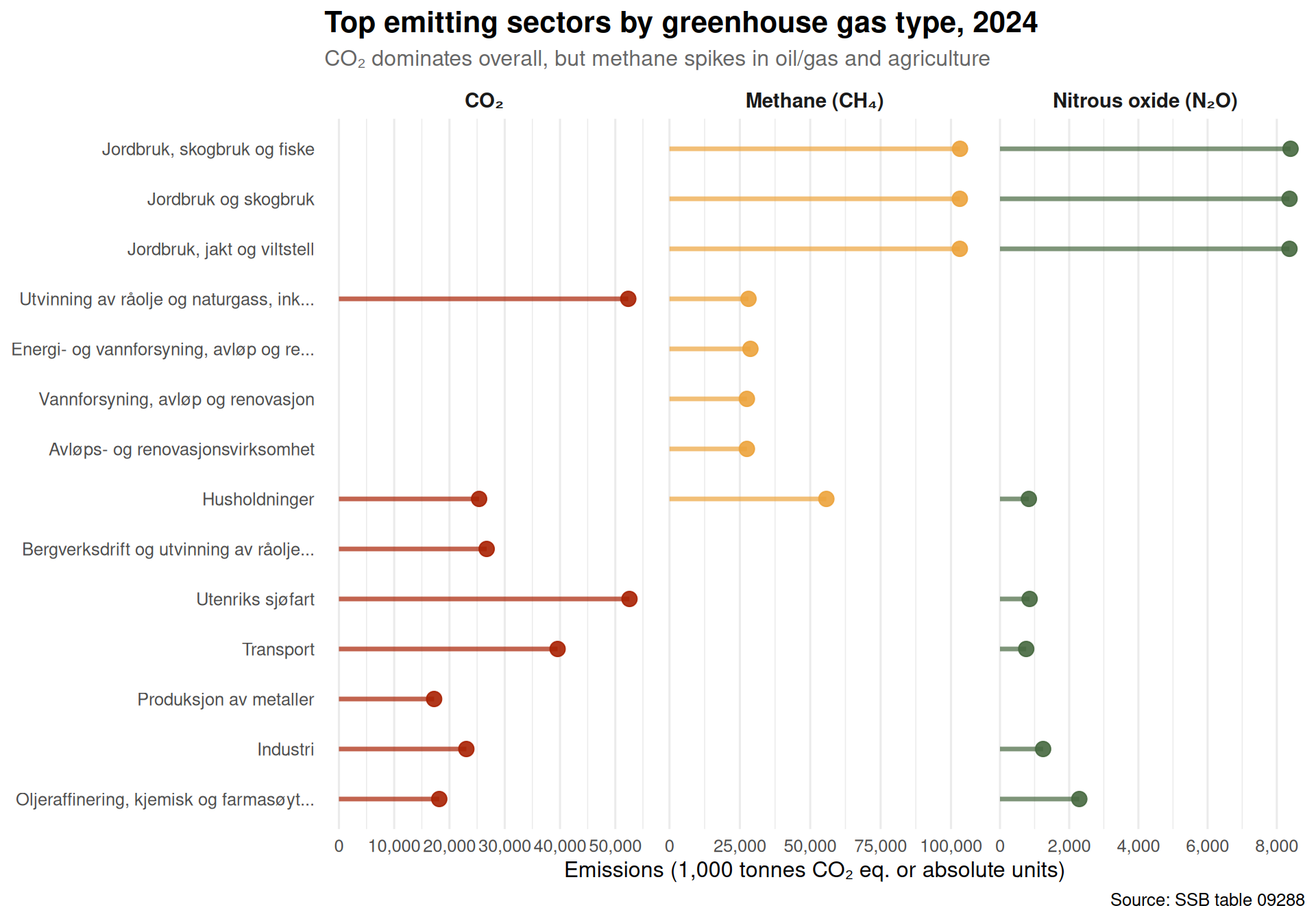
CO₂ is the workhorse pollutant across most sectors, but methane (a far more potent warming agent) concentrates in oil and gas extraction and agriculture. Nitrous oxide, meanwhile, comes mainly from fertilizer use in farming.
Finally, let’s create a heatmap showing how emissions intensity (emissions per unit of activity, proxied here by raw volume) changed across sectors and years. This reveals which industries became cleaner and which stayed dirty.
if (!is.null(df_emissions)) {
  heatmap_data <- df_emissions |>
    filter(grepl("klimagasser i alt", component, ignore.case = TRUE)) |>
    filter(!grepl("T\\.00|Alle n.ringer|husholdninger", sector, ignore.case = TRUE)) |>
    group_by(sector) |>
    filter(sum(value, na.rm = TRUE) > 500) |>  # focus on larger emitters
    ungroup() |>
    group_by(year, sector) |>
    summarise(value = sum(value, na.rm = TRUE), .groups = "drop") |>
    mutate(sector_label = str_trunc(sector, 35))

  # Normalize to 1990 baseline for each sector
  heatmap_data <- heatmap_data |>
    group_by(sector_label) |>
    mutate(
      baseline = value[year == min(year)],
      index = (value / baseline) * 100
    ) |>
    filter(!is.na(index))

  p_heatmap <- ggplot(heatmap_data, aes(x = year, y = reorder(sector_label, -index), fill = index)) +
    geom_tile(color = "white", linewidth = 0.3) +
    scale_fill_gradient2(
      low = pal[2], mid = "white", high = pal[6],
      midpoint = 100,
      labels = function(x) paste0(x, "%"),
      name = "Index\n(1990=100)"
    ) +
    labs(
      title = "Sectoral emissions intensity: indexed to 1990 baseline",
      subtitle = "Green = emissions fell, red = emissions rose — oil/gas cleaned up, transport did not",
      x = NULL,
      y = NULL,
      caption = "Source: SSB table 09288 | Total greenhouse gases"
    ) +
    theme_minimal(base_size = 12) +
    theme(
      panel.grid = element_blank(),
      plot.title = element_text(face = "bold", size = 16),
      plot.subtitle = element_text(color = "gray40", size = 12),
      axis.text.y = element_text(size = 9)
    )

  print(p_heatmap)
}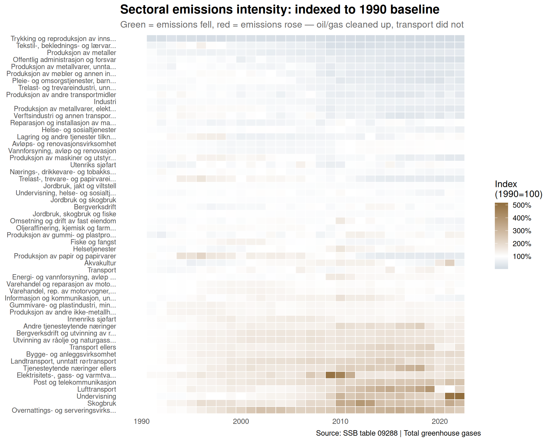
The heatmap makes the divergence unmistakable: some sectors (oil and gas, certain manufacturing) show deep green streaks — real decarbonization. But road transport and domestic aviation remain stubbornly white or red, meaning emissions barely budged or even rose relative to 1990.
Norway’s climate story is one of selective success. The oil and gas sector — under intense regulatory pressure and equipped with carbon capture — delivered real cuts. But the sectors closest to voters’ daily lives (driving, heating, flying domestically) have resisted change. The next wave of climate policy will need to crack these harder nuts: electrifying the car fleet faster, retrofitting buildings at scale, and rethinking land use in agriculture. The easy wins are done. What remains is the grinding work of transforming consumption itself.