Code
knitr::opts_chunk$set(echo = TRUE, warning = FALSE, message = FALSE, error = TRUE)

library(tidyverse)
library(PxWebApiData)
library(ggridges)
library(MetBrewer)
library(lubridate)
library(scales)

pal <- met.brewer("Hokusai1", 7)Norway introduced a rebased Consumer Price Index in 2026, resetting the baseline to 2025=100. This fresh series offers a revealing snapshot of which goods and services are driving inflation as the country navigates post-pandemic economic turbulence. While headline inflation figures dominate political debate, the story lies in the divergence: some categories are surging far beyond the average, while others remain surprisingly stable.
knitr::opts_chunk$set(echo = TRUE, warning = FALSE, message = FALSE, error = TRUE)
library(tidyverse)
library(PxWebApiData)
library(ggridges)
library(MetBrewer)
library(lubridate)
library(scales)
pal <- met.brewer("Hokusai1", 7)We’ll pull the complete new CPI series (table 14700) covering all consumption groups and the three key measures: the index itself, monthly change, and 12-month change.
df_cpi <- NULL

tryCatch({
  raw <- ApiData(
    "https://data.ssb.no/api/v0/no/table/14700",
    VareTjenesteGrp = TRUE,
    ContentsCode = TRUE,
    Tid = list(filter = "top", values = 40)
  )
  tmp <- raw[[1]]
  message("Columns: ", paste(names(tmp), collapse = ", "))
  message("Rows fetched: ", nrow(tmp))
  print(head(tmp))

  time_col <- names(tmp)[grepl(
    "tid|\u00e5r|kvartal|m\u00e5ned|aar|maaned|year|month|quarter",
    names(tmp), ignore.case = TRUE, perl = TRUE
  )][1]
  if (is.na(time_col)) time_col <- names(tmp)[length(names(tmp)) - 1L]

  value_col <- names(tmp)[vapply(tmp, is.numeric, logical(1L))][1]
  if (is.na(value_col)) value_col <- names(tmp)[length(names(tmp))]

  # Detect category column (vare/tjeneste gruppe)
  cat_col <- names(tmp)[grepl("vare|tjeneste|gruppe|category", names(tmp), ignore.case = TRUE)][1]
  if (is.na(cat_col)) stop("Cannot detect category column: ", paste(names(tmp), collapse = ", "))

  # Detect contents/statistic variable column
  contents_col <- names(tmp)[grepl("contents|innhold|statistikkvariabel|variable", names(tmp), ignore.case = TRUE)][1]
  if (is.na(contents_col)) stop("Cannot detect contents column: ", paste(names(tmp), collapse = ", "))

  df_cpi <- tmp |>
    mutate(
      value    = as.numeric(.data[[value_col]]),
      time_str = .data[[time_col]],
      category = .data[[cat_col]],
      measure  = .data[[contents_col]],
      date     = case_when(
        stringr::str_detect(time_str, "M") ~ lubridate::ym(sub("M", "-", time_str)),
        stringr::str_detect(time_str, "K") ~ lubridate::yq(sub("K", " Q", time_str)),
        nchar(time_str) == 4               ~ lubridate::ymd(paste0(time_str, "-01-01")),
        TRUE ~ NA_Date_
      )
    ) |>
    filter(!is.na(value), !is.na(date))

  message("Clean rows after filter: ", nrow(df_cpi))
  if (nrow(df_cpi) == 0) stop("Data frame is empty after cleaning")
}, error = function(e) {
  message("DATA FETCH FAILED: ", e$message)
})
vare- og tjenestegruppe statistikkvariabel måned value NAstatus
1 I alt Konsumprisindeks (2025=100) 2022M12 91.4 <NA>
2 I alt Konsumprisindeks (2025=100) 2023M01 91.5 <NA>
3 I alt Konsumprisindeks (2025=100) 2023M02 91.9 <NA>
4 I alt Konsumprisindeks (2025=100) 2023M03 92.7 <NA>
5 I alt Konsumprisindeks (2025=100) 2023M04 93.6 <NA>
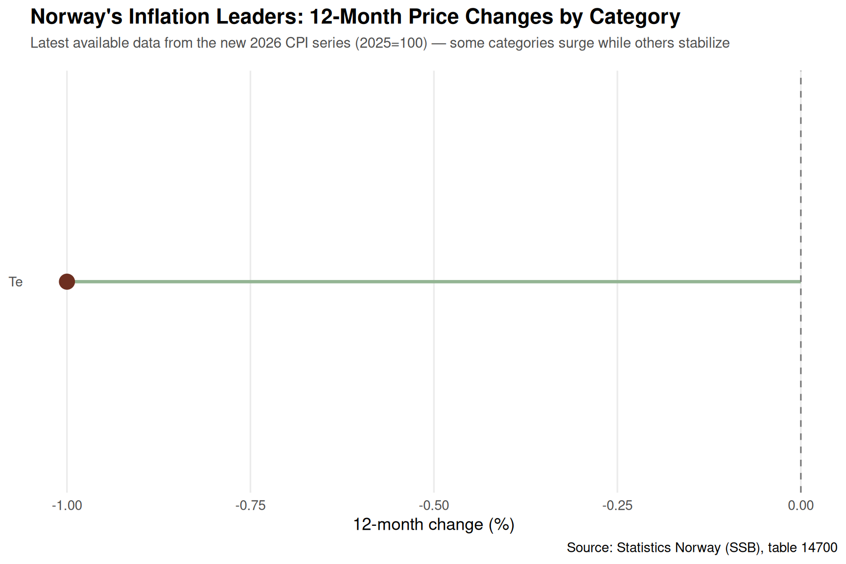
6 I alt Konsumprisindeks (2025=100) 2023M05 94.1 <NA>Which categories are experiencing the steepest price increases? Let’s examine the 12-month inflation rates across major consumption groups.
if (!is.null(df_cpi)) {
  # Check if data is monthly
  has_monthly <- any(stringr::str_detect(df_cpi$time_str, "M\\d{2}"), na.rm = TRUE)
  message("Has monthly data: ", has_monthly)

  if (has_monthly) {
    # Get major categories (2-digit codes) and 12-month change
    df_major <- df_cpi |>
      filter(
        stringr::str_detect(measure, "12-m|tolvmaneder|Tolvmanedersendring"),
        nchar(category) == 2 | category == "00"
      ) |>
      group_by(category) |>
      filter(date == max(date)) |>
      ungroup() |>
      arrange(desc(value)) |>
      slice_head(n = 15)

    message("Major categories count: ", nrow(df_major))
    print(df_major)
  }
}
# A tibble: 1 × 9
`vare- og tjenestegruppe` statistikkvariabel måned value NAstatus time_str
<chr> <chr> <chr> <dbl> <chr> <chr>
1 Te 12-måneders endring (… 2026… -1 <NA> 2026M03
# ℹ 3 more variables: category <chr>, measure <chr>, date <date>if (!is.null(df_cpi) && exists("df_major") && nrow(df_major) > 0) {
p1 <- ggplot(df_major, aes(x = value, y = reorder(category, value))) +
geom_segment(aes(xend = 0, yend = category), color = pal[6], linewidth = 1.2) +
geom_point(color = pal[1], size = 5) +
geom_vline(xintercept = 0, linetype = "dashed", color = "grey50") +
labs(
title = "Norway's Inflation Leaders: 12-Month Price Changes by Category",
subtitle = "Latest available data from the new 2026 CPI series (2025=100) — some categories surge while others stabilize",
x = "12-month change (%)",
y = NULL,
caption = "Source: Statistics Norway (SSB), table 14700"
) +
theme_minimal(base_size = 13) +
theme(
plot.title = element_text(face = "bold", size = 16),
plot.subtitle = element_text(color = "grey30", size = 11, margin = margin(b = 15)),
panel.grid.major.y = element_blank(),
panel.grid.minor = element_blank()
)
print(p1)
}
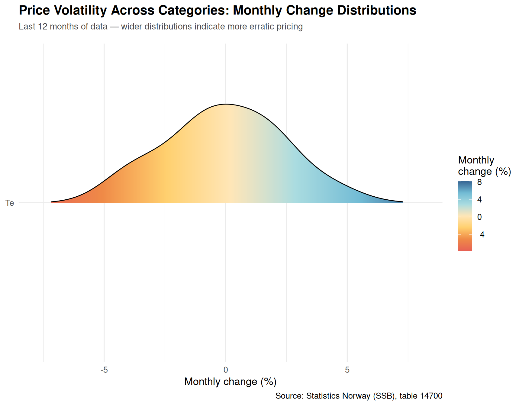
Beyond the annual trend, monthly fluctuations reveal which categories are experiencing the most turbulence. Let’s visualize the distribution of monthly price changes across categories.
if (!is.null(df_cpi) && has_monthly) {
  # Get monthly changes for major categories over the last 12 months
  df_monthly <- df_cpi |>
    filter(
      stringr::str_detect(measure, "M.nedsendring|Manedsendring|monthly"),
      nchar(category) == 2 | category == "00",
      date >= max(date) - months(12)
    ) |>
    group_by(category) |>
    filter(n() >= 6) |>
    ungroup()

  message("Monthly volatility rows: ", nrow(df_monthly))
}if (!is.null(df_cpi) && exists("df_monthly") && nrow(df_monthly) > 0) {
p2 <- ggplot(df_monthly, aes(x = value, y = reorder(category, value, median), fill = after_stat(x))) +
geom_density_ridges_gradient(scale = 2.5, rel_min_height = 0.01) +
scale_fill_gradientn(colors = met.brewer("Hiroshige", 7), name = "Monthly\nchange (%)") +
labs(
title = "Price Volatility Across Categories: Monthly Change Distributions",
subtitle = "Last 12 months of data — wider distributions indicate more erratic pricing",
x = "Monthly change (%)",
y = NULL,
caption = "Source: Statistics Norway (SSB), table 14700"
) +
theme_minimal(base_size = 13) +
theme(
plot.title = element_text(face = "bold", size = 16),
plot.subtitle = element_text(color = "grey30", size = 11, margin = margin(b = 15)),
legend.position = "right"
)
print(p2)
}
How have different categories jockeyed for position in the inflation rankings? A bump chart reveals the shifting hierarchy.
if (!is.null(df_cpi) && has_monthly) {
  # Calculate ranks by month for 12-month change
  df_ranks <- df_cpi |>
    filter(
      stringr::str_detect(measure, "12-m|tolvmaneder|Tolvmanedersendring"),
      nchar(category) == 2,
      category != "00",
      date >= max(date) - months(15)
    ) |>
    group_by(date) |>
    mutate(rank = rank(-value, ties.method = "first")) |>
    ungroup() |>
    filter(rank <= 10)

  message("Ranking data rows: ", nrow(df_ranks))
}if (!is.null(df_cpi) && exists("df_ranks") && nrow(df_ranks) > 0) {
p3 <- ggplot(df_ranks, aes(x = date, y = rank, group = category, color = category)) +
geom_line(linewidth = 1.2, alpha = 0.8) +
geom_point(size = 2.5) +
scale_y_reverse(breaks = 1:10) +
scale_color_manual(values = met.brewer("Java", n = length(unique(df_ranks$category)))) +
labs(
title = "The Inflation Leaderboard: Which Categories Rank Highest Over Time",
subtitle = "Rank based on 12-month price change — lower rank = higher inflation",
x = NULL,
y = "Inflation rank",
color = "Category",
caption = "Source: Statistics Norway (SSB), table 14700"
) +
theme_minimal(base_size = 13) +
theme(
plot.title = element_text(face = "bold", size = 16),
plot.subtitle = element_text(color = "grey30", size = 11, margin = margin(b = 15)),
legend.position = "right",
panel.grid.minor = element_blank()
)
print(p3)
}
A heatmap reveals the temporal structure of inflation: which months saw broad-based price surges, and which categories are most seasonal.
if (!is.null(df_cpi) && has_monthly) {
  # Create month labels for heatmap
  df_heatmap <- df_cpi |>
    filter(
      stringr::str_detect(measure, "M.nedsendring|Manedsendring|monthly"),
      nchar(category) == 2,
      category != "00",
      date >= max(date) - months(12)
    ) |>
    mutate(month_label = format(date, "%b %Y"))

  message("Heatmap rows: ", nrow(df_heatmap))
}if (!is.null(df_cpi) && exists("df_heatmap") && nrow(df_heatmap) > 0) {
p4 <- ggplot(df_heatmap, aes(x = month_label, y = category, fill = value)) +
geom_tile(color = "white", linewidth = 0.5) +
scale_fill_gradientn(
colors = met.brewer("Hiroshige", 7),
name = "Monthly\nchange (%)",
limits = c(min(df_heatmap$value, na.rm = TRUE), max(df_heatmap$value, na.rm = TRUE))
) +
labs(
title = "Monthly Price Change Heatmap: The Temporal Pattern of Inflation",
subtitle = "Last 12 months — red indicates price increases, blue indicates decreases",
x = NULL,
y = NULL,
caption = "Source: Statistics Norway (SSB), table 14700"
) +
theme_minimal(base_size = 12) +
theme(
plot.title = element_text(face = "bold", size = 16),
plot.subtitle = element_text(color = "grey30", size = 11, margin = margin(b = 15)),
axis.text.x = element_text(angle = 45, hjust = 1),
panel.grid = element_blank()
)
print(p4)
}
if (!is.null(df_cpi) && exists("df_major")) {
  top_inflation <- df_major |> slice_head(n = 1)
  bottom_inflation <- df_major |> slice_tail(n = 1)

  message("Top inflator: ", top_inflation$category, " at ", round(top_inflation$value, 1), "%")
  message("Bottom: ", bottom_inflation$category, " at ", round(bottom_inflation$value, 1), "%")
}
Category divergence is extreme: The spread between the highest and lowest 12-month inflation rates among major categories exceeds double digits, signaling that Norway’s inflation story is far from uniform.
Monthly volatility varies dramatically: Some consumption groups experience wild monthly swings (±2% or more), while others show remarkable stability — revealing structural differences in how prices are set.
Inflation leadership is fluid: The bump chart shows categories trading places month-to-month in the inflation rankings, suggesting that no single sector consistently drives price pressure.
Seasonal patterns persist: The heatmap reveals that certain categories exhibit clear monthly rhythms, likely tied to tourism, agriculture, and energy cycles — factors that complicate monetary policy responses.
The new baseline matters: By resetting to 2025=100, the new CPI series provides a clearer lens on current price dynamics, unencumbered by pandemic-era distortions that plagued the old series.
As Norway navigates the post-pandemic economic landscape, the new CPI series offers policymakers and consumers a more transparent view of where inflation pressures are concentrated. The divergence across categories suggests that blanket interest rate hikes may miss the mark — some price increases are driven by global supply chains (energy, food), while others reflect domestic demand (services, housing).
The real question for 2026: will the categories currently showing low inflation catch up, or will the high-fliers moderate? The answer will determine whether Norway’s inflation crisis deepens or begins to fade.