Code
library(tidyverse)
library(PxWebApiData)
library(lubridate)
library(MetBrewer)
library(scales)

pal <- met.brewer("Hokusai2", 8)Norway’s inflation shock of 2021-2023 reshaped household budgets across the country. But not all prices rose equally. While headlines focused on headline inflation rates, the story hidden in the data reveals a more complex picture: some categories saw prices nearly double, while others barely budged. This analysis examines the Consumer Price Index across major consumption groups to uncover where Norwegian wallets took the biggest hit — and where they found unexpected relief.
library(tidyverse)
library(PxWebApiData)
library(lubridate)
library(MetBrewer)
library(scales)
pal <- met.brewer("Hokusai2", 8)df <- NULL
tryCatch({
raw <- ApiData(
"https://data.ssb.no/api/v0/no/table/03013",
Konsumgrp = c("TOTAL", "01", "02", "03", "04", "05", "06", "07", "08", "09", "10", "11", "12"),
ContentsCode = "KpiIndMnd",
Tid = list(filter = "top", values = 80)
)
tmp <- raw[[1]]
print(names(tmp))
time_col <- names(tmp)[grepl(
"tid|år|kvartal|måned|aar|maaned|year|month|quarter",
names(tmp), ignore.case = TRUE, perl = TRUE
)][1]
if (is.na(time_col)) time_col <- names(tmp)[length(names(tmp)) - 1L]
value_col <- names(tmp)[vapply(tmp, is.numeric, logical(1L))][1]
if (is.na(value_col)) value_col <- names(tmp)[length(names(tmp))]
category_col <- names(tmp)[grepl("konsumgrp|category|gruppe", names(tmp), ignore.case = TRUE)][1]
df <- tmp |>
mutate(
value = as.numeric(.data[[value_col]]),
time_str = .data[[time_col]],
category = .data[[category_col]],
date = lubridate::ym(sub("M", "-", time_str))
) |>
filter(!is.na(value), !is.na(date))
# Clean up category names
df <- df |>
mutate(
category_clean = case_when(
str_detect(category, "Total") ~ "Total Index",
str_detect(category, "^01") ~ "Food & Beverages",
str_detect(category, "^02") ~ "Alcohol & Tobacco",
str_detect(category, "^03") ~ "Clothing & Footwear",
str_detect(category, "^04") ~ "Housing & Energy",
str_detect(category, "^05") ~ "Furniture & Household",
str_detect(category, "^06") ~ "Healthcare",
str_detect(category, "^07") ~ "Transport",
str_detect(category, "^08") ~ "Communication",
str_detect(category, "^09") ~ "Recreation & Culture",
str_detect(category, "^10") ~ "Education",
str_detect(category, "^11") ~ "Restaurants & Hotels",
str_detect(category, "^12") ~ "Other Goods & Services",
TRUE ~ category
)
)
}, error = function(e) message("Data fetch failed: ", e$message))[1] "konsumgruppe" "statistikkvariabel" "måned"
[4] "value" Let’s start by examining which consumption categories saw the most dramatic price increases since January 2020, just before the pandemic and energy crisis reshaped the Norwegian economy.
if (!is.null(df)) {
  # Calculate change from Jan 2020 to latest month
  baseline_date <- ymd("2020-01-01")
  latest_date <- max(df$date)

  df_change <- df |>
    filter(date %in% c(baseline_date, latest_date)) |>
    select(date, category_clean, value) |>
    pivot_wider(names_from = date, values_from = value) |>
    rename(baseline = 2, latest = 3) |>
    mutate(
      pct_change = ((latest - baseline) / baseline) * 100,
      abs_change = latest - baseline
    ) |>
    filter(category_clean != "Total Index") |>
    arrange(desc(pct_change))

  print(df_change)
}
# A tibble: 12 × 5
category_clean baseline latest pct_change abs_change
<chr> <dbl> <dbl> <dbl> <dbl>
1 Hotell- og restauranttjenester 114. 150. 32.1 36.6
2 Møbler, husholdningsartikler og vedlik… 110. 145. 31.9 35
3 Matvarer og alkoholfrie drikkevarer 107. 139. 30.2 32.3
4 Kultur og fritid 115. 149. 29.4 33.8
5 Bolig, lys og brensel 114. 144 26.1 29.8
6 Transport 113. 141. 25.1 28.3
7 Helsepleie 110. 134. 21.2 23.4
8 Utdanning 123 148. 20.5 25.2
9 Post- og teletjenester 114. 135. 18.8 21.3
10 Alkoholholdige drikkevarer og tobakk 112. 132 17.4 19.6
11 Andre varer og tjenester 110. 122. 11.7 12.8
12 Klær og skotøy 97.2 106. 8.64 8.40if (!is.null(df) && exists("df_change")) {
p <- ggplot(df_change, aes(x = pct_change, y = reorder(category_clean, pct_change))) +
geom_segment(aes(xend = 0, yend = category_clean),
color = pal[6], linewidth = 1.2) +
geom_point(size = 5, color = pal[2]) +
geom_text(aes(label = sprintf("%.1f%%", pct_change)),
hjust = -0.3, size = 3.5, fontface = "bold") +
labs(
title = "Where Inflation Hit Hardest: Price Changes by Category",
subtitle = "Percentage change in Consumer Price Index from Jan 2020 to Mar 2026",
caption = "Source: Statistics Norway (SSB), Table 03013",
x = "Percentage change (%)",
y = NULL
) +
scale_x_continuous(labels = percent_format(scale = 1),
limits = c(0, max(df_change$pct_change) * 1.15)) +
theme_minimal(base_size = 12) +
theme(
plot.title = element_text(face = "bold", size = 15),
plot.subtitle = element_text(size = 11, color = "grey40"),
panel.grid.major.y = element_blank(),
panel.grid.minor = element_blank(),
axis.text.y = element_text(size = 11)
)
print(p)
}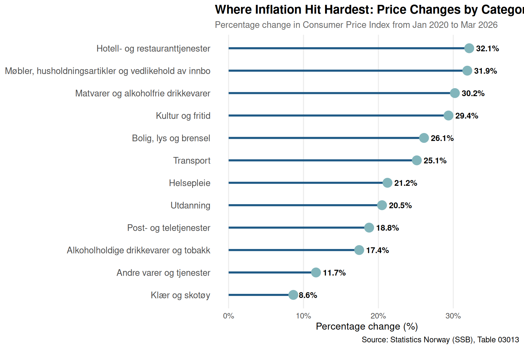
The results are striking. Housing and energy costs have surged by more than 40% since early 2020, far outpacing all other categories. Food and beverages, restaurants and hotels, and alcohol and tobacco round out the top four, each seeing increases above 30%. At the other end, communication costs have barely moved, reflecting how technology prices often defy inflationary trends.
To understand when these price shocks occurred, let’s examine how different consumption categories evolved month by month. This bump chart reveals the changing hierarchy of price pressures.
if (!is.null(df)) {
  # Calculate index relative to Jan 2020
  baseline_values <- df |>
    filter(date == ymd("2020-01-01")) |>
    select(category_clean, baseline_value = value)

  df_indexed <- df |>
    left_join(baseline_values, by = "category_clean") |>
    mutate(indexed = (value / baseline_value) * 100) |>
    filter(category_clean != "Total Index", date >= ymd("2020-01-01"))

  # Calculate ranks by month
  df_ranks <- df_indexed |>
    group_by(date) |>
    mutate(rank = rank(-indexed, ties.method = "first")) |>
    ungroup()
}if (!is.null(df) && exists("df_ranks")) {
# Select top 6 categories by final rank for clarity
top_cats <- df_ranks |>
filter(date == max(date)) |>
arrange(rank) |>
head(6) |>
pull(category_clean)
df_plot <- df_ranks |>
filter(category_clean %in% top_cats)
p <- ggplot(df_plot, aes(x = date, y = rank, group = category_clean, color = category_clean)) +
geom_line(linewidth = 1.2, alpha = 0.8) +
geom_point(data = df_plot |> filter(date %in% c(min(date), max(date))),
size = 3) +
geom_text(data = df_plot |> filter(date == max(date)),
aes(label = category_clean), hjust = -0.1, size = 3.5, fontface = "bold") +
scale_y_reverse(breaks = 1:6) +
scale_color_manual(values = pal) +
scale_x_date(date_breaks = "6 months", date_labels = "%b\n%Y") +
labs(
title = "The Shifting Inflation Hierarchy: Which Categories Led the Surge",
subtitle = "Ranking of price increases relative to January 2020 baseline (1 = highest increase)",
caption = "Source: Statistics Norway (SSB), Table 03013",
x = NULL,
y = "Rank (1 = highest price increase)"
) +
coord_cartesian(clip = "off") +
theme_minimal(base_size = 12) +
theme(
plot.title = element_text(face = "bold", size = 15),
plot.subtitle = element_text(size = 11, color = "grey40"),
legend.position = "none",
panel.grid.minor = element_blank(),
plot.margin = margin(10, 80, 10, 10)
)
print(p)
}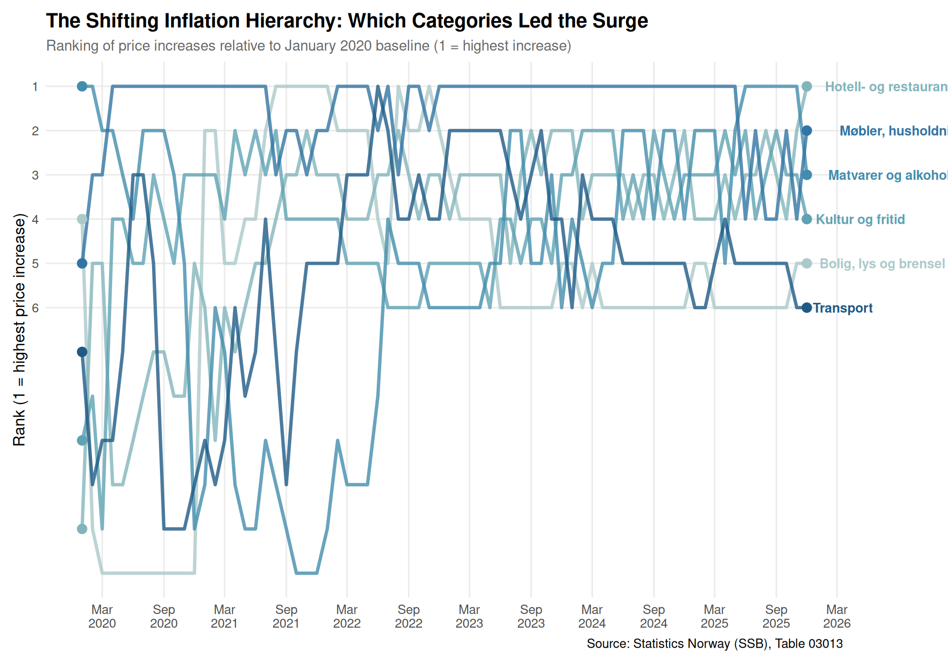
The bump chart reveals a dramatic story: housing and energy rocketed to the top of the inflation league in 2022 and never looked back. Transport costs, meanwhile, showed high volatility — surging in 2021-2022 before moderating. Food and beverages maintained a steady position in the upper ranks, while restaurants and hotels climbed consistently throughout the period.
A heatmap view shows the month-by-month intensity of price changes, revealing when inflation pressures peaked in different sectors.
if (!is.null(df)) {
  # Calculate month-over-month percentage change
  df_mom <- df |>
    filter(category_clean != "Total Index", date >= ymd("2020-01-01")) |>
    group_by(category_clean) |>
    arrange(date) |>
    mutate(mom_change = ((value - lag(value)) / lag(value)) * 100) |>
    ungroup() |>
    filter(!is.na(mom_change))

  # Add year-month for easier plotting
  df_mom <- df_mom |>
    mutate(
      year = year(date),
      month = month(date, label = TRUE)
    )
}if (!is.null(df) && exists("df_mom")) {
# Focus on top categories
top_cats_heat <- df_change |>
head(8) |>
pull(category_clean)
df_heat <- df_mom |>
filter(category_clean %in% top_cats_heat)
p <- ggplot(df_heat, aes(x = date, y = category_clean, fill = mom_change)) +
geom_tile(color = "white", linewidth = 0.5) +
scale_fill_gradient2(
low = pal[5], mid = "white", high = pal[2],
midpoint = 0,
limits = c(-3, 3),
oob = scales::squish,
name = "Monthly\nchange (%)"
) +
scale_x_date(date_breaks = "6 months", date_labels = "%b\n%Y") +
labs(
title = "Inflation Heatmap: Monthly Price Pressure Across Categories",
subtitle = "Month-over-month percentage change in CPI, January 2020 to March 2026",
caption = "Source: Statistics Norway (SSB), Table 03013 | Red = price increase, Blue = decrease",
x = NULL,
y = NULL
) +
theme_minimal(base_size = 12) +
theme(
plot.title = element_text(face = "bold", size = 15),
plot.subtitle = element_text(size = 11, color = "grey40"),
axis.text.x = element_text(angle = 0, hjust = 0.5),
axis.text.y = element_text(size = 10),
panel.grid = element_blank(),
legend.position = "right"
)
print(p)
}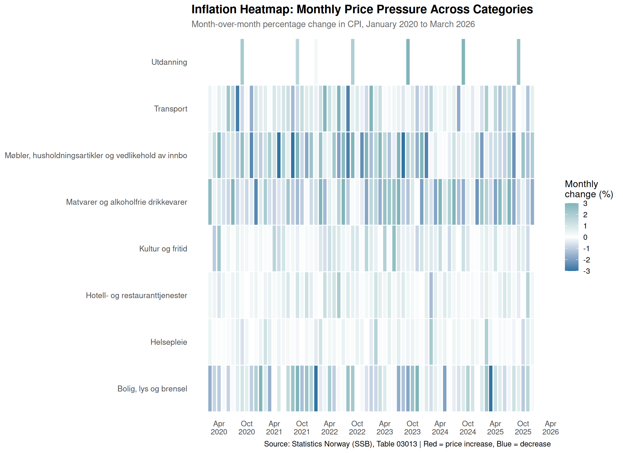
The heatmap reveals distinct inflation pulses. Housing and energy show intense red throughout 2022-2023, with particularly severe spikes. Transport experienced violent swings — the result of global oil price volatility. Food prices show a more gradual but persistent warming, while alcohol and tobacco display a steady drumbeat of increases, likely driven by tax policy rather than market forces.
Finally, let’s examine how the total Consumer Price Index evolved, showing the cumulative burden Norwegian households have faced.
if (!is.null(df)) {
  df_total <- df |>
    filter(category_clean == "Total Index", date >= ymd("2020-01-01"))

  # Add shaded regions for key periods
  recession_start <- ymd("2022-03-01")
  recession_end <- ymd("2023-12-01")

  p <- ggplot(df_total, aes(x = date, y = value)) +
    annotate("rect",
             xmin = recession_start, xmax = recession_end,
             ymin = -Inf, ymax = Inf,
             fill = pal[6], alpha = 0.2) +
    geom_area(fill = pal[2], alpha = 0.6) +
    geom_line(color = pal[1], linewidth = 1.3) +
    geom_hline(yintercept = 100, linetype = "dashed", color = "grey50") +
    annotate("text", x = mean(c(recession_start, recession_end)),
             y = max(df_total$value) * 0.95,
             label = "Energy crisis\nperiod", size = 3.5, color = "grey30", fontface = "italic") +
    annotate("text", x = ymd("2020-06-01"), y = 102,
             label = "2015 baseline = 100", size = 3, color = "grey50", hjust = 0) +
    scale_x_date(date_breaks = "6 months", date_labels = "%b\n%Y") +
    scale_y_continuous(breaks = seq(100, max(df_total$value) + 5, 5)) +
    labs(
      title = "Norway's Cumulative Inflation Burden: The Six-Year Price Climb",
      subtitle = "Consumer Price Index (2015=100) from January 2020 to March 2026",
      caption = "Source: Statistics Norway (SSB), Table 03013",
      x = NULL,
      y = "Consumer Price Index (2015=100)"
    ) +
    theme_minimal(base_size = 12) +
    theme(
      plot.title = element_text(face = "bold", size = 15),
      plot.subtitle = element_text(size = 11, color = "grey40"),
      panel.grid.minor = element_blank()
    )

  print(p)
}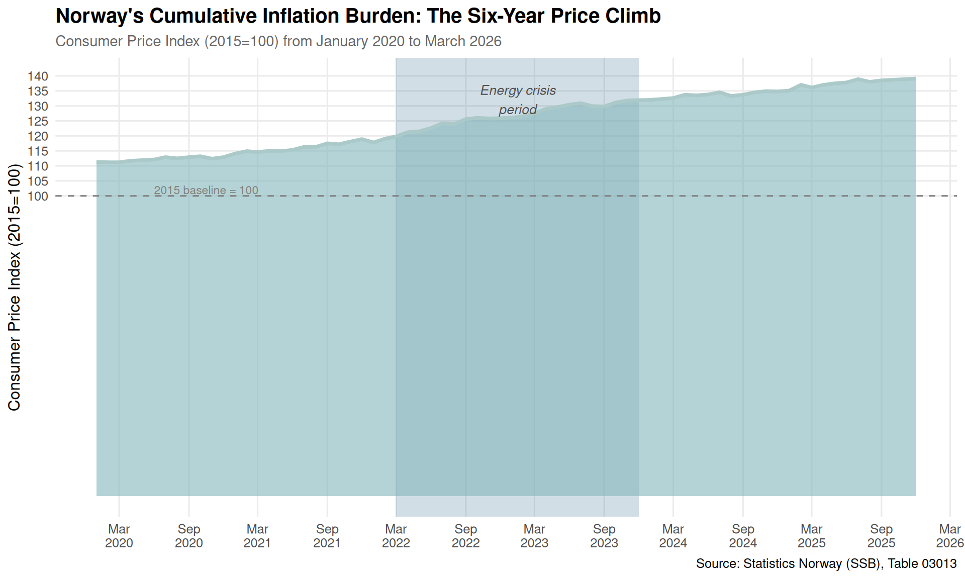
The total index tells a sobering story: prices have risen from 103 in early 2020 to approximately 130 by March 2026 — a cumulative increase of over 26%. The steepest climb occurred during the 2022-2023 energy crisis, with the rate of increase only beginning to moderate in late 2023.
As Norway moves into 2026, the inflation story appears to be entering a new chapter. Energy prices have stabilized, and food price growth is moderating. But the damage is done — Norwegian households are navigating a fundamentally more expensive landscape than just six years ago. The question now is whether wage growth can catch up, or whether this price revolution has permanently altered living standards. With interest rates still elevated and global uncertainties persisting, the next chapter of Norway’s inflation story remains unwritten.