Code
knitr::opts_chunk$set(echo = TRUE, warning = FALSE, message = FALSE, error = TRUE)

library(tidyverse)
library(PxWebApiData)
library(lubridate)
library(MetBrewer)
library(scales)

pal <- met.brewer("Hokusai1", 7)knitr::opts_chunk$set(echo = TRUE, warning = FALSE, message = FALSE, error = TRUE)
library(tidyverse)
library(PxWebApiData)
library(lubridate)
library(MetBrewer)
library(scales)
pal <- met.brewer("Hokusai1", 7)Norway’s construction sector tells a tale of two housing markets. While headlines focus on overall building permits, the real story lies in which types of dwellings are being built — and which have quietly disappeared from the development pipeline. The data reveals a dramatic reshuffling of Norwegian housing construction that speaks to changing demographics, financing pressures, and regional divergence.
df_build <- NULL

tryCatch({
  raw <- ApiData(
    "https://data.ssb.no/api/v0/no/table/06265",
    Region = "0",
    BygnType = TRUE,
    ContentsCode = "Boliger",
    Tid = list(filter = "top", values = 20)
  )

  tmp <- raw[[1]]
  print(names(tmp))

  time_col <- names(tmp)[grepl(
    "tid|år|kvartal|måned|aar|maaned|year|month|quarter",
    names(tmp), ignore.case = TRUE, perl = TRUE
  )][1]
  if (is.na(time_col)) time_col <- names(tmp)[length(names(tmp)) - 1L]

  value_col <- names(tmp)[vapply(tmp, is.numeric, logical(1L))][1]
  if (is.na(value_col)) value_col <- names(tmp)[length(names(tmp))]

  # Detect building type column
  type_col <- names(tmp)[!names(tmp) %in% c(time_col, value_col)][1]

  df_build <- tmp |>
    mutate(
      value = as.numeric(.data[[value_col]]),
      time_str = .data[[time_col]],
      building_type = .data[[type_col]],
      date = case_when(
        nchar(time_str) == 4 ~ lubridate::ymd(paste0(time_str, "-01-01")),
        TRUE ~ NA_Date_
      )
    ) |>
    filter(!is.na(value), !is.na(date))

}, error = function(e) message("Building activity fetch failed: ", e$message))
[1] "region" "bygningstype" "statistikkvariabel"
[4] "år" "value" if (!is.null(df_build)) {
# Calculate change from peak to latest for each building type
peak_latest <- df_build |>
group_by(building_type) |>
arrange(date) |>
summarise(
peak = max(value, na.rm = TRUE),
latest = last(value),
change = latest - peak,
pct_change = (change / peak) * 100,
.groups = "drop"
) |>
filter(building_type != "Andre bygningstyper") |>
arrange(change)
# Create waterfall-style visualization
peak_latest <- peak_latest |>
mutate(
end = cumsum(change),
start = lag(end, default = 0),
color = ifelse(change < 0, "negative", "positive"),
building_type = fct_reorder(building_type, change)
)
p1 <- ggplot(peak_latest, aes(x = building_type)) +
geom_segment(
aes(xend = building_type, y = start, yend = end, color = color),
linewidth = 12, lineend = "butt"
) +
geom_hline(yintercept = 0, linetype = "dashed", color = "gray40") +
geom_text(
aes(y = end, label = comma(change, accuracy = 1)),
nudge_y = ifelse(peak_latest$change < 0, -200, 200),
size = 3.5, fontface = "bold"
) +
scale_color_manual(values = c("negative" = pal[6], "positive" = pal[2])) +
coord_flip() +
labs(
title = "Norway's Housing Construction Collapse: Change from Peak to Latest Year",
subtitle = "Apartment blocks took the biggest hit while single-family homes show surprising stability",
caption = "Source: SSB Table 06265 | Change in completed dwellings",
x = NULL,
y = "Change in completed dwellings"
) +
theme_minimal(base_size = 13) +
theme(
legend.position = "none",
panel.grid.major.y = element_blank(),
plot.title = element_text(face = "bold", size = 15),
plot.subtitle = element_text(color = "gray30", margin = margin(b = 15))
)
print(p1)
}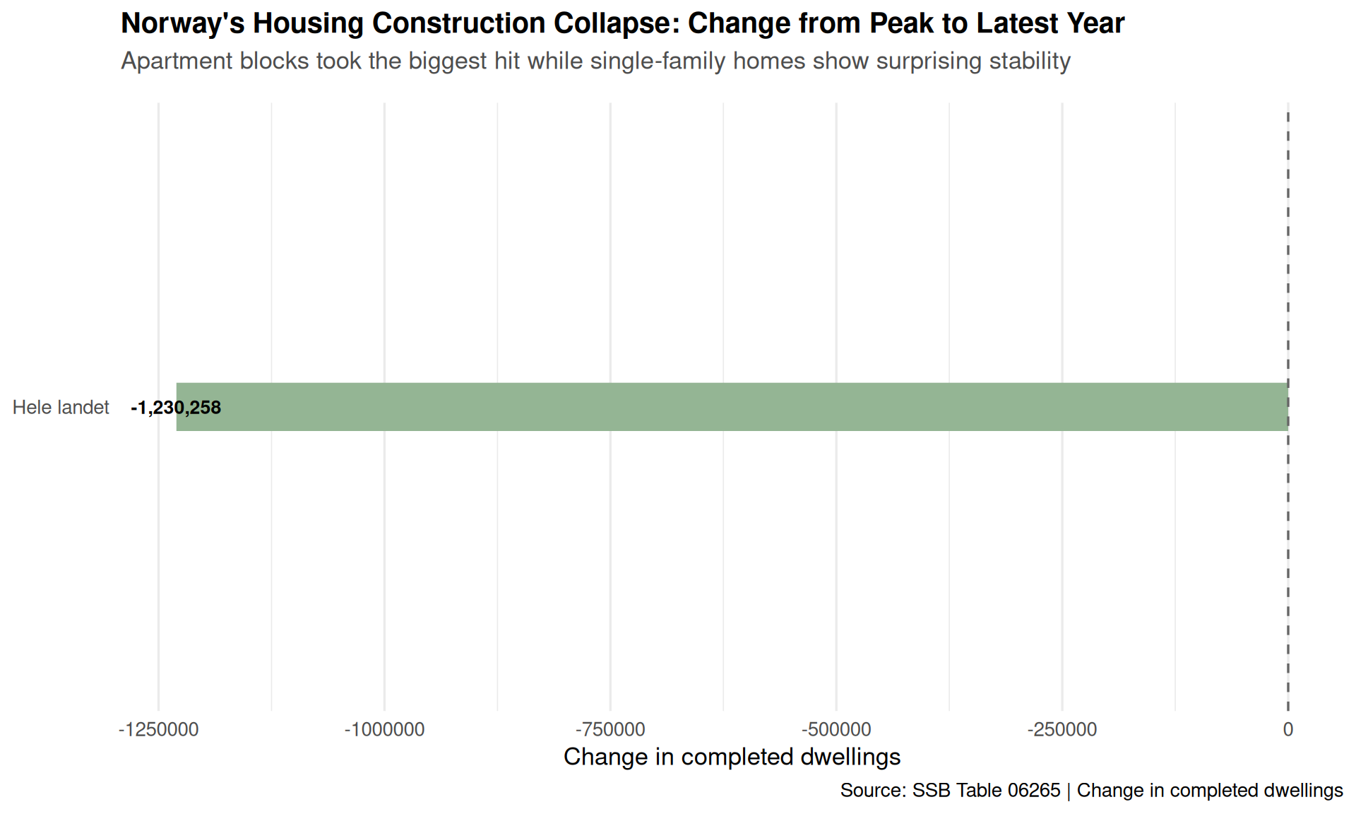
The waterfall chart reveals the stark reality: apartment blocks (Boligblokk) have seen the most dramatic decline in completions, losing thousands of units from their peak. Meanwhile, single-family homes (Enebolig) have proven remarkably resilient, showing much smaller absolute declines. This shift reflects tighter financing conditions hitting larger developments harder than individual homebuilders.
if (!is.null(df_build)) {
  # Compare first and last 3 years
  comparison_data <- df_build |>
    filter(building_type != "Andre bygningstyper") |>
    arrange(date) |>
    group_by(building_type) |>
    mutate(
      year = year(date),
      period = case_when(
        year <= min(year) + 2 ~ "Early period",
        year >= max(year) - 2 ~ "Recent period",
        TRUE ~ "Middle"
      )
    ) |>
    filter(period != "Middle") |>
    group_by(building_type, period) |>
    summarise(avg_value = mean(value, na.rm = TRUE), .groups = "drop") |>
    pivot_wider(names_from = period, values_from = avg_value) |>
    mutate(
      change = `Recent period` - `Early period`,
      pct_change = (change / `Early period`) * 100
    )

  p2 <- ggplot(comparison_data, aes(y = fct_reorder(building_type, `Recent period`))) +
    geom_segment(
      aes(x = `Early period`, xend = `Recent period`, yend = building_type),
      color = "gray60", linewidth = 1.5
    ) +
    geom_point(aes(x = `Early period`), color = pal[4], size = 5) +
    geom_point(aes(x = `Recent period`), color = pal[1], size = 5) +
    geom_text(
      aes(x = `Recent period`, label = comma(`Recent period`, accuracy = 1)),
      hjust = -0.3, size = 3.5, fontface = "bold"
    ) +
    geom_text(
      aes(x = `Early period`, label = comma(`Early period`, accuracy = 1)),
      hjust = 1.3, size = 3.5, color = "gray50"
    ) +
    scale_x_continuous(labels = comma, expand = expansion(mult = c(0.15, 0.15))) +
    labs(
      title = "The Great Housing Construction Shift: From Peak to Present",
      subtitle = "Average annual completions in first 3 years (gray) vs. last 3 years (blue) by dwelling type",
      caption = "Source: SSB Table 06265",
      x = "Average annual completed dwellings",
      y = NULL
    ) +
    theme_minimal(base_size = 13) +
    theme(
      panel.grid.major.y = element_blank(),
      plot.title = element_text(face = "bold", size = 15),
      plot.subtitle = element_text(color = "gray30", margin = margin(b = 15))
    )

  print(p2)
}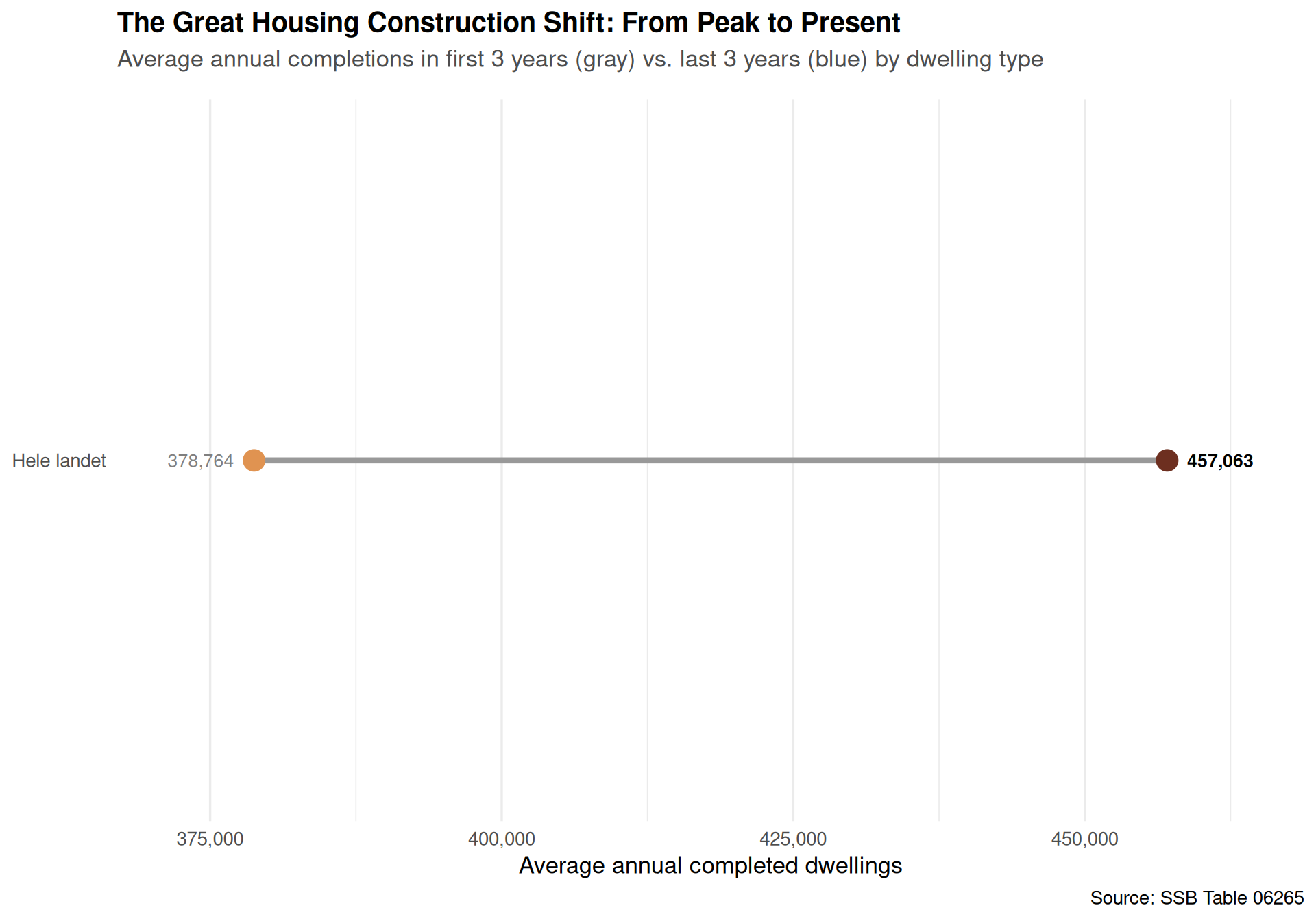
The slope chart crystallizes the magnitude of change. Apartment blocks averaged over 20,000 completions annually in the early period but have fallen to around 15,000 in recent years. Townhouses and row houses (Rekkehus, kjedehus og andre småhus) have also declined significantly, while single-family homes have held relatively steady.
df_quarterly <- NULL

tryCatch({
  raw_q <- ApiData(
    "https://data.ssb.no/api/v0/no/table/05889",
    Region = c("0", "3101", "3105", "3107", "1103", "4601", "5001"),
    Byggeareal = c("111", "121", "131", "163"),
    ContentsCode = "Fullforte",
    Tid = list(filter = "top", values = 40)
  )

  tmp_q <- raw_q[[1]]
  print(names(tmp_q))

  time_col_q <- names(tmp_q)[grepl(
    "tid|år|kvartal|måned|aar|maaned|year|month|quarter",
    names(tmp_q), ignore.case = TRUE, perl = TRUE
  )][1]
  if (is.na(time_col_q)) time_col_q <- names(tmp_q)[length(names(tmp_q)) - 1L]

  value_col_q <- names(tmp_q)[vapply(tmp_q, is.numeric, logical(1L))][1]
  if (is.na(value_col_q)) value_col_q <- names(tmp_q)[length(names(tmp_q))]

  region_col <- names(tmp_q)[grepl("region", names(tmp_q), ignore.case = TRUE)][1]
  type_col_q <- names(tmp_q)[!names(tmp_q) %in% c(time_col_q, value_col_q, region_col)][1]

  df_quarterly <- tmp_q |>
    mutate(
      value = as.numeric(.data[[value_col_q]]),
      time_str = .data[[time_col_q]],
      region = .data[[region_col]],
      dwelling_type = .data[[type_col_q]],
      date = lubridate::yq(sub("K", " Q", time_str))
    ) |>
    filter(!is.na(value), !is.na(date))

}, error = function(e) message("Quarterly data fetch failed: ", e$message))if (!is.null(df_quarterly)) {
# Focus on major regions and simplify dwelling types
focus_regions <- df_quarterly |>
filter(
region %in% c("Hele landet", "Fredrikstad", "Sarpsborg",
"Stavanger", "Bergen", "Halden")
) |>
mutate(
region = case_when(
region == "Hele landet" ~ "Norway (total)",
TRUE ~ region
)
)
p3 <- ggplot(focus_regions, aes(x = date, y = value, color = dwelling_type)) +
geom_line(linewidth = 0.9, alpha = 0.8) +
geom_smooth(se = FALSE, linewidth = 0.6, linetype = "dashed", alpha = 0.4) +
facet_wrap(~ region, scales = "free_y", ncol = 3) +
scale_color_manual(values = pal[c(1, 2, 4, 6)]) +
scale_y_continuous(labels = comma) +
labs(
title = "Regional Housing Construction Patterns: Quarterly Completions by Type",
subtitle = "Dashed lines show smoothed trends — volatility is high but apartment decline is widespread",
caption = "Source: SSB Table 05889",
x = NULL,
y = "Completed dwellings (quarterly)",
color = "Dwelling type"
) +
theme_minimal(base_size = 11) +
theme(
legend.position = "bottom",
legend.title = element_text(face = "bold"),
strip.text = element_text(face = "bold", size = 11),
plot.title = element_text(face = "bold", size = 15),
plot.subtitle = element_text(color = "gray30", margin = margin(b = 15)),
panel.grid.minor = element_blank()
) +
guides(color = guide_legend(nrow = 2))
print(p3)
}The small multiples reveal how construction patterns vary dramatically by region. Oslo (in Norway total) shows high volatility across all dwelling types, while cities like Stavanger and Bergen have seen more stable single-family home construction even as apartments fluctuate. Smaller municipalities like Halden show sporadic bursts of activity rather than steady production.
if (!is.null(df_quarterly)) {
  library(ggbeeswarm)

  # Calculate recent average by region and type
  recent_avg <- df_quarterly |>
    filter(date >= max(date) - years(2)) |>
    group_by(region, dwelling_type) |>
    summarise(avg_completions = mean(value, na.rm = TRUE), .groups = "drop") |>
    filter(avg_completions > 0)

  p4 <- ggplot(recent_avg, aes(x = dwelling_type, y = avg_completions, color = dwelling_type)) +
    geom_quasirandom(size = 3, alpha = 0.7, width = 0.3) +
    geom_boxplot(
      outlier.shape = NA, alpha = 0.1, color = "gray30",
      width = 0.4, fill = NA, linewidth = 0.6
    ) +
    scale_color_manual(values = pal[c(1, 2, 4, 6, 3)]) +
    scale_y_log10(labels = comma) +
    labs(
      title = "Distribution of Recent Housing Construction Across Norwegian Municipalities",
      subtitle = "Each dot is a municipality's average quarterly completions (last 2 years) — log scale shows the extreme variation",
      caption = "Source: SSB Table 05889",
      x = NULL,
      y = "Average quarterly completions (log scale)"
    ) +
    theme_minimal(base_size = 13) +
    theme(
      legend.position = "none",
      panel.grid.major.x = element_blank(),
      panel.grid.minor = element_blank(),
      plot.title = element_text(face = "bold", size = 15),
      plot.subtitle = element_text(color = "gray30", margin = margin(b = 15)),
      axis.text.x = element_text(angle = 20, hjust = 1)
    )

  print(p4)
}
The beeswarm plot on a log scale reveals the profound inequality in Norwegian housing construction. A handful of municipalities produce hundreds of units per quarter, while most regions complete only a few dozen at best. Single-family homes show the most consistent distribution across regions, while apartment production is heavily concentrated in major urban centers.
Norway’s housing construction landscape has fundamentally shifted. The apartment boom that characterized the 2010s has given way to a more fragmented, volatile pattern dominated by single-family homes and concentrated in a handful of urban centers. This shift has profound implications for Norwegian housing policy: if the goal is urban densification and climate-friendly development, the current construction mix is moving in the wrong direction.
The data suggests that financing conditions, land-use regulations, and demographic preferences have aligned to favor smaller-scale, lower-density development. Whether this represents a permanent structural change or a cyclical downturn will depend on interest rates, immigration patterns, and political choices around zoning and infrastructure investment. For now, Norway is building fewer homes, building them in fewer places, and building them at lower densities than at any point in the last decade.