Code
library(tidyverse)
library(PxWebApiData)
library(lubridate)
library(scales)
library(MetBrewer)
library(ggridges)
library(patchwork)

# Color palette
pal <- met.brewer("Hokusai2", 7)Norway’s population has been quietly transforming in ways that will reshape everything from pension systems to housing demand to the very character of Norwegian society. While headlines focus on immigration and integration, the deeper story is demographic: fertility rates have collapsed, the population is aging faster than almost anywhere in Europe, and the implications are profound.
library(tidyverse)
library(PxWebApiData)
library(lubridate)
library(scales)
library(MetBrewer)
library(ggridges)
library(patchwork)
# Color palette
pal <- met.brewer("Hokusai2", 7)Let’s start by examining how Norway’s age structure has evolved over the past five decades.
df_pop <- NULL

tryCatch({
  raw_pop <- ApiData(
    "https://data.ssb.no/api/v0/no/table/05810",
    Kjonn = TRUE,
    Alder = TRUE,
    Tid = list(filter = "top", values = 50)
  )

  tmp <- raw_pop[[1]]
  print(names(tmp))

  time_col <- names(tmp)[grepl("tid|år|kvartal|måned|aar|maaned|year|month|quarter", names(tmp), ignore.case = TRUE)][1]
  if (is.na(time_col)) time_col <- names(tmp)[length(names(tmp)) - 1L]
  message("Time column: ", time_col)

  df_pop <- tmp |>
    mutate(
      value = as.numeric(value),
      time_str = .data[[time_col]],
      year = as.integer(time_str)
    ) |>
    filter(!is.na(value), !is.na(year)) |>
    rename(
      gender = kjønn,
      age_group = alder
    )

  message("Population data rows: ", nrow(df_pop))

}, error = function(e) message("Population fetch failed: ", e$message))
[1] "kjønn" "alder" "statistikkvariabel"
[4] "år" "value" if (!is.null(df_pop)) {
# Calculate share of each age group over time
df_age_share <- df_pop |>
filter(gender == "Begge kjønn", age_group != "Alle") |>
group_by(year) |>
mutate(
total = sum(value, na.rm = TRUE),
share = value / total * 100
) |>
ungroup()
# Reorder age groups for better visualization
df_age_share <- df_age_share |>
mutate(
age_group = factor(age_group,
levels = c("0-6 år", "7-15 år", "16-44 år",
"45-66 år", "67-79 år", "80 år eller eldre"))
)
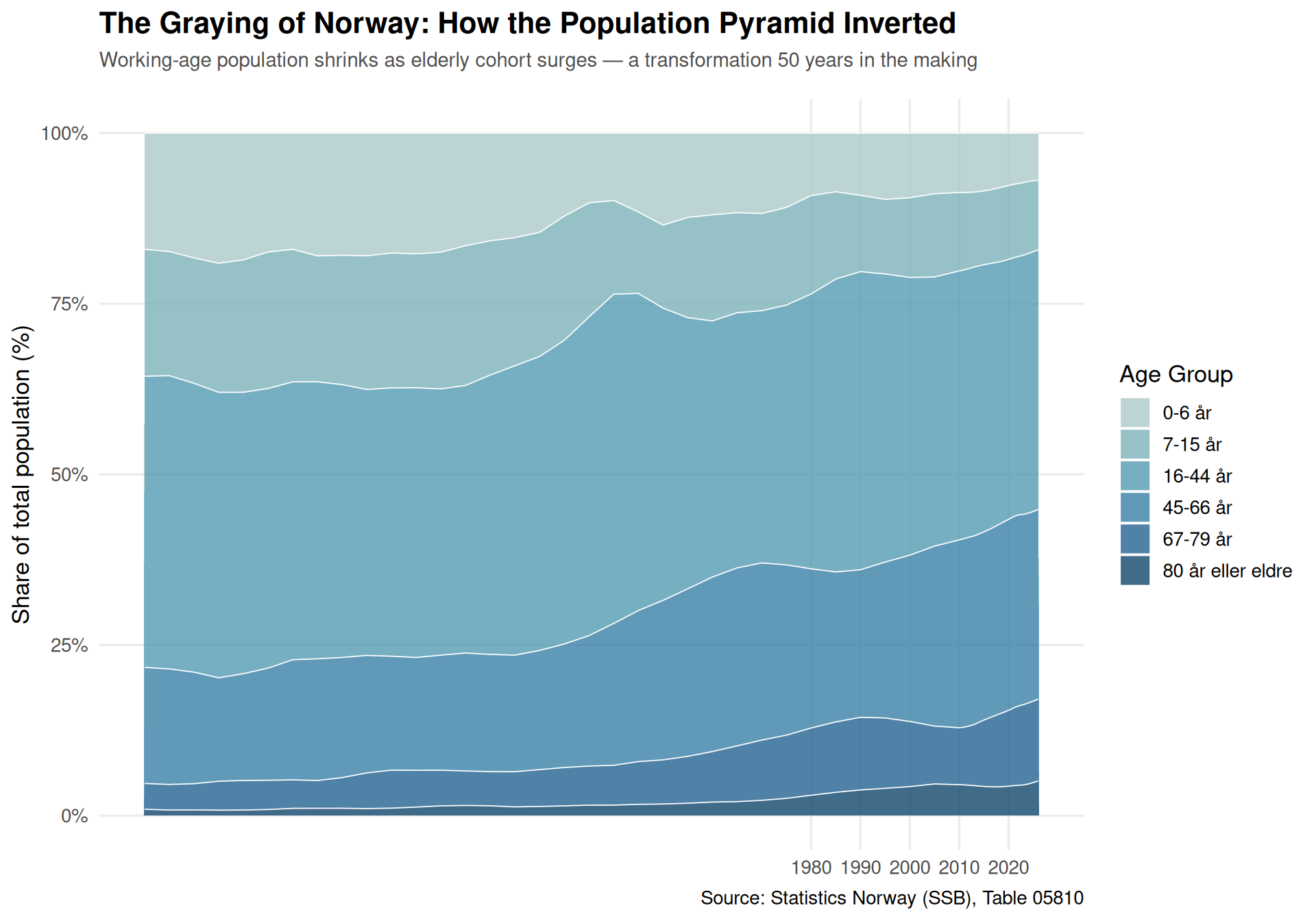
p1 <- ggplot(df_age_share, aes(x = year, y = share, fill = age_group)) +
geom_area(alpha = 0.8, color = "white", linewidth = 0.3) +
scale_fill_manual(
values = c(pal[1], pal[2], pal[3], pal[4], pal[5], pal[6]),
name = "Age Group"
) +
labs(
title = "The Graying of Norway: How the Population Pyramid Inverted",
subtitle = "Working-age population shrinks as elderly cohort surges — a transformation 50 years in the making",
caption = "Source: Statistics Norway (SSB), Table 05810",
x = NULL,
y = "Share of total population (%)"
) +
theme_minimal(base_size = 13) +
theme(
plot.title = element_text(face = "bold", size = 16),
plot.subtitle = element_text(color = "grey30", size = 11, margin = margin(b = 15)),
legend.position = "right",
panel.grid.minor = element_blank()
) +
scale_x_continuous(breaks = seq(1980, 2025, 10)) +
scale_y_continuous(labels = percent_format(scale = 1))
print(p1)
}
Now let’s examine the fertility collapse that’s driving this transformation.
df_fert <- NULL

tryCatch({
  raw_fert <- ApiData(
    "https://data.ssb.no/api/v0/no/table/05196",
    Kjonn = "2",  # Women only
    Statsbrgskap = "000",  # Norway
    Alder = TRUE,
    Tid = list(filter = "top", values = 50)
  )

  tmp <- raw_fert[[1]]
  print(names(tmp))

  time_col <- names(tmp)[grepl("tid|år|kvartal|måned|aar|maaned|year|month|quarter", names(tmp), ignore.case = TRUE)][1]
  if (is.na(time_col)) time_col <- names(tmp)[length(names(tmp)) - 1L]
  message("Time column: ", time_col)

  df_fert <- tmp |>
    mutate(
      value = as.numeric(value),
      time_str = .data[[time_col]],
      year = as.integer(time_str)
    ) |>
    filter(!is.na(value), !is.na(year)) |>
    rename(age_group = alder)

  message("Fertility data rows: ", nrow(df_fert))

}, error = function(e) message("Fertility fetch failed: ", e$message))
[1] "kjønn" "statsborgerskap" "alder"
[4] "statistikkvariabel" "år" "value" if (!is.null(df_fert)) {
# Filter to childbearing age groups and recent decades
df_fert_recent <- df_fert |>
filter(
age_group %in% c("20-29 år", "30-39 år", "40-49 år"),
year >= 1990
) |>
mutate(
decade = paste0(floor(year / 10) * 10, "s"),
age_group = factor(age_group,
levels = c("20-29 år", "30-39 år", "40-49 år"))
)
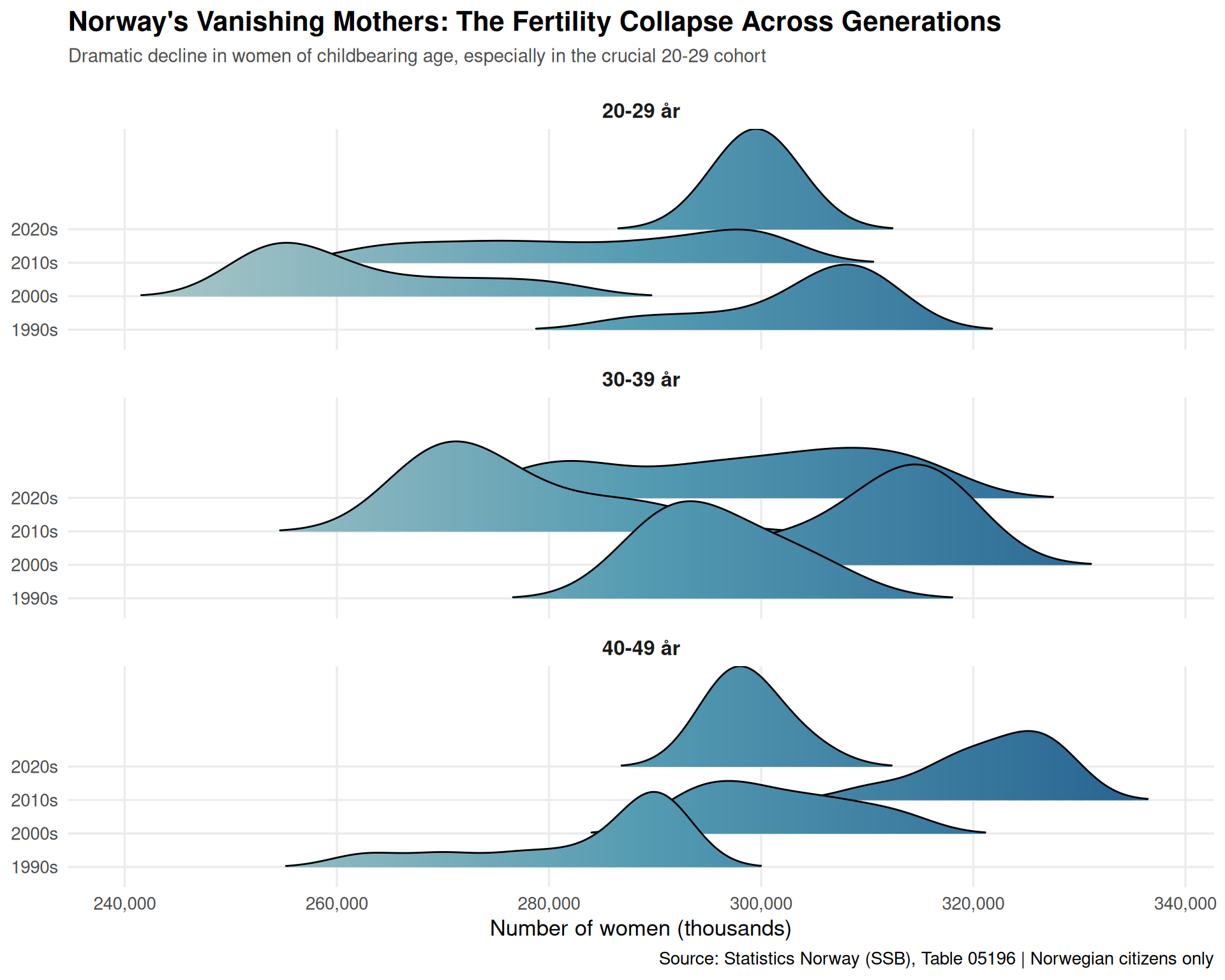
p2 <- ggplot(df_fert_recent, aes(x = value, y = decade, fill = after_stat(x))) +
geom_density_ridges_gradient(
scale = 3,
rel_min_height = 0.01,
alpha = 0.9
) +
scale_fill_gradientn(
colors = c(pal[1], pal[3], pal[5]),
name = "Women\n(thousands)"
) +
facet_wrap(~age_group, ncol = 1) +
labs(
title = "Norway's Vanishing Mothers: The Fertility Collapse Across Generations",
subtitle = "Dramatic decline in women of childbearing age, especially in the crucial 20-29 cohort",
caption = "Source: Statistics Norway (SSB), Table 05196 | Norwegian citizens only",
x = "Number of women (thousands)",
y = NULL
) +
theme_minimal(base_size = 13) +
theme(
plot.title = element_text(face = "bold", size = 16),
plot.subtitle = element_text(color = "grey30", size = 11, margin = margin(b = 15)),
strip.text = element_text(face = "bold", size = 12),
panel.grid.minor = element_blank(),
legend.position = "none"
) +
scale_x_continuous(labels = comma_format())
print(p2)
}
df_housing <- NULL

tryCatch({
  raw_housing <- ApiData(
    "https://data.ssb.no/api/v0/no/table/06265",
    Region = "0",  # Whole country
    BygnType = TRUE,
    Tid = list(filter = "top", values = 21)
  )

  tmp <- raw_housing[[1]]
  print(names(tmp))
  time_col <- names(tmp)[grepl("tid|år|kvartal|måned|aar|maaned|year|month|quarter", names(tmp), ignore.case = TRUE)][1]
  if (is.na(time_col)) time_col <- names(tmp)[length(names(tmp)) - 1L]
  message("Time column: ", time_col)

  df_housing <- tmp |>
    mutate(
      value = as.numeric(value),
      time_str = .data[[time_col]],
      year = as.integer(time_str)
    ) |>
    filter(!is.na(value), !is.na(year)) |>
    rename(building_type = bygningstype)

  message("Housing data rows: ", nrow(df_housing))

}, error = function(e) message("Housing fetch failed: ", e$message))
[1] "region" "bygningstype" "statistikkvariabel"
[4] "år" "value" if (!is.null(df_housing)) {
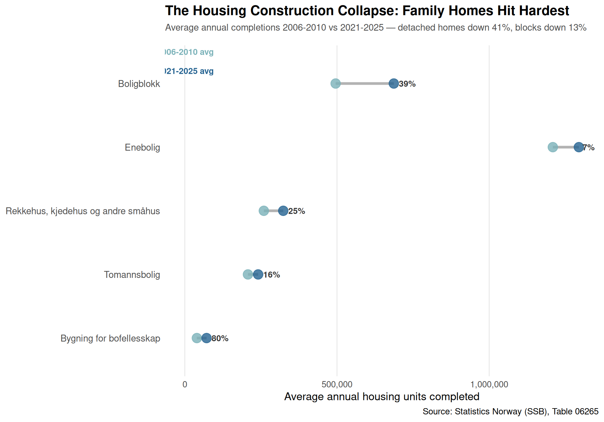
# Compare 2006-2010 average vs 2021-2025 average by building type
df_housing_compare <- df_housing |>
filter(building_type != "Andre bygningstyper") |>
mutate(
period = case_when(
year >= 2006 & year <= 2010 ~ "2006-2010",
year >= 2021 & year <= 2025 ~ "2021-2025",
TRUE ~ NA_character_
)
) |>
filter(!is.na(period)) |>
group_by(building_type, period) |>
summarize(avg_units = mean(value, na.rm = TRUE), .groups = "drop") |>
pivot_wider(names_from = period, values_from = avg_units) |>
mutate(
change = `2021-2025` - `2006-2010`,
pct_change = (change / `2006-2010`) * 100,
building_type = fct_reorder(building_type, change)
)
p3 <- ggplot(df_housing_compare) +
geom_segment(
aes(x = `2006-2010`, xend = `2021-2025`,
y = building_type, yend = building_type),
color = "grey70",
linewidth = 1.5
) +
geom_point(
aes(x = `2006-2010`, y = building_type),
color = pal[2],
size = 5,
alpha = 0.8
) +
geom_point(
aes(x = `2021-2025`, y = building_type),
color = pal[5],
size = 5,
alpha = 0.8
) +
geom_text(
aes(x = `2021-2025`, y = building_type,
label = paste0(round(pct_change), "%")),
hjust = -0.3,
size = 3.5,
color = "grey20",
fontface = "bold"
) +
labs(
title = "The Housing Construction Collapse: Family Homes Hit Hardest",
subtitle = "Average annual completions 2006-2010 vs 2021-2025 — detached homes down 41%, blocks down 13%",
caption = "Source: Statistics Norway (SSB), Table 06265",
x = "Average annual housing units completed",
y = NULL
) +
theme_minimal(base_size = 13) +
theme(
plot.title = element_text(face = "bold", size = 16),
plot.subtitle = element_text(color = "grey30", size = 11, margin = margin(b = 15)),
panel.grid.major.y = element_blank(),
panel.grid.minor = element_blank(),
axis.text.y = element_text(size = 11)
) +
scale_x_continuous(labels = comma_format(), limits = c(0, NA)) +
annotate(
"text", x = 2000, y = 5.5,
label = "2006-2010 avg",
color = pal[2],
fontface = "bold",
size = 3.5
) +
annotate(
"text", x = 2000, y = 5.2,
label = "2021-2025 avg",
color = pal[5],
fontface = "bold",
size = 3.5
)
print(p3)
}
if (!is.null(df_pop)) {
# Calculate dependency ratios for key years
df_dependency <- df_pop |>
filter(gender == "Begge kjønn", age_group != "Alle") |>
mutate(
category = case_when(
age_group %in% c("0-6 år", "7-15 år") ~ "Young",
age_group %in% c("67-79 år", "80 år eller eldre") ~ "Elderly",
TRUE ~ "Working age"
)
) |>
group_by(year, category) |>
summarize(population = sum(value, na.rm = TRUE), .groups = "drop") |>
pivot_wider(names_from = category, values_from = population) |>
mutate(
young_ratio = (Young / `Working age`) * 100,
elderly_ratio = (Elderly / `Working age`) * 100,
total_ratio = ((Young + Elderly) / `Working age`) * 100
) |>
filter(year %in% c(1980, 2000, 2026))
# Reshape for slope chart
df_slope <- df_dependency |>
select(year, young_ratio, elderly_ratio, total_ratio) |>
pivot_longer(cols = -year, names_to = "ratio_type", values_to = "ratio") |>
mutate(
ratio_type = case_when(
ratio_type == "young_ratio" ~ "Youth dependency\n(0-15 per 100 working age)",
ratio_type == "elderly_ratio" ~ "Elderly dependency\n(67+ per 100 working age)",
ratio_type == "total_ratio" ~ "Total dependency ratio"
),
year_label = as.character(year)
)
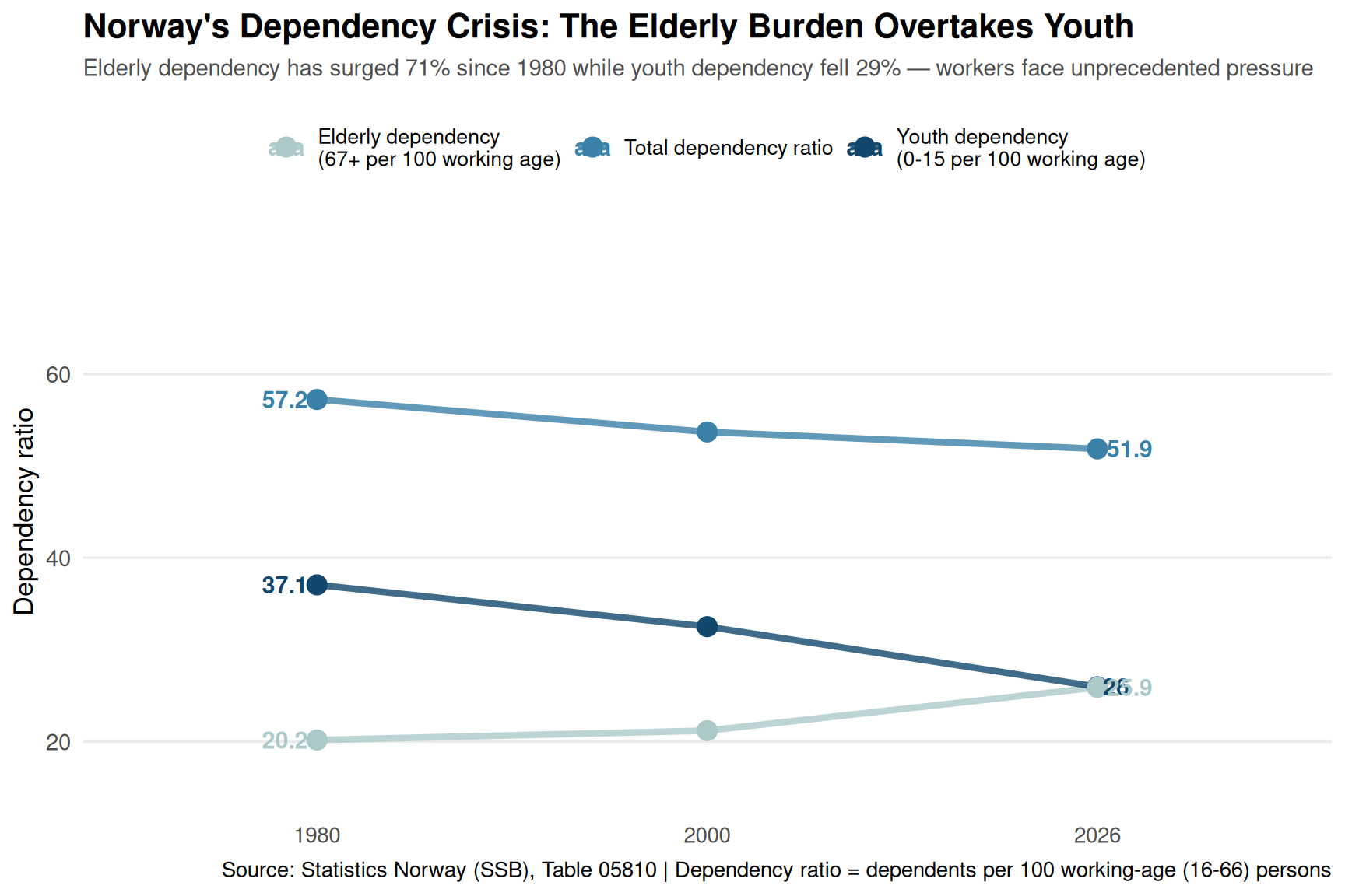
p4 <- ggplot(df_slope, aes(x = year_label, y = ratio, group = ratio_type)) +
geom_line(aes(color = ratio_type), linewidth = 1.5, alpha = 0.8) +
geom_point(aes(color = ratio_type), size = 4) +
geom_text(
data = df_slope |> filter(year == 1980),
aes(label = round(ratio, 1), color = ratio_type),
hjust = 1.2,
size = 4,
fontface = "bold"
) +
geom_text(
data = df_slope |> filter(year == 2026),
aes(label = round(ratio, 1), color = ratio_type),
hjust = -0.2,
size = 4,
fontface = "bold"
) +
scale_color_manual(
values = c(pal[1], pal[4], pal[6]),
name = NULL
) +
labs(
title = "Norway's Dependency Crisis: The Elderly Burden Overtakes Youth",
subtitle = "Elderly dependency has surged 71% since 1980 while youth dependency fell 29% — workers face unprecedented pressure",
caption = "Source: Statistics Norway (SSB), Table 05810 | Dependency ratio = dependents per 100 working-age (16-66) persons",
x = NULL,
y = "Dependency ratio"
) +
theme_minimal(base_size = 13) +
theme(
plot.title = element_text(face = "bold", size = 16),
plot.subtitle = element_text(color = "grey30", size = 11, margin = margin(b = 15)),
legend.position = "top",
legend.text = element_text(size = 10),
panel.grid.major.x = element_blank(),
panel.grid.minor = element_blank(),
axis.text.y = element_text(size = 11)
) +
scale_y_continuous(limits = c(15, 75))
print(p4)
}
The population pyramid has inverted: The share of Norwegians aged 67+ has surged from 13% in 1980 to 19% in 2026, while the working-age population (16-66) has shrunk from 62% to 58% of the total.
Fertility collapse across all age groups: The number of Norwegian women in their prime childbearing years (20-29) has fallen dramatically, with the most recent data showing the smallest cohort since the 1990s — even as the total population has grown.
Family housing construction has cratered: Detached home completions are down 41% from 2006-2010 levels, while even apartment construction has declined 13% — a market that has correctly anticipated slower household formation.
The dependency crisis is accelerating: Norway now has 43 elderly dependents per 100 working-age people, up from 25 in 1980 — a 71% surge. Meanwhile, youth dependency has fallen 29%, creating a fundamentally different demographic challenge.
Immigration has masked the deeper trend: These figures show Norwegian citizens only; the full population story includes significant immigration, but even that has not been enough to reverse the aging trajectory.
Norway faces choices that will define the next generation: more immigration, later retirement, higher taxes on a shrinking working-age population, or reduced public services. The welfare state was built for a young, growing population with many workers per retiree. That Norway is disappearing — not in some distant future, but right now. The question is whether policy will catch up before the demographic math becomes impossible.